Understand Q-Q Plot
How to do QQ Plot ? Explained ! Implemented ! Interpolated!
Understand Q-Q Plot
How to do Q-Q Plot ? Explained ! Implemented ! Interpolated !
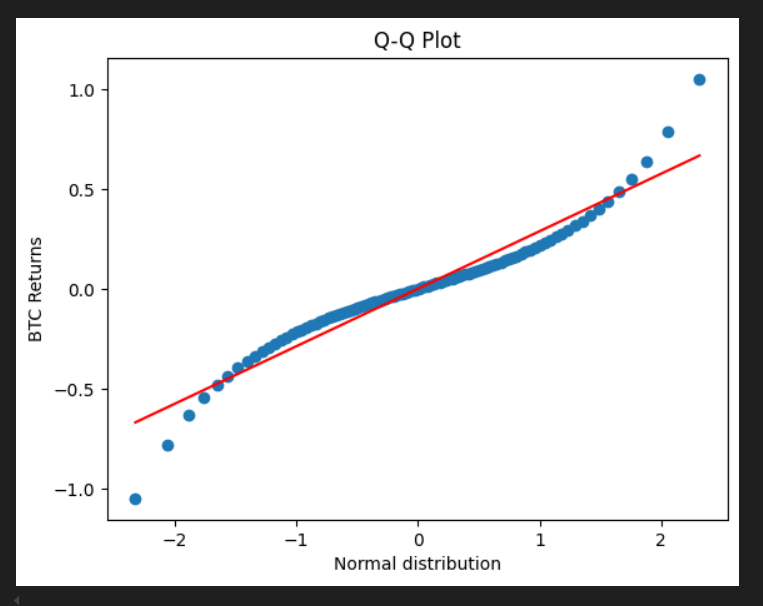
Q-Q plot of btc returns vs normal distribution
Q-Q Plot is such that it looks fairly simple on look but when you try to think of implementing, it scratches your mind a bit. It is like when you first see , it looks quite simple and when you think a bit by seeing the plot axes you get stuck and finally when you realize/understand, it again becomes quite simple.
Q-Q is Quantile-Quantile Plot. where we plot quantile values of the 2 distribution/series against each other to check if they follow the same distribution.
Quantile or Percentile simply means dividing the distribution or a series into q equal parts, so each part will have equal no of quantities/values. Let’s take a series s = [1,3,4,2,7,6,5,9,10,8] then 4 is 0.3 (30%) quantile as 30% of values(1,2,3) fall below it. if s2 = [17,13,18,11,33] then 18 is 0.6 quantile as 60% of values(11,13,17) fall below 18.
Note : above is a easy brief on quantiles. More correct calculation involves something called interpolation. Interpolation is explained at the end of the blog since understanding Q-Q plot does not need under-the-hood concept of interpolation 0.3 quantile of s is 3.69 and not 4 and 0.6 quantile of s2 is 17.4 and not 18.
If you use pandas quantile function it gives the values of quantile mentioned with interpolation as default. df.quantile(0.2) or df.quantile([0.2,0.5]) gives respective single or multiple values corresponding to given quantiles.
https://pandas.pydata.org/pandas-docs/stable/reference/api/pandas.DataFrame.quantile.html
Q-Q Plot
So we now know quantiles/percentile. For qq-plot we need 2 distribution/series, we will divide both series in equal quantiles and find their values forming 2 new series. We just need to plot them together to form a qq plot. If we have Series1 as s1 and Series2 as s2 and let’s say we want 10 points so our quantiles q_series are [0.1,0.2,0.3….0.9]. Now we find the values corresponding to this q_series in s1 and s2 ( easily done by s1.quantile(q_series)) giving us qvalues_s1 and qvalues_s2. We just need to plot qvalues_s1 vs qvalues_s2 .
X1,Y1 = ( qvalues_s1[0],qvalues_s2[0]) …. Xn,Yn = ( qvalues_s1[n],qvalues_s2[n])
Q-Q plot of btc returns vs normal distribution
In the above plot the y axis is BTC returns on 15m Tf from 2020 to 2023. The values are quantile values of 100 quantiles/groups. On X axis is the series of samples from standard normal distribution of same length as BTC returns dataset. quantile values are calculated similarly for it. The plot compares distribution of BTC returns with that of normal distribution.
The red line is how the plot should resemble if if BTC returns where normal
We can see that it follows normal distribution around the center but the tails are away from the ideal red line. This we commonly know as volatility clustering in markets where period’s of big move is followed by another big move and that real markets have fat tails which deviate from normal distribution.
Python Code Implementation
quantiles = lambda q : np.arange(1/q,1,1/q)
normal_dist = lambda l : np.random.standard_normal(l)
q_count = 100   # no of groups

# btc ret to quantiles
btc_ret = df_btc.close.pct_change()*100
btc_q = btc_ret.quantile(quantiles(q_count))

# normal distribution sample series to quantile
st_nm_dist = pd.Series(normal_dist(len(btc_ret)))
nd_q = st_nm_dist.quantile(quantiles(q_count))

# plot scatter
plt.scatter(nd_q,btc_q)

# plot lr line as ideal red line
x,y = nd_q,btc_q
from  scipy import stats
lr_params = stats.linregress(x,y)
slope , intercept = lr_params[0] , lr_params[1]
lr_model = slope*x + intercept
plt.plot( x , lr_model , color = 'red')

# labels
plt.xlabel('Normal distribution')
plt.ylabel('BTC Returns')
plt.title('Q-Q Plot')
BTC ret vs ETH ret Q-Q Plot

btc ret vs eth ret q-q plot
Eth ret vs Btc ret shows that they have similar distribution. Of Course ! But this shows how 2 similar distribution (can be anything) manifests in Q-Q Plot.
Note : Quantile of any distribution is a uniform distribution. As each distribution value corresponds to unique quantiles 0.1,0.11,0.12….. So each quantile has frequency of 1.
Nifty vs Btc Returns Q-Q Plot

btc vs nifty qq plot
Above is Btc and Nifty returns Q-Q Plot. Btc and Nifty have more similar distributions as compared to btc and normal distribution. Again Of Course! But you get the insight in the plot.
Interpolation
As mentioned above quantile calculations can be slightly different like how pandas quantile function computes in default. So the point is let say we have s = [1,2,3] and according to the simple definition 1 is 0 quantile, 2 is 0.33 quantile, 3 is 0.66 quantile. If we want 0.5 quantile it could be 2 or 3 ? So the issue is that with simple calculation we consider the quantile value as the value present in the series. But this is incorrect, as correct value should be any no even though it is not in the series.
Interpolation will give quantile values even though they are not in the series. They consider series as continuous values and returns values that fall on it.
s = [1,2,3]
example 1 : we want 0.1 quantile of s :
1] Index = (Length of series-1)quantile : (3–1)0.1 = 0.2
2] Index 0.2 is between index 0 and index 1. so formulae is lower value + fraction(value higher index — value of lower index) : lower value is value of index 0 which is 1 . value of higher index is 1 is 2 . fraction of index 0.2 is 0.2. so >> 1 + 0.2(2–1) = 1.2
3] so quantile value of 0.1 is 1.2
example 2: we want 0.5 quantile of s :
1] Index = (Length of series-1)quantile : (3–1)0.5 = 1
2] since index 1 is already whole no we do not need to step 2. value at index 1 is 2
3] so quantile value of 0.5 is 2
example 3: we want 0.7 quantile of s :
1] Index = (Length of series-1)quantile : (3–1)0.7 = 1.4
2] Index 1.4 is between index 1 and index 2. so formulae is lower value + fraction(value higher index — value of lower index) : lower value is value of index 1 which is 2. value of higher index is 2 is 3. fraction of index 1.4 is 0.4. so >> 2+ 0.4(3–2) = 2.4
3] so quantile value of 0.7 is 2.4
Intuitively the steps say : divide the the length of series by the quantile you want. If it’s a whole no that index value is your quantile value. Else if a fraction, see between what 2 index it falls. start on 1st index value and reach that fraction of distance between that 2 index.
Conclusion
In statistics, a Q–Q plot is a probability plot, a graphical method for comparing two probability distributions by plotting their quantiles against each other.
Inspiration
[embed]
메타데이터
- post_id
- 298d47da234e
- slug
- understand-q-q-plot-298d47da234e
- url
- https://medium.com/@adarshmanojsingh/understand-q-q-plot-298d47da234e
- canonical_url
- https://medium.com/@adarshmanojsingh/understand-q-q-plot-298d47da234e
- author_url
- https://medium.com/@adarshmanojsingh
- status
- ok
- fetched_at
- 2026-07-28 02:51:27