The Ultimate Beginner’s Guide to UI/UX Wireframing
Imagine trying to build a house without a blueprint. You’d probably end up moving walls mid-construction, wasting thousands of dollars, and…
The Ultimate Beginner’s Guide to UI/UX Wireframing
Imagine trying to build a house without a blueprint. You’d probably end up moving walls mid-construction, wasting thousands of dollars, and tearing out electrical wiring because nobody planned where the light switches should go.
In digital product design, wireframing is that blueprint. It is the simple skeleton of a website or app — a basic structural map created before adding colors, images, or code.
Whether you are a complete beginner, a product manager, a marketer, or a developer, learning how to wireframe is the fastest way to turn rough ideas into easy-to-use digital products.
What Exactly Is a UI/UX Wireframe?
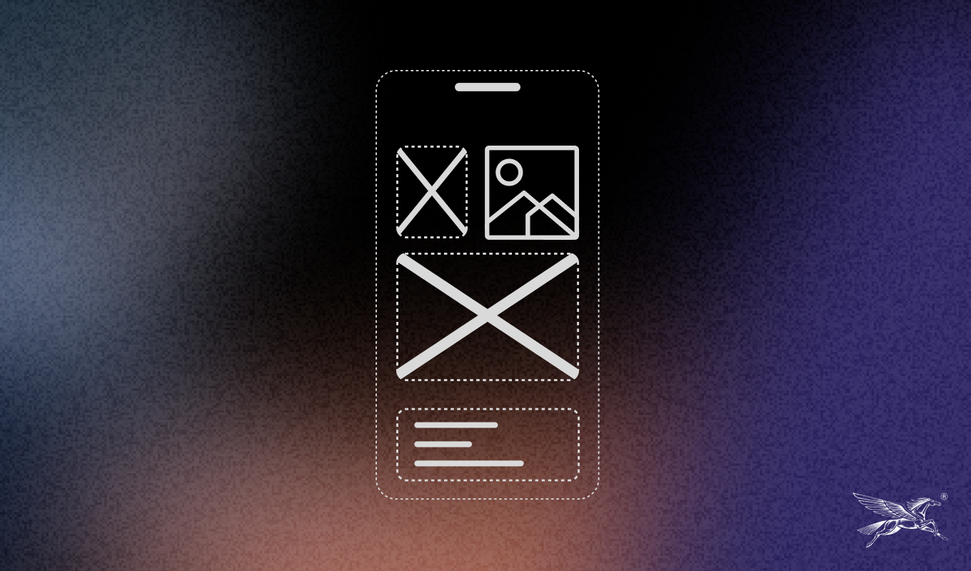
A wireframe is a simplified, low-detail drawing or digital layout of an app or website screen. Think of it like an architectural floor plan. It shows where things go without worrying about interior decoration.
When creating a wireframe, you focus on three simple things:
- Information Architecture: What content goes on the page and where it sits.
- User Navigation: How a user moves from one screen or button to the next.
- Core Functionality: What interactive elements exist (like search bars, buttons, and form fields).
The Gold Rule of Wireframing: Strip away colors, logos, and fancy visuals. If a screen layout isn’t clear in simple black and white boxes, adding pretty photos won’t fix it.
Why Wireframing Is So Important for Beginners
Skipping the wireframe step is one of the most common mistakes new creators make. Here is why taking time to wireframe saves projects:
- Saves Time and Money: Fixing a mistake on a simple paper sketch takes 10 seconds. Fixing the same mistake after a developer has written code can take days or weeks.
- Keeps Everyone Focused: It prevents team members from arguing over background colors, fonts, or image choices before deciding if the actual layout makes sense.
- Makes Usability Testing Easy: You can put a simple wireframe in front of a friend or user and instantly see if they understand how to navigate your app.
Wireframes vs. Mockups vs. Prototypes (The Simple Difference)
It is easy to get confused by design jargon. Here is how these three design stages fit together:
- Wireframe (The Skeleton): Low-detail, monochrome layout focused purely on structure, spacing, and content placement.
- Mockup (The Skin): High-detail, colorful visual design that shows exactly how the final app or website will look, including fonts, brand colors, and real images.
- Prototype (The Nervous System): An interactive model that lets you click through screens to test how the product actually works and feels.
The 3 Levels of Wireframe Detail
Depending on where you are in your project, you will move through three basic stages of detail:
- Low-Fidelity (Lo-Fi):
- What it looks like: Quick paper sketches using basic boxes, lines, and stick figures.
- Primary Goal: Rapid brainstorming and exploring quick ideas.
- Best Tools: Pen, paper, and whiteboards.
- Mid-Fidelity (Mid-Fi):
- What it looks like: Clean digital layouts using greys, black, white, simple fonts, and clear buttons.
- Primary Goal: Figuring out exact spacing, screen structure, and user paths.
- Best Tools: Figma, Whimsical, and Wireframe.cc.
- High-Fidelity (Hi-Fi):
- What it looks like: Precise digital grids with exact spacing, real headings, and precise text boundaries.
- Primary Goal: Final review before handing designs over to web developers.
- Best Tools: Figma and Adobe XD.
Key Components Every Wireframe Needs
When you start drawing your first screen, you will rely on a few universal building blocks:
- Boxes with ‘X’ Marks: Standard placeholder visual for images, banners, or video players.
- Text Lines: Parallel horizontal lines used to represent paragraphs of copy.
- CTA Buttons: Rectangles containing simple action words like “Sign Up,” “Buy Now,” or “Learn More.”
- Navigation Bars: Top or side headers containing simple link labels like “Home,” “About,” and “Contact.”
- Input Fields: Blank rectangular boxes representing forms where users type details like names or emails.
Step-by-Step: How to Build Your First Wireframe
Step 1: Define the Main Goal of the Screen
- Before drawing, answer one simple question: What is the single most important thing a user needs to do on this page? (e.g., search for a product, book a call, or read an article).
Step 2: Map Out the User Flow
- Write down the steps a user takes to achieve that goal. For example: Home Page $\rightarrow$ Click Product $\rightarrow$ Add to Cart $\rightarrow$ Checkout.
Step 3: Sketch the Rough Layout on Paper
- Start off-screen. Grab a pen and paper and sketch 3 or 4 quick variations of the layout in 5 minutes. Don’t worry about clean lines or straight edges.
Step 4: Move to Digital and Establish Hierarchy
- Pick your best sketch and recreate it in a digital tool using grayscale. Place your main Call-To-Action button and important headings where users naturally look first (usually starting from the top-left).
Step 5: Add Brief Notes for Developers
- Add simple bullet points next to your digital wireframe explaining what happens when a button is clicked or what happens if a user fills out a form incorrectly.
Beginner-Friendly Tools to Get Started
You don’t need expensive software to start wireframing. Here are the best options for beginners:
- Pen and Paper (Cost: Free): Still the fastest way to get ideas out of your head without technical distraction.
- Balsamiq: Designed specifically to make digital wireframes look like hand-drawn sketches so you don’t get bogged down in visual details.
- Whimsical: An extremely intuitive, drag-and-drop tool for quick flowcharts and wireframes.
- Figma: The industry-standard design tool. It has a slight learning curve, but offers free wireframe templates to help you build quickly.
5 Common Beginner Mistakes to Avoid
- Adding Colors Too Early: Resist the temptation to add brand colors or logos right away. Color distracts people from evaluating layout usability.
- Designing Only for Desktop: Most web traffic happens on mobile devices. Always sketch how your layout will stack vertically on a small phone screen first.
- Using Too Much “Lorem Ipsum” Placeholder Text: While placeholder text is fine for long paragraphs, always write real headings and button text. Fake text makes it hard to judge if a design actually works.
- Trying to Make It Perfect: Wireframes are meant to be fast and disposable. Don’t waste time trying to make your lines perfectly aligned on your first draft.
- Not Getting Feedback Early: Show your wireframes to teammates or potential users as soon as possible. It is much easier to fix confusing layouts when they are still on paper.
메타데이터
- post_id
- 3c0f368f2df6
- slug
- the-ultimate-beginners-guide-to-ui-ux-wireframing-3c0f368f2df6
- url
- https://medium.com/@wingsdesignstudio.global/the-ultimate-beginners-guide-to-ui-ux-wireframing-3c0f368f2df6
- canonical_url
- https://medium.com/@wingsdesignstudio.global/the-ultimate-beginners-guide-to-ui-ux-wireframing-3c0f368f2df6
- author_url
- https://medium.com/@wingsdesignstudio.global
- status
- ok
- fetched_at
- 2026-08-16 08:01:07