From Fourier to Prophet: A Practical Guide to Business Time Series Forecasting
Detect seasonal patterns, validate with Prophet, and decide when Fourier terms actually improve accuracy and interpretability
From Fourier to Prophet: A Practical Guide to Business Time Series Forecasting
Detect seasonal patterns, validate with Prophet, and decide when Fourier terms actually improve accuracy and interpretability
Photo by Clay Banks on Unsplash
Most teams can run Prophet and generate a nice-looking forecast.
The real problems appear when that forecast moves from Jupyter notebook into actual business decisions. Accuracy suddenly drifts. Seasonality behaves unexpectedly.
When a manager asks “Why is this month so different”?, the answer is often vague or overly technical.
The root issue is rarely the tool itself. It’s that teams typically treat Prophet’s seasonal settings as black-box knobs instead of understanding the underlying time series structure first.
This article offers a practical, step-by-step framework that connects Fourier Transform, time series fundamentals, Prophet mechanics, and real-world experiments.
Article Outline
-
Why Many People Use Prophet Without Really Understanding Time Series
-
What Fourier Transform Means: An Intuitive Explanation for Engineers and Data Practitioners
-
How Fourier Transform Connects to Time Series Analysis
-
Why Fourier Transform Matters in Time Series
-
From Fourier Transform to Prophet: How Prophet Uses Seasonal Terms
-
The Prophet Settings That Matter Most for Seasonal Structure
-
Prophet’s Fourier Mechanics in Practice: Seasonality, Fourier Order, Prior Scale, and a Baseline Experiment
-
How to Read Prophet Output and Turn It Into Business Interpretation
-
The Key Question: How to Decide Whether Fourier Terms Are Worth Using
-
A Final Workflow: From Structure Detection to Validation to Deployment Decisions
Why Many People Use Prophet Without Really Understanding Time Series
A good-looking forecast can still hide what is really happening in the data. This is very common in business. A model may fit last quarter well, then suddenly fail after a promotion, traffic shift, or behavior change.
The issue is rarely Prophet itself. More often, the underlying time series structure was never examined first.
A business time series is not just dates and numbers. It usually consists of three core components:
- Trend: the long-term direction
- Seasonality: repeating cycles (weekly, monthly, etc.)
- Noise: random variation and external shocks
Without separating these, forecasting becomes trial-and-error tuning. Once the structure is clear, modeling decisions become much easier to justify and explain.
Fourier methods matter because they offer a practical way to detect and describe periodic patterns. Prophet uses this exact idea through sine and cosine terms in its seasonality component.
This changes the workflow: instead of turning on seasonality by default, you first inspect the raw series for repeating structure, then decide whether Fourier terms are truly worth adding.
Here is a simulated business series that combines trend, weekly seasonality, and noise:
import numpy as np
import pandas as pd
import matplotlib.pyplot as plt
np.random.seed(42)
n_days = 180
dates = pd.date_range(start="2024-01-01", periods=n_days, freq="D")
t = np.arange(n_days)
trend = 50 + 0.15 * t
weekly = 8 * np.sin(2 * np.pi * t / 7)
noise = np.random.normal(0, 2.5, n_days)
y = trend + weekly + noise
df = pd.DataFrame({"ds": dates, "y": y})
plt.figure(figsize=(12, 4))
plt.plot(df["ds"], df["y"], linewidth=1.8)
plt.title("Raw Time Series (Trend + Weekly Seasonality + Noise)")
plt.xlabel("Date")
plt.ylabel("Value")
plt.tight_layout()
plt.show()Even this raw plot already tells you a lot. A rising line suggests trend. Repeating waves suggest seasonality. Scattered jumps suggest noise or events.
Even this simple chart already gives useful clues. The upward movement suggests trend. The repeated wave suggests seasonality. The irregular scatter suggests noise.
That is the starting point for the rest of the article: understand the structure first, then decide how Prophet and Fourier terms should be used.
What Fourier Transform Means: An Intuitive Explanation for Engineers and Data Practitioners
Fourier Transform sounds more complex than it needs to be for practical time series work.
The core idea is straightforward: any complicated pattern can usually be broken down into a set of simpler repeating waves at different frequencies.
Think of it like music. A song isn’t one giant sound — it’s many individual notes with different pitches layered together.
A time series works the same way. What looks like one messy line on a chart often contains several overlapping cycles.
This leads to the useful distinction between the time domain and the frequency domain:
- In the time domain, you see how values change over time.
- In the frequency domain, you ask: “What repeating cycles are hidden inside this series, and how strong are they”?
A weekly retail pattern, a monthly billing cycle, and a yearly holiday effect can all exist at once. Fourier Transform gives you a clear way to describe and separate that mixture.
Mathematically, it approximates a signal as a sum of sine and cosine waves:

Here, a_k and b_k control the strength (amplitude) of each wave, and ω_k controls how fast each cycle repeats.
Here’s an example combining a 7-day cycle and a 30-day cycle:
import numpy as np
import matplotlib.pyplot as plt

t = np.arange(200)
y = 2 * np.sin(2 * np.pi * t / 7) + 1.5 * np.cos(2 * np.pi * t / 30)

plt.figure(figsize=(10, 4))
plt.plot(t, y, linewidth=1.8)
plt.title("Synthetic Signal: Weekly + Monthly Cycles")
plt.xlabel("Time")
plt.ylabel("Value")
plt.tight_layout()
plt.show()
Patterns like this appear often in business data.

Website traffic may reflect both weekly usage and monthly campaign timing.
Store sales may respond to shopping routines and payroll cycles.
System demand may show daily usage along with longer operational waves. Fourier thinking helps detect those hidden layers before a forecasting model is built.
It helps clarify what kind of seasonality exists and whether that seasonality is worth modeling at all.
How Fourier Transform Connects to Time Series Analysis
A business time series usually contains three layers at once: trend, seasonality, and noise. Fourier Transform matters because it is especially good at isolating the seasonal part.
Instead of reading the observed series as one irregular curve, it rewrites that curve in terms of frequencies and shows which repeating cycles carry real weight.
That makes it useful long before a forecasting model is fitted. A quick frequency check can tell you whether meaningful periodic structure is present at all. It can show whether the dominant rhythm is weekly, monthly, yearly, or something less obvious. It can also keep a project from going in the wrong direction.
If the spectrum is flat, forcing seasonal terms into Prophet may add complexity without adding much signal. If a few strong peaks appear, seasonality is no longer just a modeling guess. It becomes something the data is actually supporting.
The code below gives a simple way to check that structure.
The first step centers the series so the average level does not dominate the spectrum. The FFT then converts the data from the time domain into the frequency domain. After that, only the positive frequencies are plotted, since those are enough for interpretation.
import numpy as np
import matplotlib.pyplot as plt

y = df["y"].values.astype(float)
y_centered = y - y.mean()

fft_vals = np.fft.fft(y_centered)
fft_freq = np.fft.fftfreq(len(y), d=1)   # d=1 means daily spacing
positive = fft_freq > 0

plt.figure(figsize=(10, 4))
plt.plot(fft_freq[positive], np.abs(fft_vals[positive]), linewidth=1.5)
plt.title("Frequency Spectrum")
plt.xlabel("Frequency (cycles per day)")
plt.ylabel("Amplitude")
plt.tight_layout()
plt.show()

# Find dominant period
peak_idx = np.argmax(np.abs(fft_vals[positive]))
main_freq = fft_freq[positive][peak_idx]
main_period = round(1 / main_freq, 1)

print(f"Dominant cycle: ~{main_period} days")
The spectrum shows a clear peak around 0.14 cycles per day, which corresponds to a dominant period of about 7 days because period = 1 / frequency. This suggests that the series contains a strong weekly seasonal pattern.
Note, the very large values near frequency zero reflect slow-moving variation or trend-like behavior, while sharper peaks away from zero indicate more regular repeating cycles.
Why Fourier Transform Matters in Time Series
Fourier Transform is valuable not because it is mathematically elegant, but because it provides the hidden structure of your data before modeling.
Its benefits are:
- Detects real periodic patterns It quickly identifies whether stable cycles exist (weekly, monthly, yearly, etc.). A strong peak at frequency ~1/7 in daily data clearly signals weekly seasonality.
- Separates mixed signals Business time series are usually a blend of trend, repeating cycles, and noise. Fourier isolates the periodic part, turning a messy chart into a clear structural summary.
- Creates usable features Detected cycles can be directly converted into sine/cosine features for Prophet, linear models, tree models, or hybrid systems — making the model both stronger and more interpretable.
- Helps decide if seasonality is worth modeling Strong, clear peaks justify adding seasonal terms. Weak or flat spectra warn that forcing seasonality may add complexity without real value.
The FFT rule:
Run an FFT check before fitting Prophet.
It is a quick way to inspect the structure of the data and avoid adding seasonal components by default.
From Fourier Transform to Prophet: How Prophet Uses Seasonal Terms
Fourier Transform is mainly used for analysis — to detect periodic patterns. Prophet takes the next logical step: it builds those patterns directly into the forecasting model.
Prophet decomposes a time series into three clear components:
- Trend: long-term movement
- Seasonality: repeating cycles
- Holidays: irregular calendar events
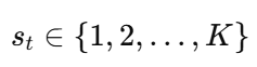
Its seasonality is modeled using Fourier series:

Where:
- P = period (7 for weekly, 365.25 for yearly)
- a_n, b_n = coefficients learned from data
- N = number of Fourier terms (controls flexibility)
Practical Prophet example:
from prophet import Prophet

model = Prophet(
    weekly_seasonality=True,   # Uses Fourier terms internally
    yearly_seasonality=True
)
model.fit(train_df)
Turning on weekly_seasonality or yearly_seasonality means Prophet is automatically applying Fourier series.
The earlier FFT analysis helps you decide whether these terms are actually justified by the data — or whether they risk adding complexity without real value.
So the deep connection is this:
Fourier Transform helps you see the cycles.
Prophet uses Fourier series to model them for forecasting.
Prophet’s Fourier Mechanics in Practice: Seasonality, Fourier Order, Prior Scale, and a Baseline Experiment
Prophet does not add seasonality as a vague adjustment layer. It models repeated patterns with Fourier series, which means sine and cosine terms are used to represent cyclical structure. That becomes much easier to understand when the model is tested on a real dataset instead of a toy signal.
For this experiment, I used the monthly Electric Production series. Since the data is monthly, weekly and daily seasonality are not relevant here. The main seasonal question is annual: does the series follow a stable within-year pattern, and does modeling that pattern improve forecasting?
A clean baseline is the right place to start. The model below keeps yearly seasonality and leaves the shorter cycles off:
import numpy as np
import pandas as pd
import matplotlib.pyplot as plt
from prophet import Prophet
from sklearn.metrics import mean_absolute_error, mean_squared_error

# Prepare data
raw = pd.read_csv("Electric_Production.csv")
df = raw[['date', 'value']].rename(columns={'date': 'ds', 'value': 'y'})
df['ds'] = pd.to_datetime(df['ds'])
df = df.sort_values('ds').dropna()

train = df.iloc[:-30].copy()
test = df.iloc[-30:].copy()

# Baseline model
m = Prophet(
    weekly_seasonality=True,
    yearly_seasonality=True,
    daily_seasonality=False,
    seasonality_mode='additive'
)

m.fit(train)

future = m.make_future_dataframe(periods=30, freq='D')
forecast = m.predict(future)

# Evaluate
pred = forecast[['ds', 'yhat']].merge(test, on='ds', how='inner')

print("MAE:", round(mean_absolute_error(pred['y'], pred['yhat']), 3))
print("RMSE:", round(np.sqrt(mean_squared_error(pred['y'], pred['yhat'])), 3))

m.plot(forecast)
m.plot_components(forecast)
plt.show()
On the last 30 months of holdout data, this baseline produced:
- MAE = 3.779
- RMSE = 4.712
That is already a useful result. It shows that the default yearly seasonal structure in Prophet is capturing a meaningful part of the signal rather than acting as decorative complexity.
The component plots make this more concrete.
The trend rises steadily from the mid-1980s to the early 2000s, then flattens after around 2007. This reflects a long period of strong production growth followed by a more mature phase with slower structural expansion.
The yearly seasonality plot is very obvious. It is clearly not flat: production peaks toward the end of the year and early winter, drops sharply in March–April, recovers during summer, weakens again in early autumn, and rises once more toward year-end. This repeating annual rhythm is exactly what Fourier-based seasonality is designed to capture.
Here is fourier_order and prior_scale matter most:
- fourier_order controls the flexibility of the seasonal curve. Lower values produce smoother shapes; higher values allow more detail and variation.
- prior_scale controls how strongly the seasonal component influences the model fit.
Tuning Guidance for this dataset:
Start with the baseline. Then adjust slowly:
- Increase fourier_order if the seasonal curve is too smooth and misses known business patterns.
- Decrease fourier_order or prior_scale if the curve becomes jagged or unstable (a sign of overfitting noise).
A custom annual seasonal component would look like this:
m_custom = Prophet(
    yearly_seasonality=False,
    weekly_seasonality=False,
    daily_seasonality=False,
    seasonality_mode='additive'
)

m_custom.add_seasonality(
    name='yearly_custom',
    period=365.25,
    fourier_order=8,
    prior_scale=5.0
)

m_custom.fit(train)
This makes the modeling logic explicit.
period=365.25 says the cycle repeats once a year.
ourier_order=8 controls how much shape that yearly curve can have.
rior_scale=5.0 controls how strongly the annual component is allowed to contribute.
In short, the baseline Prophet model captures much of that structure, as shown by both the holdout error and the component plots. That means tuning should begin from evidence, not from instinct.
Tuning principle: Start from evidence, not instinct. The goal is not to make the seasonal curve as flexible as possible. The goal is to match the level of seasonal complexity that the data can actually support.
How to Read Prophet Output and Turn It Into Business Interpretation
A nice-looking forecast chart is not enough.
The real value comes when you can clearly explain what the model sees and whether it aligns with actual business behavior.
Prophet gives you three key outputs to interpret:
- Overall Forecast: The final predicted line. Does it follow the general level and rhythm of the business?
- Trend Component: The long-term baseline (after removing cycles). Is the underlying direction growing, flat, or declining? Is it absorbing movements that should belong to seasonality?
- Seasonal Component: The repeating patterns (where Fourier terms show up). Does the weekly curve match real customer behavior? Does the yearly curve reflect known business cycles?
Visual Checks:
- Flat seasonal curve → Seasonality is weak or under-modeled.
- Very jagged seasonal curve → Likely overfitting (reduce fourier_order).
- Trend explaining most changes → Seasonality may be too weak.
- Seasonality dominating → Model may be forcing cycles that don’t exist.
Real Business Example (Daily E-commerce Traffic):
- Rising trend → Sustainable user growth.
- Strong Monday–Thursday peaks, lower weekends → Workweek shopping habit.
- Jagged weekly curve → Possible overfitting to recent noise.
We then can use these components to answer actual business questions:
- When should we launch marketing campaigns?
- How should we plan staffing and inventory?
- Is growth structural or mostly seasonal?
This turns Prophet from a black-box forecasting tool into a transparent decision support system.
The basic code:
fig1 = m.plot(forecast)
plt.title("Prophet Forecast")
plt.show()

fig2 = m.plot_components(forecast)
plt.show()
To make the output easier to inspect numerically, it also helps to look directly at the forecast table:
forecast[['ds', 'yhat', 'yhat_lower', 'yhat_upper', 'trend']].tail(10)When actual test data is available, overlaying it on the forecast gives an even clearer reading:
plt.figure(figsize=(12, 4))
plt.plot(train['ds'], train['y'], label='Train', alpha=0.7)
plt.plot(test['ds'], test['y'], label='Actual', alpha=0.9)
plt.plot(forecast['ds'], forecast['yhat'], label='Forecast', linewidth=2)
plt.fill_between(
    forecast['ds'],
    forecast['yhat_lower'],
    forecast['yhat_upper'],
    alpha=0.2,
    label='Uncertainty Interval'
)
plt.legend()
plt.title("Forecast vs Actual")
plt.tight_layout()
plt.show()
This plot helps answer a key practical question that component plots alone cannot:
Is the model wrong because the overall level is off, the trend is drifting, or the seasonal rhythm is being misread?
Useful interpretation workflow:
- Check if the total forecast follows the broad movement of the actual data.
- Examine the trend — does it match the long-term business story?
- Review the seasonal component — does the repeating pattern look realistic and believable?
The Key Question: How to Decide Whether Fourier Terms Are Worth Using
Fourier terms are easy to add, but they are not always helpful. They should only be included when the data shows a clear, stable repeating pattern that actually improves out-of-sample performance.
Practical Decision Workflow (Recommended Order):
- Visual Inspection — Start with the raw time plot. Look for obvious repeating rhythms (weekly, monthly, etc.).
- Autocorrelation (ACF) — Check for significant spikes at business-relevant lags.
- Frequency Spectrum (FFT) — Identify dominant cycles and their strength.
- Stability Check — Test whether the main periods remain consistent across different time windows.
- Model Validation — Compare Prophet versions with and without Fourier terms on holdout data.
Start with the raw chart
The first step is simple but powerful. Plot the raw series and ask: “Do I see any consistent repeating movement”?
Examples:
- Daily website traffic often shows clear weekly patterns.
- Retail sales may rise around weekends or paydays.
- Sensor data frequently reveals day-night cycles.
If the raw plot looks mostly random or dominated by irregular events, adding Fourier terms is usually not worth it.
import matplotlib.pyplot as plt

plt.figure(figsize=(12, 4))
plt.plot(df["ds"], df["y"], linewidth=1.4)
plt.title("Raw Time Series")
plt.xlabel("Date")
plt.ylabel("Value")
plt.tight_layout()
plt.show()
A useful habit is to write down a hypothesis before moving on.
For example: “this traffic series appears to have a 7-day rhythm” or “this sales series looks noisy but no stable cycle is obvious.” That short note will make the next steps easier to interpret.
Check the Autocorrelation Function (ACF)
The next step is to check whether the series shows repeating dependence at regular intervals.
For a daily dataset with weekly seasonality, you should see clear spikes in the ACF at lags 7, 14, 21, and 28. Strong, consistent peaks at these business-relevant lags provide good evidence that seasonal modeling is worth considering.
Quick Tip: Before plotting the ACF, remove the overall trend first. A strong upward or downward drift can distort the result by pushing too much energy into low frequencies. A simple linear detrend is usually sufficient for this check.
If the ACF shows weak or no significant peaks at expected lags, the case for adding Fourier-based seasonality becomes much weaker.
import numpy as np
from statsmodels.graphics.tsaplots import plot_acf

# Simple linear detrending
t = np.arange(len(df))
coef = np.polyfit(t, df["y"].values, 1)
y_detrended = df["y"].values - np.polyval(coef, t)

plt.figure(figsize=(10, 4))
plot_acf(y_detrended, lags=40)
plt.title("ACF of Detrended Series")
plt.tight_layout()
plt.show()
The interpretation: Repeated peaks at regular business intervals support seasonal structure. A weak and irregular ACF is a warning sign. That does not prove Fourier terms will fail, but it tells you not to assume they will help.
Use FFT or Periodogram to Inspect the Frequency Spectrum
This step moves from the time domain to the frequency domain.
Instead of asking “Does the series look repetitive”?, you now ask a much sharper question: “Which specific cycles (periods) actually dominate the data”?
import numpy as np
import pandas as pd
import matplotlib.pyplot as plt
from scipy.signal import periodogram

# Detrended series from previous step
freqs, power = periodogram(y_detrended, fs=1.0, detrend=False)

mask = freqs > 0
freqs = freqs[mask]
power = power[mask]

plt.figure(figsize=(10, 4))
plt.plot(freqs, power, linewidth=1.4)
plt.title("Periodogram of Detrended Series")
plt.xlabel("Frequency (cycles per day)")
plt.ylabel("Power")
plt.tight_layout()
plt.show()

# Show the strongest candidate periods
top_idx = np.argsort(power)[::-1][:5]
top_periods = pd.DataFrame({
    "period_days": 1 / freqs[top_idx],
    "power": power[top_idx]
}).sort_values("power", ascending=False)

print(top_periods)
A clear peak at frequency ≈ 1/7 (daily data) suggests a weekly cycle. A peak near 1/30 indicates monthly behavior. A peak near 1/365 points to yearly seasonality.
Conversely, a flat or scattered spectrum usually means there is no strong, stable periodic structure. This is common in data heavily influenced by promotions, policy changes, regime shifts, or irregular events.
Practical Rule: If the frequency spectrum is weak or unclear, avoid adding seasonal (Fourier) terms by default. Forcing them often increases model complexity without improving real forecast performance.
Key Principle: Frequency evidence should be visible in the raw data before you ask Prophet (or any model) to learn seasonality. This prevents unnecessary Fourier terms that add noise rather than value.
Compare Models Instead of Guessing
A strong peak in the frequency spectrum is useful, but the final proof is lower forecast error on unseen data.
This is the decisive step: always compare models rather than relying on intuition or visual appeal.
Recommended Comparison:
- Model A: Default Prophet (with built-in weekly and yearly seasonality)
- Model B: Prophet with seasonality turned off
- Model C: Prophet with custom Fourier seasonality (adjusted fourier_order and prior_scale)
Only keep Fourier terms (or custom seasonality) if they meaningfully reduce out-of-sample error (MAE / RMSE) compared to the baseline.
If they don’t improve performance on holdout data, remove them — they are adding complexity without value.
from prophet import Prophet
from sklearn.metrics import mean_absolute_error, mean_squared_error
import numpy as np

train = df.iloc[:-30].copy()
test = df.iloc[-30:].copy()

def evaluate_prophet(model, train_df, test_df):
    model.fit(train_df)
    future = model.make_future_dataframe(periods=len(test_df), freq="D")
    forecast = model.predict(future)
    pred = forecast[["ds", "yhat"]].merge(test_df[["ds", "y"]], on="ds", how="inner")
    mae = mean_absolute_error(pred["y"], pred["yhat"])
    rmse = np.sqrt(mean_squared_error(pred["y"], pred["yhat"]))
    return mae, rmse, forecast

# Model A: default seasonality
m1 = Prophet()

# Model B: no seasonality
m2 = Prophet(
    yearly_seasonality=False,
    weekly_seasonality=False,
    daily_seasonality=False
)

# Model C: custom weekly seasonality
m3 = Prophet(
    yearly_seasonality=False,
    weekly_seasonality=False,
    daily_seasonality=False
)
m3.add_seasonality(name="weekly_custom", period=7, fourier_order=5)

for name, model in [("Default", m1), ("No seasonality", m2), ("Custom weekly", m3)]:
    mae, rmse, _ = evaluate_prophet(model, train.copy(), test.copy())
    print(name, "MAE =", round(mae, 3), "RMSE =", round(rmse, 3))
Compare the models on out-of-sample performance:
- If the seasonal model clearly beats the non-seasonal baseline, Fourier terms are likely adding real value.
- If the improvement is tiny or marginal, the added complexity may not be worth it.
- If the seasonal version performs worse, treat it as valuable information — the data probably lacks strong, stable periodicity or is dominated by irregular events.
This comparison is one of the most important steps in the workflow. It prevents you from adding seasonal terms out of habit and ensures every modeling choice is backed by measurable improvement.
Test stability with rolling windows
One good split is not enough. A Fourier-friendly series should show its main rhythm repeatedly, not only in one lucky window. This is the part many workflows skip. Your pasted note is right to emphasize it. A strong full-sample spectrum can still hide instability. If the dominant period wanders across time, a fixed seasonal basis may not generalize well.
A stability check can be done two ways. First, track the dominant period across rolling windows. Second, compare model error across rolling forecast origins.
from scipy.signal import periodogram

def dominant_periods_by_window(frame, window=180, step=90):
    periods = []
    for start in range(0, len(frame) - window + 1, step):
        chunk = frame.iloc[start:start+window].copy()
        t = np.arange(len(chunk))
        coef = np.polyfit(t, chunk["y"].values, 1)
        y_det = chunk["y"].values - np.polyval(coef, t)

        freqs, power = periodogram(y_det, fs=1.0, detrend=False)
        mask = freqs > 0
        freqs, power = freqs[mask], power[mask]

        top_freq = freqs[np.argmax(power)]
        periods.append(round(1 / top_freq, 2))
    return periods

print(dominant_periods_by_window(df, window=180, step=90))
If those dominant periods stay clustered around the same business rhythm, such as 7 days, the case for a Fourier basis is stronger. If they jump between 10, 22.5, 45, and 90 days, the structure is likely unstable.
For model stability, a rolling-origin validation loop is more reliable than one holdout split:
def rolling_prophet_cv(frame, model_builder, initial=365, horizon=30, step=30):
    rmses = []

    for end in range(initial, len(frame) - horizon + 1, step):
        tr = frame.iloc[:end].copy()
        te = frame.iloc[end:end+horizon].copy()

        model = model_builder()
        model.fit(tr)

        future = model.make_future_dataframe(periods=horizon, freq="D")
        forecast = model.predict(future)

        pred = forecast[["ds", "yhat"]].merge(te[["ds", "y"]], on="ds", how="inner")
        rmse = np.sqrt(mean_squared_error(pred["y"], pred["yhat"]))
        rmses.append(rmse)

    return np.array(rmses)

def build_no_seasonality():
    return Prophet(
        yearly_seasonality=False,
        weekly_seasonality=False,
        daily_seasonality=False
    )

def build_custom_weekly():
    m = Prophet(
        yearly_seasonality=False,
        weekly_seasonality=False,
        daily_seasonality=False
    )
    m.add_seasonality(name="weekly_custom", period=7, fourier_order=5)
    return m

rmse_base = rolling_prophet_cv(df, build_no_seasonality)
rmse_fourier = rolling_prophet_cv(df, build_custom_weekly)

print("No seasonality RMSE mean:", round(rmse_base.mean(), 3))
print("Custom weekly RMSE mean:", round(rmse_fourier.mean(), 3))
This is where the decision becomes operational.
Fourier terms are worth keeping when they improve future prediction error in a stable way across windows. If they help once and then disappear, the pattern may be accidental. If they never help, the data did not earn them.
A direct decision rule
By this point, the answer should come from evidence rather than taste.
Use Fourier terms when four things line up: the raw chart suggests repetition, the ACF shows recurring lag structure, the spectrum shows a clear dominant period, and rolling validation improves out-of-sample error.
Walk away when those checks fail. That is not a failure of Fourier. It is a success of validation.
A Final Workflow: From Structure Detection to Validation to Deployment Decisions
A good forecasting workflow should not begin with parameter tuning. It should begin with evidence.
The goal is simple: decide whether periodic structure is real, stable, and useful enough to earn a place in the model. The sequence below turns that idea into something you can run on your own data.
1. Plot the raw series. Look for repeated movement before touching any model. A visible weekly or monthly rhythm is a useful clue. A noisy line with no clear repetition is an early warning.
2. Check the ACF. Repeated peaks at business-relevant lags, such as 7, 14, or 30, support the case for seasonality. Weak or irregular autocorrelation lowers confidence.
3. Run an FFT or periodogram. Use the frequency view to see whether a dominant cycle is actually present. Strong peaks justify further work. A flat spectrum usually means seasonality is weak, unstable, or not worth forcing.
4. Build a Prophet baseline. Start with a simple model before adding custom seasonal terms. That baseline gives you a reference point for every later change.
5. Compare models with and without seasonality. Test at least two versions: one that includes seasonal structure and one that removes it. Improvement on holdout data matters more than a nicer in-sample fit.
6. Adjust Fourier order only when the data supports it. Raise flexibility when the seasonal curve is clearly too simple. Pull it back when the shape becomes too jagged or unstable.
7. Test stability with rolling windows. One successful split is not enough. A seasonal component should improve forecasting repeatedly across different time windows, not only once.
8. Make the deployment decision. Keep Fourier terms when they reduce error, remain stable over time, and produce a seasonal shape that the business can explain. Otherwise, leave them out or move them into feature engineering experiments rather than production forecasting.
A compact decision rule looks like this:
if visible_cycle and acf_peak and fft_peak:
    run_prophet_experiments()
    compare_metrics()
    test_stability()
    deploy_if_consistently_better()
else:
    do_not_force_fourier()
That is the practical standard worth keeping. Do not add Fourier terms because Prophet allows them. Add them when the data shows a real repeating structure, validation confirms the gain, and the result can survive outside the training sample.
About me
With over 20 years of experience in software and database management and 25 years teaching IT, math, and statistics, I am a Data Scientist with extensive expertise across multiple industries.
You can connect with me at:
Email: datalev@gmail.com | LinkedIn | https://shenggang.substack.com
메타데이터
- post_id
- 7a5d6869d457
- slug
- from-fourier-to-prophet-a-practical-guide-to-business-time-series-forecasting-7a5d6869d457
- url
- https://medium.com/data-science-collective/from-fourier-to-prophet-a-practical-guide-to-business-time-series-forecasting-7a5d6869d457
- canonical_url
- https://medium.com/data-science-collective/from-fourier-to-prophet-a-practical-guide-to-business-time-series-forecasting-7a5d6869d457
- author_url
- https://medium.com/@datalev
- status
- ok
- fetched_at
- 2026-06-13 07:35:29