“Try again” vs. "we couldn't": the way to write better error messages so users don't close their tab
I traded a 6-word error for a 31-word roadmap and watched support tickets plummet. Here is the 3-line formula to fix your broken UX.
“Try again” vs. “We couldn’t”: The precise moment a user decides to close your tab due to bad error messages
It was 11:47 PM on a Thursday. I was staring at a toast notification I’d shipped two weeks prior.
It read: Error: Invalid input.
Zero context. No next step. Just six cold words telling a user absolutely nothing.
The user who hit this error? A merchant trying to schedule her first push notification campaign for Black Friday. She’d spent forty minutes crafting copy, selecting images, and defining audience segments. She clicked “Schedule” and hit a brick wall.
I felt sick.
Here’s the thing about error messages: they are the only moment in your product where the user is already frustrated and you are about to speak to them. Every other screen, they are at least neutral. But an error? That’s a human being who just tried to do something and failed. What you say next decides whether they try again or close the tab permanently.
So I went down a rabbit hole.
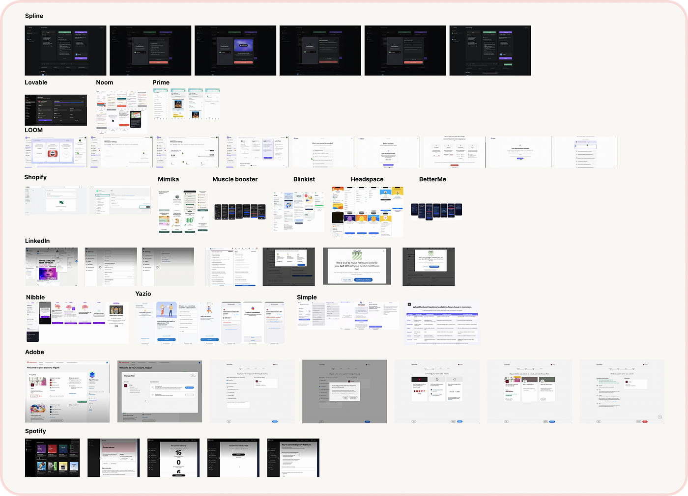
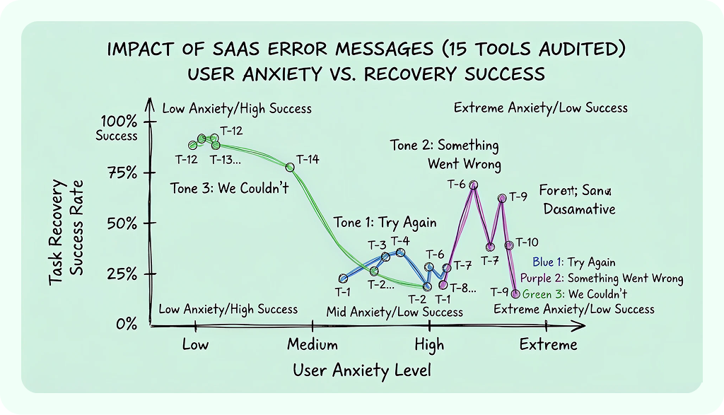
I screenshotted error messages across 15 marketing tools, ecommerce platforms, and SaaS products. I categorized them by tone. What I found changed how I view product copy entirely. Every error falls into one of three distinct tonal families, and only one actually salvages the user experience.
The three tones & what each one actually communicate
Writing better SaaS error state messages
Tone 1: “Try again”
You see this everywhere. Something went wrong. Try again.Or just a lazy blue button: Retry.
On the surface, it looks concise. It looks action-oriented. But “try again” is actually the product equivalent of a shrug.
It tells the merchant: the system has no clue what happened, it has no idea if clicking this button again will work, and the entire burden of recovery is sitting squarely on you.
I noticed this pattern in 8 of the 15 tools I audited. When a campaign builder fails to save a draft, “try again later” is a terrifying phrase. The sale starts in three hours. There is no “later” (this is where chasing pure efficiency kills user trust, imo).
“Try again” works in exactly one scenario: when the error is genuinely transient — like a minor network hiccup — and a retry will almost certainly work. Even then, it’s better to say what happened: Connection interrupted. Your draft is saved. Try sending again.
Tone 2: “Something went wrong”
The vague middle ground. An error occurred. We hit a snag.
It sounds slightly warmer because the language is softer, but it’s actively worse for usability. At least “try again” suggests a kinetic action. “Something went wrong” just sits there on the screen like an uninvited guest.
Funny enough, I found this most often in onboarding flows and complex form submissions. A merchant fills out a 6-field integration form, hits connect, and gets a dead end: Something went wrong. Please contact support. The error message turned a 2-minute task into a 45-minute support ticket.
Vagueness breeds anxiety. In ecommerce and marketing tools, if you aren’t specific, users assume the absolute worst. Something went wrongwith my payment? With my customer data? Did I just double-charge 10,000 subscribers?
Tone 3: “We couldn’t”
This is where the magic happens. We couldn’t send your campaign because your sender identity isn’t verified.We couldn’t process your payment. Your card was declined.
“We couldn’t” does three massive things the other tones fail to do:
First, it takes radical ownership. “We” positions the system as the responsible party. Even if the error was technically triggered by the user (like an unverified email), “we couldn’t” feels collaborative instead of accusatory.
Second, it forces specificity. The phrase “We couldn’t” naturally demands a becauseclause. The grammar itself pushes you toward explaining the ACTUAL cause.
Third, it maps out the path forward. “We couldn’t send your campaign because…” automatically makes the reader ask, “so what do I need to do?”
Only 3 of the 15 products I audited used this framing. Unsurprisingly, those were the exact 3 products where I actually completed the recovery flow instead of abandoning the task.
The 3-line formula
After parsing the data, I built a rigid, three-line framework for every error container. The sequence matters immensely.

Adding better description, creating a pattern
- Line 1: What happened(In human terms, zero engineering jargon)
- Line 2: Why it happened(If the system knows, surface it directly)
- Line 3: What to do next (A hyper-specific, contextual action they can take right now)
Let’s look at how this flips the structural dynamic:
Before:Error: Invalid input.
After:We couldn't schedule your campaign. The send time you selected is in the past. Pick a time at least 15 minutes from now.
Before:Something went wrong. Please try again later.
After:Your draft didn't save because the connection dropped. We preserved your last version from 2 minutes ago. Reconnect to resume.
Before:Authentication failed.
After:We couldn't connect to your Shopify store. The API key you entered doesn't match. You can find your key in Shopify Admin → Settings → Apps.
Yes, the “after” versions are longer. That is completely fine. An error message isn’t a tweet. The user is stuck; they require data, not brevity.
Architecting the correct copy message
If you only change the copy, you’ve only fixed half the problem. Exceptional UX writing requires understanding the physical boundaries of the interface. When analyzing the best-performing platforms, a few critical micro-patterns emerged:
In Forms, Display Error Messages ABOVE the Input Field
The industry convention is to drop error text under the input container. This is a massive accessibility trap. On mobile devices, an error message positioned under a field is instantly covered by the virtual software keyboard when the user taps to edit.
Worse, browser autofill dropdowns or autocomplete lists will completely mask anything written below the box. Displaying error text directly above the input container ensures it remains fully visible while the user is actively making corrections.
Never rely on red color alone
Subconsciously, we associate bold red text with system failures. But color alone fails the 350 million people globally dealing with color-vision deficiencies.
Always anchor your error blocks with a distinct visual layout shift: a bold vertical border line on the left, high-contrast structural text, and a dedicated icon (like a crisp exclamation mark) placed on the left edge where the eye naturally scans first.
Build failsafes and validation overrides
No validation library is 100% bulletproof against real-world edge cases. Aggressive address or phone number validators cause catastrophic checkout abandonment. If a merchant has lived at an address for five years, but an over-engineered validation API refuses to recognize it, a rigid error state becomes a monetization dead end.
For high-stakes input fields like addresses, provide a validation override mechanism. Present the warning, but include a clear out: “We couldn’t find this exact address, but you can choose to use it anyway.” Protect the transaction over the technical metric.
Stop the authority words
To establish conversational authority, establish an absolute ban on engineering artifacts and corporate shields within your microcopy.
- Technical jargon: Wipe out words like
form post error,unspecified fault, or raw system codes (Error 0x000000643). - Judgmental phrasing: Ban words that shift system blame to human behavior — like
invalid,illegal,prohibited, or accusing them withyou forgot. - Polite padding: Drop
pleaseandsorry. "Please" implies the system is offering an optional choice rather than a functional requirement, and "sorry" takes up valuable cognitive space without offering a path to resolution.
The small things that compounds
- Preserve the Input: If an error occurs, do NOT clear the form. 4 of the 15 platforms I tested completely wiped all fields on failure, forcing the user to re-type everything from scratch. It is an absolute product conversion killer.
- Inline Over Modals: Modals are highly intrusive; they force a user to click ‘Dismiss’ before they can even look at the form fields. Inline errors sit contextually next to the source of the issue, allowing a single-glance resolution.

- Own Your Infrastructure: If your servers are down, be completely transparent. Our systems are having issues (started 5 mins ago). Adding a tiny timestamp cuts down the “should I wait or quit?” dilemma entirely.
Why error tone matters more in martech and ecommerce
I want to anchor this point deeply because it changes how you prioritize your product copy.
In a standard consumer app, an error is a minor annoyance. You can’t refresh your feed. You can’t like a photo. The stakes are low.

How to use it? No modals for everything please!
But in marketing and ecommerce tools, errors occur during high-stakes, high-stress moments. A merchant is scheduling a seasonal automation that will trigger for thousands of new checkouts. They are connecting a live gateway to process real money.
The user’s anxiety level at the moment of error is already at a 7 out of 10.
Your job isn’t to be cute, clever, or corporate. Your job is to bring that number down to a 3. If you leave them with a vague error, you’ve broken their trust.
What I changed after this rabbit hole
I went back to that original toast notification, the 6-word ghost that started this whole project. I rewrote it to:
We couldn't schedule your campaign. The audience segment you selected has 0 subscribers. Try selecting a different segment or check that your segment filters match active subscribers.
But it’s 31 words instead of 6.… this seems too long, what to do?
We couldn’t schedule your campaign Your selected segment has 0 subscribers. Pick a different segment or adjust your filters.
That is the absolute core of exceptional UX writing. It doesn’t pretend system errors don’t exist. It prevents the error from becoming the end of the road.
Do not automate away the exact human empathy that your users need when things break. Keep this framework close the next time you’re writing microcopy at midnight. Your users will notice.
Thank you for reading and keep creating.
Other references:
메타데이터
- post_id
- a38915a56e1e
- slug
- try-again-vs-we-couldnt-the-way-to-write-better-error-messages-so-users-don-t-close-their-tab-a38915a56e1e
- url
- https://medium.com/@riyajawandhiya/try-again-vs-we-couldnt-the-way-to-write-better-error-messages-so-users-don-t-close-their-tab-a38915a56e1e
- canonical_url
- https://medium.com/@riyajawandhiya/try-again-vs-we-couldnt-the-way-to-write-better-error-messages-so-users-don-t-close-their-tab-a38915a56e1e
- author_url
- https://medium.com/@riyajawandhiya
- status
- ok
- fetched_at
- 2026-08-15 13:37:56