Checkbox vs Switch: The Tiny Decision That Confuses Everyone
Let me start with a small story.
Checkbox vs Switch: The Tiny Decision That Confuses Everyone
Let me start with a small story.
You’re designing a simple form.
There’s one line that says:
“Send me promotional emails”
You pause.
Your cursor hovers.
Checkbox or switch?
You Google it.
You ask a senior designer.
They say the most dangerous UX sentence ever:
“It depends.”
So let’s finally make it not confusing, especially if you’re a beginner.
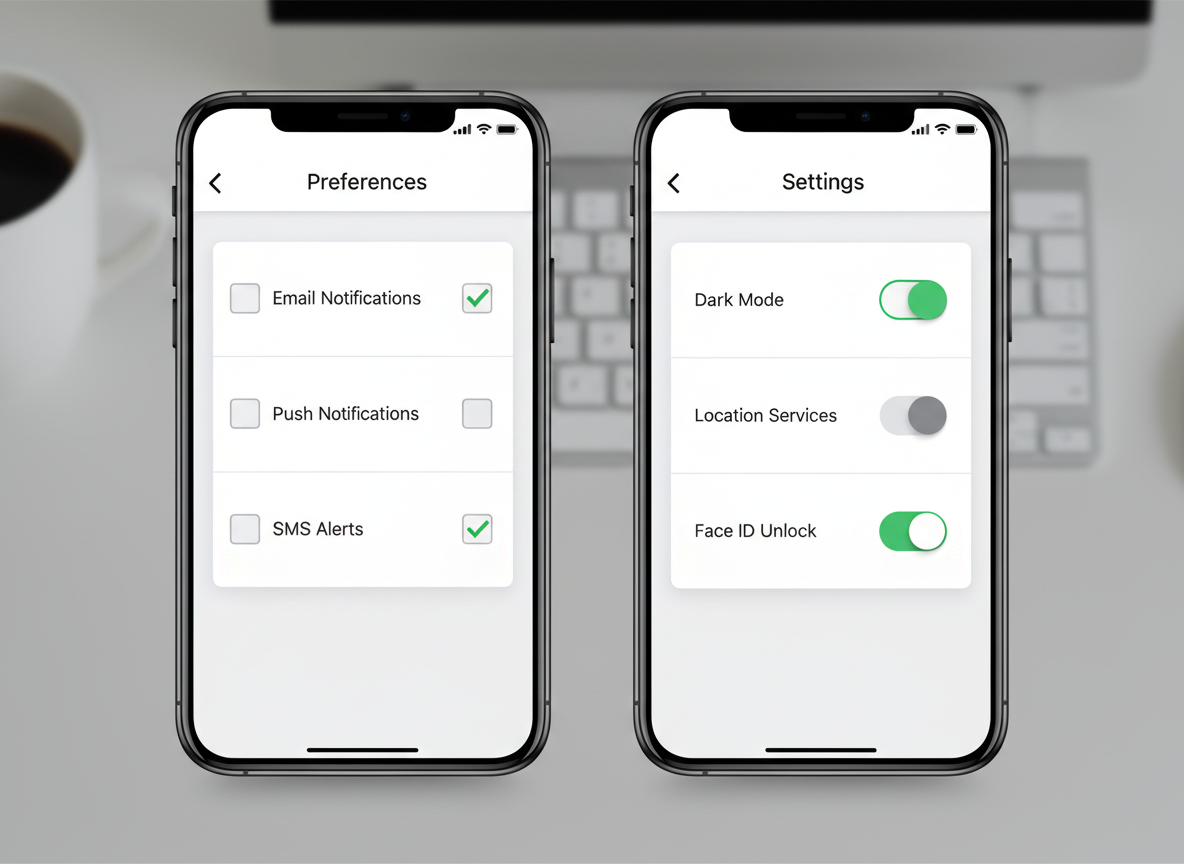
Generated in Adobe Firefly
The Real Question Is Not Checkbox vs Switch
Is the user making a decision right now, or are they setting a state?
Once you understand this, 90% of confusion disappears.

Generated in Gemini
When a Checkbox Is the Right Choice
Think of a checkbox as a decision collector.
Checkboxes are best when:
• The user is filling a form
• The decision is submitted later
• The action does nothing immediately
Example:
• “I agree to the Terms & Conditions”
• “Subscribe to newsletter”
• “Include GST invoice”
In these cases:
• The user is saying “Yes, remember this choice”
• Nothing changes instantly on the screen
• The effect happens after clicking Submit
Golden rule:
If there is a Submit / Save / Next button → think Checkbox
When a Switch Is the Right Choice
A switch represents a live state.
Switches are best when:
• The change happens immediately
• There is no submit button
• The user is turning something ON or OFF
Example:
• Wi-Fi ON/OFF
• Dark Mode ON/OFF
• Notifications enabled/disabled
Here, the moment the user toggles:
• The system reacts instantly
• The state is already saved
• There is no “Are you sure?” moment
Golden rule:
If the system reacts instantly → use a Switch
The Most Common Beginner Mistake
Using a switch inside a form.
Example:
• A long signup form
• A switch saying “Receive updates”
• A big Submit button at the bottom
This creates confusion:
• Did the switch already save?
• Or will it save after submit?
• What happens if I leave the page?
Why This Matters More Than You Think
Checkbox vs switch looks tiny, but:
• It affects user trust
• It affects error rates
• It affects how “polished” your product feels
Good UX isn’t about fancy components.
It’s about predictable behavior.
And users love predictability more than creativity.
Forms = Checkbox
Settings = Switch
Next time someone says “It depends”, smile and ask:
“Is this a decision, or a state?”
You’ll look confident.
And your UX will quietly improve.
메타데이터
- post_id
- ecadc14398c4
- slug
- checkbox-vs-switch-the-tiny-decision-that-confuses-everyone-ecadc14398c4
- url
- https://medium.com/@deeneeshdamodaran/checkbox-vs-switch-the-tiny-decision-that-confuses-everyone-ecadc14398c4
- canonical_url
- https://medium.com/@deeneeshdamodaran/checkbox-vs-switch-the-tiny-decision-that-confuses-everyone-ecadc14398c4
- author_url
- https://medium.com/@deeneeshdamodaran
- status
- ok
- fetched_at
- 2026-06-11 15:16:29