Mean, Median and Mode: What Are They and When Should You Use Them?
You probably remember Mean, Median, and Mode from high school stats classes but they are often misused. We look at how you should use them…
Statistics 101
Mean, Median and Mode: What Are They and When Should You Use Them?
You probably remember Mean, Median, and Mode from high school stats classes but they are often misused. We look at how you should use them — with Python and Pandas examples.
Various images by author
What is the average height of an 18-year-old British male? Or the average price of a house in Madrid? Or the average grade achieved by high school students in England?
These are all good questions but they each mean something slightly different.
The average in the first case is calculated using the mean, the house prices would be better represented using the median and the school grades by the mode.
We are going to try and unravel which measurement to use and when.
Averages
The average is a measurement of a central tendency, a kind of summary or overview of a set of data. Typically we would expect to calculate it by adding a set of values together and then dividing by the number of those values. But that is only one of the three basic interpretations of the term ‘average’¹.
The one I just described is the mean and this works perfectly well for a normally distributed set of data like height. The median is the central value meaning that there are an equal number of measurements either side of this value.
As Alberto Cairo tells us, “What you need to remember is that the mean is very sensitive to extreme values, while the median is not. The median is a resistant statistic.”²
That is to say that the median is not changed radically by a relatively small number of outlying values whereas the mean does. This can make the median a better measurement under certain circumstances as we will see a little later when we look at house prices.
The third ‘average’ is the mode which is the most frequent value in a set and is generally the only option when dealing with categorical data.
Let’s take a look at some examples of how they are used.
The Mean
You can legitimately track the height of British 18 year-olds over time by adding all of their heights together and dividing by the number of 18 year-old Brits. (That’s quite a task so you’d probably want to take a representative sample instead — you’d also want to separate them in to two groups: males and females)
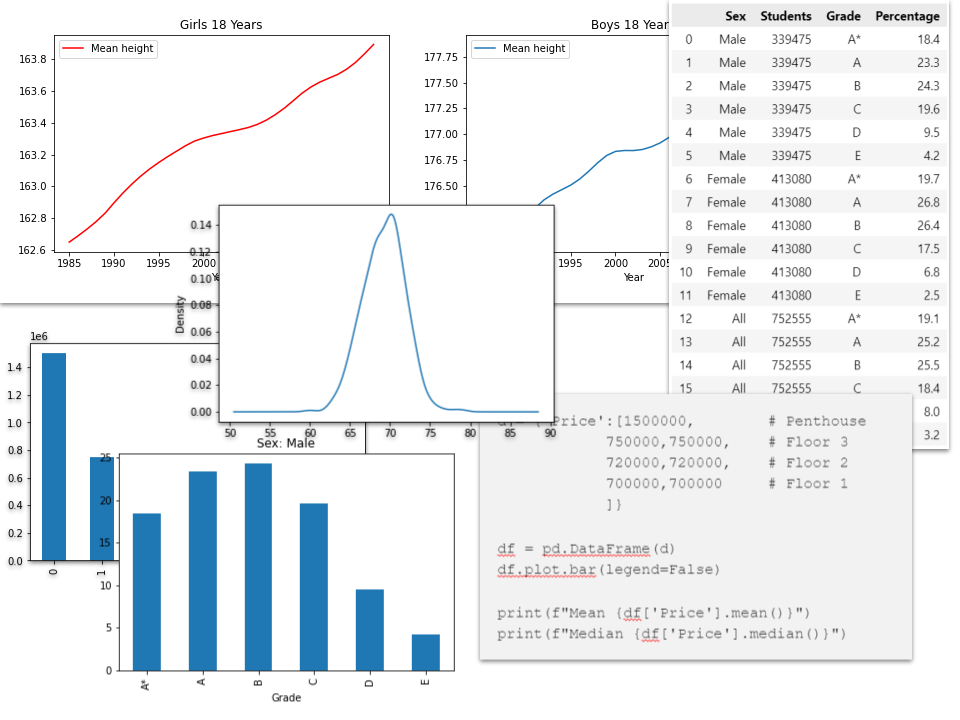
And if you tracked this over time you’d get graphs like the ones below.

Image by author — Data source: Our World in Data, Creative Commons BY license
This works fine because human height follows a normal distribution.
In a normal distribution, values are distributed evenly around a central point and tail off similarly to the left and right as illustrated in the graph below.

Normal distribution curve — image by author
If we look at the height of a set of individuals we can see that the measurements follow, pretty much, the same pattern.
In the figure below we use the height data recorded by the influential statistician Sir Francis Galton (1822–1911) in his famous experiment that illustrated the statistical concept of regression to the mean (he noted that the adult offspring of shorter people tended to be taller than their parents while those of taller mothers and fathers tended to be shorter than their parents).
We use the data here simply to explore the range in height of over five hundred 18-year-old male adults. The Galton data is in the public domain and can be found on many websites. Here, I have downloaded it from Harvard University’s Dataverse³.
In the code below we filter Galton’s data to create a density plot of the height of all males.
gal = pd.read_csv('galton-stata11.csv', delimiter='\t')
gal['height'][gal['male']==1].plot.density();
Galton’s height data — Source: public domain data from Harvard Dataverse
As you can see the graph very closely resembles a normal distribution and that the mean is around 70 inches.
Pandas gives us a convenience method that can be used to find the mean of a series of values, e.g.
gal['height'][gal['male']==1].mean()From which we get the result:
69.22881720430108
The Median
In the case of a normal distribution, the mean and the median are the same value but that is not true for other types of distribution.
Take the house price question. In most major cities around the world, there are a wide range of properties and prices but there are a relatively small number of very expensive properties. These expensive properties skew the mean.
So instead of measuring the average price of an apartment in Madrid a more meaningful measurement would be the price of an average apartment.
Sounds like the same thing? Let’s take a look at a simple fictitious example. Imagine an apartment block with different-sized properties: they are mostly three-bedroom apartments but at the top of the building there is a luxury penthouse that occupies the entire top floor of the building.
The apartment block is in a sought-after area in the centre of Madrid not far from the Retiro park. None of the apartments are going to be cheap.
Let’s say there are 4 floors. Each of the lower floors house two 3 bedroom apartments which are priced at 700,000€ for the bottom floor, 720,000€ the the next one up, 750,000€ for the one above that and the top floor, as we said is the penthouse — a luxury apartment with 5 bedrooms — which costs 1.5 million euros.
If we were to take the arithmetic mean of the prices we would get an average of approximately 834,285€. But nobody paid that price for an apartment, all but one are below that figure as only one person had to fork out 1.5 million for their apartment.
So the mean is not a very useful figure even if it is the average price. A better measurement of the average is the median, the value in the centre of the range which is 720,000€, a much better representation of the price paid by most people.
Here is a little code that illustrates the example:
d = {'Price':[1500000,        # Penthouse
            750000,750000,    # Floor 3
            720000,720000,    # Floor 2
            700000,700000     # Floor 1
            ]}
df = pd.DataFrame(d)
df.plot.bar(legend=False)print(f"Mean {df['Price'].mean()}")
print(f"Median {df['Price'].median()}")That prints out the following:
Mean 834285.7142857143
Median 720000.0
Looking at the bar graph makes it clear that the mean price is really not illustrative of the apartment prices and the median is a far better measure.

This is a simple example but is illustrative of the property price ranges in any major city where the price of an average house or apartment is much less than the relatively few very expensive properties.
So the while mean is the average of all the property prices, the median is the price of the average property which, in this type of example, is a much more useful number.
The Mode
The mode can be used for numerical data but is often used to find a central tendency for categorical data.
Let’s look at the third of our questions, the average exam grades for English high school students. Here is a table of results for the ‘A level’ exams for 18-year-olds in 2021 as provided by Ofqual⁴ (A levels are basically how students in England gain access to a university).

Image by author — source: Ofqual⁴
The grades are A, A, B, C, D, and E and the results are broken up by sex and the percentages of each grade are given. So you can see that 18.4% of males gained an ‘A’ grade, 19.7% of females got the same grade and overall the percentage of all students gaining an ‘A*’ grade was 19.1.
Obviously, we cannot find an average by calculating a mean as the data is not numerical but we can clearly see which was the most popular grade. Here are some bar charts that illustrate this:


From this, we can see that more males achieved a ‘B’ grade than any other, but for females, it was an ‘A’ grade.
It is this most popular grade that is the mode and it is a clear way of showing the average grade.
Pandas also gives us a useful method of calculating the mode. Here is a fictitious set of data that, more or less, follows the pattern above. It represents a list of 33 students and their grades: 6 students achieved an ‘A*’, 8 received an ‘A’, 9 got a ‘B’, 6 a ‘C’, 3 a ‘D’ and one received an ‘E’.
We convert that to a dataframe and calculate the mode like this:
res = {'Grade':[ 'A*','A*','A*','A*','A*','A*',
                 'A','A','A','A','A','A','A','A',
                 'B','B','B','B','B','B','B','B','B',
                 'C','C','C','C','C','C',
                 'D','D','D',
                 'E']}
r = pd.DataFrame(res)
r.mode()The result we get from Pandas is a dataframe:

The first row in the dataframe gives us the value ‘B’ and that is the mode for this list as there are more ‘B’ grades than any other grade.
Why a dataframe? Because there can be more than one mode. Let’s change the data to make the number of ‘A’ grades and ‘B’ grades the same.
res = {'Grade':[ 'A*','A*','A*','A*','A*','A*',
                 'A','A','A','A','A','A','A','A','A',
                 'B','B','B','B','B','B','B','B','B',
                 'C','C','C','C','C','C',
                 'D','D','D',
                 'E']}
r = pd.DataFrame(res)
r.mode()Now we have two modes — the data is multi-modal — and this is reflected in the resulting data frame.

Image by author
Interestingly, if we were to find the mode from our house price data, above, we would get the following result.

Image by author
In this case, because there are the same number of apartments at each of the three prices, we have three modes, which is not very informative thus reinforcing the the view that the median is the better measurement for this data.
Code and data
You can find links to a Jupyter Notebook with the code above (and more besides) and all of the data files used in the article on my GitHub page.
As ever thanks for reading and if you would like to be informed about new articles that I publish, please consider signing up for an email alert below or subscribing to my occasional free newsletter on Substack.
Notes
- This quote comes from David Spiegelhalter’s excellent book, *The Art of Statistics: How to Learn from Data*, David Spiegelhalter, 2021
- From: The Truthful Art: Data, Charts, and Maps for Communication, Alberto Cairo, 2016
- Galton’s data is available from many places (try Googling ‘Galton height data’) but this version was downloaded from Harvard University's Dataverse: Francis Galton, 2017, “Galton height data”, https://doi.org/10.7910/DVN/T0HSJ1, Harvard Dataverse, public domain licence CC0 1.0
- The A-level data is a subset of results published by Ofqual https://analytics.ofqual.gov.uk/apps/Alevel/Outcomes/ and is used in accordance with the Open Government Licence v3.0
(This article contains affiliate links which means that if you purchase something I get a small commission but you won’t pay any more for the product)
메타데이터
- post_id
- edc3949aa142
- slug
- mean-median-and-mode-what-are-they-and-when-should-you-use-them-edc3949aa142
- url
- https://medium.com/@alan-jones/mean-median-and-mode-what-are-they-and-when-should-you-use-them-edc3949aa142
- canonical_url
- https://medium.com/@alan-jones/mean-median-and-mode-what-are-they-and-when-should-you-use-them-edc3949aa142
- author_url
- https://medium.com/@alan-jones
- status
- ok
- fetched_at
- 2026-06-10 08:17:25