Choosing the Right Colours for Effective UI/UX Design
Choosing colours in UI/UX design is not just about aesthetics — it’s about shaping user perception, guiding behaviour, and evoking the…
Choosing the Right Colours for Effective UI/UX Design
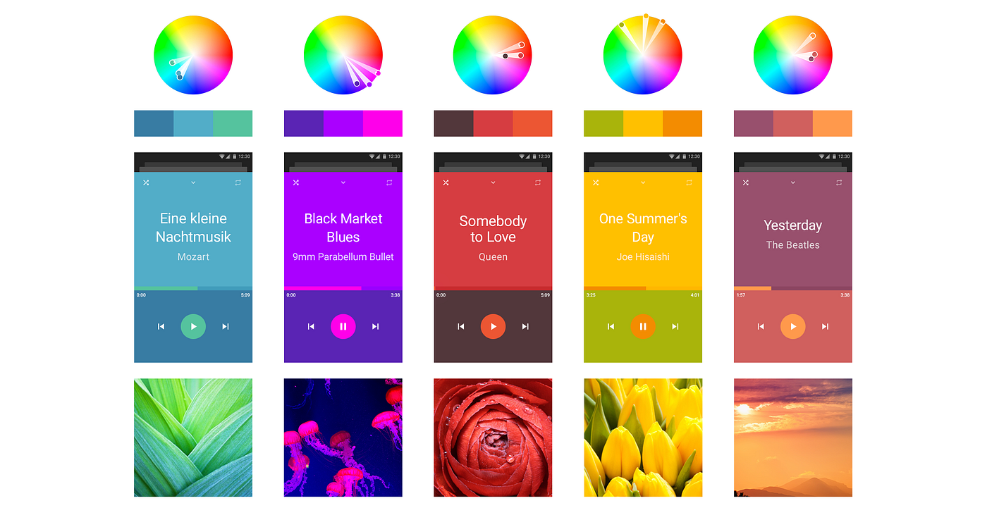
Choosing colours in UI/UX design is not just about aesthetics — it’s about shaping user perception, guiding behaviour, and evoking the right emotional response. Colours have psychological associations that can influence how users feel and interact with a product, making thoughtful colour selection essential.
Different colours evoke different emotions. For example, blue often conveys trust, calmness, and reliability, which is why it’s widely used in banking and technology interfaces. Red, on the other hand, is associated with urgency, passion, or danger, making it effective for alerts, errors, or call-to-action buttons. Green typically represents growth, health, and success, while yellow can express energy and optimism but must be used carefully to avoid overwhelming the user.
Understanding your target audience and context is key. Cultural differences can influence how colors are perceived, so a color that feels positive in one region may carry a different meaning elsewhere. Additionally, accessibility should always be considered — ensuring sufficient contrast and readability for all users, including those with visual impairments.
Consistency is another critical factor. A well-defined color palette helps create a cohesive and recognizable experience. Primary colors are usually reserved for key actions, while secondary and neutral colors support the overall design without distracting the user. Overusing too many colors can lead to confusion and reduce usability.
Finally, colors should align with the brand identity and the product’s purpose. A meditation app might use soft, muted tones to promote relaxation, while a gaming interface could use bold, vibrant colors to create excitement.
In UI/UX design, color is a powerful communication tool. When used strategically, it enhances usability, strengthens brand identity, and creates meaningful emotional connections with users.
Pink is a versatile color in UI/UX design that can communicate a wide range of emotions depending on its shade, intensity, and context. Traditionally associated with femininity, softness, and romance, pink has evolved into a modern, flexible color used across many types of websites and digital products.
Lighter shades of pink, such as pastel or blush tones, evoke feelings of calmness, warmth, and approachability. These are commonly used in wellness apps, beauty websites, and lifestyle platforms to create a soothing and friendly user experience. Such tones help users feel comfortable and emotionally connected, making them ideal for brands that want to appear caring, gentle, or nurturing.
Brighter and more vibrant pinks, like hot pink or magenta, convey energy, creativity, and playfulness. These shades are often used in fashion, entertainment, or youth-focused platforms to grab attention and create a bold visual identity. When used strategically for buttons or highlights, bright pink can effectively draw users toward key actions without overwhelming the interface.
Pink can also represent modernity and innovation when paired with minimal layouts and neutral colors like white, grey, or black. Many contemporary brands use pink to stand out from traditional color schemes and communicate uniqueness and confidence.
However, balance is important. Overusing pink can make a design feel overwhelming or overly niche. It’s best used as part of a balanced colour palette, supported by complementary or neutral tones. Accessibility should also be considered, ensuring sufficient contrast for readability.
Overall, pink is a powerful emotional colour that, when used thoughtfully, can create a warm, engaging, and memorable user experience while reinforcing brand personality.


메타데이터
- post_id
- a8fa16371ed8
- slug
- choosing-the-right-colours-for-effective-ui-ux-design-a8fa16371ed8
- url
- https://medium.com/@1704kathir/choosing-the-right-colours-for-effective-ui-ux-design-a8fa16371ed8
- canonical_url
- https://medium.com/@1704kathir/choosing-the-right-colours-for-effective-ui-ux-design-a8fa16371ed8
- author_url
- https://medium.com/@1704kathir
- status
- ok
- fetched_at
- 2026-06-11 22:20:54





