The Minnesota Wild need a Rebrand
For a state that proudly calls itself the “State of Hockey,” Minnesota has always had a strange identity crisis in the NHL.
The Minnesota Wild need a Rebrand
For a state that proudly calls itself the “State of Hockey,” Minnesota has always had a strange identity crisis in the NHL.
The current franchise, the Minnesota Wild, has spent more than two decades trying to establish a lasting visual and competitive identity. Yet despite occasional playoff appearances and loyal fan support, the franchise still feels stuck between eras — never fully embracing its own history, while never truly escaping the shadow of the Minnesota North Stars.
At some point, the Wild need to stop pretending the answer isn’t obvious: We need a true rebrand to the franchise. While the Minnesota Wild may have been the chosen name for the franchise, we missed on what truly could have been a name with a better fit for our state and would have lead to a more marketable name around the league. What did we skip on?
- Minnesota Voyageurs — is probably the fan-favorite alternate today because it ties directly to Minnesota’s French-Canadian and Boundary Waters history. Not a true long term solution, never my favorite.
- Northern Lights - gets a lot of praise for sounding uniquely Minnesotan and visually flexible for branding. Another name that makes sense on paper but doesn’t fit to be a true franchise. Would have lead to some awesome color schemes though.
- Blue Ox- referenced Paul Bunyan’s companion Babe the Blue Ox, though many people thought it sounded more like a minor league baseball team. This was my choice and landslide favorite. Can you imagine a plaid jersey theme? Endless colors and identity, a true identity and hometown feel.
- Freeze- was heavily mocked even back then because it sounded more like an indoor soccer team or energy drink. The PWHL took this and ran with it, they did a great job going away from the Whitecaps. Another solid option that I would have rather seen than the Wild.
- White Bears- was a nod to White Bear Lake, but many thought it was too generic. Would have made sense if White Bear Lake was the state capitol or if we had Polar Bears in Minnesota. This could have been tweaked to be the Black Bears (naming issues with the Black Bear Casino?). Would this have conflicted with the Minnesota Timberwolves, potentially. This is another viable option that would have been better than the Wild name.
There are so many better names that could have been. Minnesota franchises has a unique opportunity where the bulk of the population are in the Twin Cities but also can use the entire state to build their brand. Are there wolves in Minneapolis or St. Paul, no. Are their wolves in the state, yes. The Minnesota Timberwolves played into this perfectly. Are their Vikings in Minnesota, no. Is there a massive Norwegian tie to Minnesota, yes. How about the Minnesota Twins? The only team catering to the metropolitan area but the identity being the two major cities along with a title of “Minnesota” made sense. Let’s take a look at a few other options.
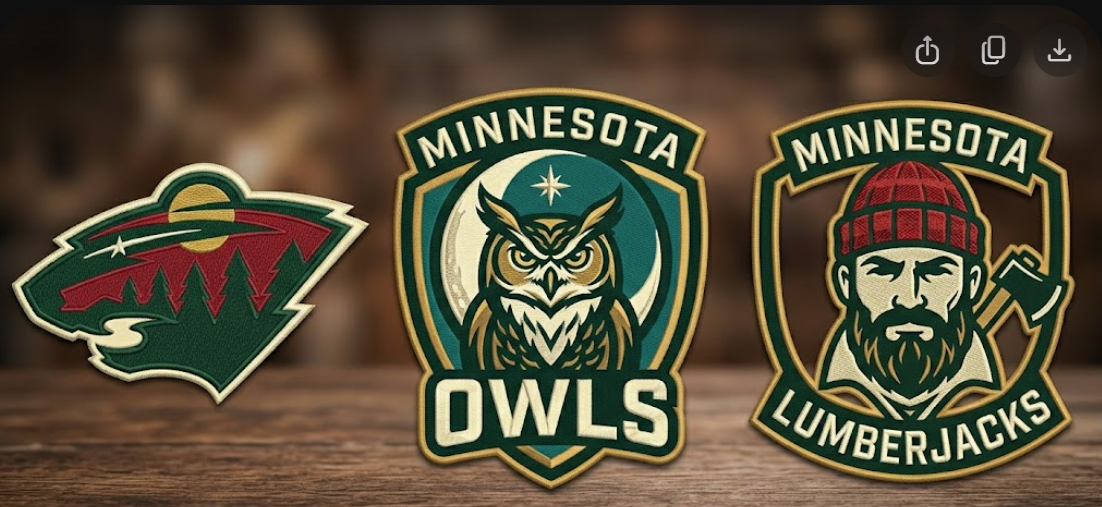
- Minnesota Lumberjacks — Bouncing off of the Blue Ox name, the lumberjacks would pay homage to the North and giving us a state identity around the league. A grit first, hardworking and name with deep history to our state and tribute to the national legend of Paul Bunyan. No one would ever complain about a lumberjack face (Cloquet) or saw related logo.
- Minnesota Arctics — Similar to the Wild name and may not be perfect to with our friends to the Great White North considering they are more North than Minnesota. The idea could have consisted around igloos and snow or ice. Always able to draw in the North Star as a tie in for the logo. Endless possibilities and a scheme that could bleed baby and navy blue. Something the NHL was missing until the Seattle Kraken came to the league.
- Minnesota Moose/Loons /Saints— This falls into the category of “What could have been.” The Moose, iconic logo but would have come with copyright issues. Worth the price in my opinion but likely not on the table. The loon is the state bird with an iconic sound. The Minnesota United got it right and used baby blue for their colors. Home run pick and something the hockey team SHOULD have used. Lastly, the Fighting Saints. Held by the College of St. Scholastica and old semi-pro team. What a logo they could have had. Another naming issue but would have easily held an iconic look that would rival the Original Six logos the NHL has today.
- Minnesota Owls — Tell me this doesn’t appeal to the entire state of Minnesota? Like the loon, iconic sounds but can be built with a menacing logo. Endless schemes and fit. Memes could range from the Detroit Redwings to Hooters restaurant. Being able to tie in the wilderness of the Boundary Waters and North Star, this is another no brainer that the ownership missed. This would be my number one option for a rebrand.
- Minnesota Walleye — Sure, another minor league team name option. Something that pays tribute to the “Land of 10,000 Lakes” without being named the Lakers or Skippers. Maybe the Sturgeon or Muskies would be different fits but still, a common fish that would resonate with the entire state. Another mean and intimating logo option that would be much better suited than what the current is.
If we were to do it all over again, is the Minnesota Wild being chosen? No chance. We saw the NHL flourish with the names of the Golden Knights and Kraken, Utah Mammoth not far behind. Far superior logos and color schemes that are unique to the league and we are stuck looking like a Christmas tree. We don’t have a true identity and have a logo that is instilled with too much detail without actually meaning anything. Is it cool that the logo is abstract as an mythical animal, sure. Does 90% of the common NHL fan know that, no. They screwed it up and we were created in the wrong (and awful) era. Look at the other teams from the 90’s. Nashville Predators, Anaheim Ducks (rebranded), Columbus Bluejackets, Florida Panthers (rebranded), even the Colorado Avalanche don’t have a consensus great logo/scheme.
We have seen teams go through very successful rebrands. The Washington Capitols and Tampa Bay Lighting as examples. With the emergence of Alexander Ovechkin, the Capitols went with red and white. One would argue that their old logo has aged extremely well with the current landscape for retro looks. Similar to the Phoenix Coyotes, the Aztec fox/wolf plays well in todays age. The Lightning went from a higher detailed logo to a simplistic blue and white look that sells well. The San Jose Sharks have a very 90’s feel but stayed true to their teal and unique look. A logo that flourished with “Jumbo” Joe Thornton and will rise again with Macklin Celebrini. The Ottawa Senators have a very distinct look and that rebranded and went back to its roots. It is hard to create iconic logos without having any true history behind it. In terms of jersey sales, the simplistic look and Original Six teams are going to dominate.
In todays “Cancel Culture,” it is hard to create logos accepted and loved by everyone. We have seen this with the now defunct University of North Dakota Fighting Sioux. The Portland Winterhawks rebranded away from the Indian theme. The Washington Redskins changed names. The Kansas City Chiefs, Chicago Blackhawks and Florida State Seminoles may not be far behind. The Minnesota Wild was certainly a choice as a name for the NHL franchise but it’s one that should be open to a change with a new or renovated arena coming and a roster filled with Stanley Cup talent for the first time in its 25+ years of existence.
메타데이터
- post_id
- 34cf2ca4ad59
- slug
- the-minnesota-wild-need-a-rebrand-34cf2ca4ad59
- url
- https://medium.com/@ottobruh99/the-minnesota-wild-need-a-rebrand-34cf2ca4ad59
- canonical_url
- https://medium.com/@ottobruh99/the-minnesota-wild-need-a-rebrand-34cf2ca4ad59
- author_url
- https://medium.com/@ottobruh99
- status
- ok
- fetched_at
- 2026-06-09 15:37:30