What Your Spatial Transcriptomics Analysis Misses, and How Topology Finds It
Moran’s I is the standard tool for spatial gene expression. It has a specific, well-defined blind spot. Here is how persistent homology…
What Your Spatial Transcriptomics Analysis Misses, and How Topology Finds It
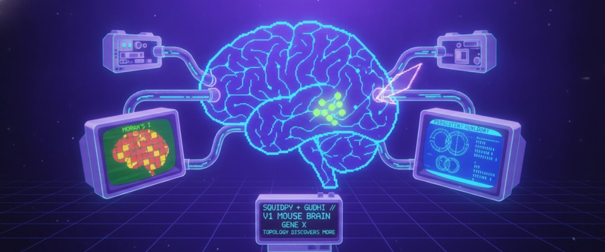
Moran’s I is the standard tool for spatial gene expression. It has a specific, well-defined blind spot. Here is how persistent homology fills it, with a concrete and carefully qualified result on real mouse brain data.
If you have done any spatial transcriptomics, you know the routine. Load the Visium data, run Moran’s I, find the spatially variable genes, and plot a few on the tissue. The picture looks great. You move on.
But you never asked the harder question: did that standard statistic actually capture all the spatial structure in your data, or did it quietly miss some?
It misses some. There is a branch of mathematics that finds what it misses, and the gap between the two is not a curiosity. It is the difference between seeing a pattern and not seeing it. This is the story of building a benchmark that demonstrates the gap, ending with a specific gene whose spatial pattern Moran’s I ranks far lower than topology does, and with an honest account of exactly what that does and does not prove.
The blind spot in one sentence
Moran’s I measures whether neighbouring spots have similar expression. It does not measure the shape of the expression pattern.
That distinction sounds subtle. It is not. Consider two genes:
- Gene A is expressed in one tight, solid blob in the centre of the tissue.
- Gene B is expressed in a ring around a structure, or in a scattered multi focal network.
Gene A has high Moran’s I, because neighbouring spots are very similar. Gene B may have only modest Moran’s I, because across the whole tissue its expression looks patchy. Yet Gene B has the richer spatial structure. Its ring is a real organisational pattern. Moran’s I, which only ever compares a spot to its immediate neighbours, barely registers it.
To see Gene B’s structure you need a tool that measures shape across every spatial scale at once. That tool is topological data analysis.
What topology actually measures
Picture each expressing spot as a dot on the tissue. Now, imagine slowly inflating a circle around every dot. As the circles grow, separate dots merge into connected regions, and sometimes a ring of dots encloses an empty space before that space finally fills in.
Persistent homology watches this whole process and counts two things at every scale:
- Connected components, written H0: how many separate clusters of expression exist?
- Loops, written H1: how many ring-like enclosed structures exist?
For each feature, it records how long it survives as the circles grow. A loop that persists across a wide range of scales is a robust, real structure. A loop that appears and vanishes at once is noise. A genuine ring of expression registers as a long-lived loop. A multifocal network comprisesmany components and loops. None of this is visible to a correlation statistic. That is the complementary signal, and it is precisely the signal Moran’s I throws away.
The experiment
I built a three part benchmark on the canonical Visium adult mouse brain dataset: 2,688 tissue spots across 15 annotated anatomical regions.
The first two parts exist to earn trust. They confirm the pipeline reproduces known biology before it makes any novel claim. Using squidpy, spatially variable gene detection correctly ranks myelin markers such as Mbp at the very top, because they form the sharpest spatial domain in the section, the white matter tract. Neighbourhood enrichment correctly recovers known neuroanatomy: the hippocampal complex co-localises with a z score of 24.9.
There was a sharp lesson in that second part. My first attempt assumed that brain regions sharing the same name, Thalamus_1 and Thalamus_2, would be spatially adjacent. The data said the opposite. Their enrichment score was strongly negative. Those numbered subclusters are transcriptionally distinct territories in separate parts of the tissue. Spatial adjacency and statistical co-localisation are not the same thing, and the data, not the label, is the arbiter.
The third part is where it gets interesting.
The result that matters, stated carefully
I ranked a panel of genes in two ways. First, Moran’s I, spatial autocorrelation. Then, by topological complexity, the persistence entropy of their H1 loops. Then I looked for the genes that the two methods disagreed about most.
The standout is a gene called Apbb2, amyloid beta precursor protein binding.
- By Moran’s I, Apbb2 ranks around the tenth position. Unremarkable.
- In terms of topological complexity, Apbb2 ranks first. The most structured gene in the panel.
Gpr17 shows the same divergence. And the mirror image holds: Mbp, the sharpest spatial domain in the whole section, ranks first by Moran’s I but only eighth by topology, because a solid blob has strong autocorrelation and simple shape.
Now, the part that matters more than the result itself is what separates a real finding from an overclaim. What I have measured is a topological signal: Apbb2’s expressing spots produce a high persistence entropy, and that signal disagrees sharply with its Moran’s I rank. That disagreement is real and reproducible. What I have not done is confirm, through independent histology, that Apbb2 forms a literal anatomical ring in the tissue. The topology is strong evidence of loop like organisation in the data, not proof of a biological annulus.
There is a second honest caveat. Across the panel, the topological complexity scores cluster fairly closely together. The ordering of genes is stable, but the absolute gaps between them are modest. So the correct claim is “the two methods rank genes differently, and Apbb2 is the clearest case”, not “topology found a spectacular outlier that Moran’s I missed entirely”. The careful version is the one that survives scrutiny, and it is still a genuinely useful finding: it tells you that for loop-rich genes, the standard statistic is the wrong instrument.
A debugging lesson worth more than the result
Building this involved a moment I value more than any benchmark score.
The first time the topology analysis ran, it reported a complexity score of exactly zero for every single gene, including the most structured ones. The output was clean and uniform. It would have been easy to accept it and move on.
It was completely wrong. The algorithm was finding more than two dozen genuine loops in the data, but a filter I had set was discarding them all. The loops in this kind of spatial data are short-lived. They exist only across a narrow band of scales, and my threshold was set about ten times too high.
The fix was a single number. The lesson was the instinct behind it: a result that looks too clean deserves more suspicion, not less. Zero complexity on a visibly structured dataset is not a pass; it is a red flag. Trusting that instinct over the tidy-looking output is the difference between a benchmark that means something and one that quietly lies to you.
Why this matters
Anyone can run the standard spatial statistic. The skill that matters, in research, in clinical genomics, anywhere spatial data drives a decision, is knowing where the standard tool is blind, reaching for the right complement, and then being precise about what the complement proves.
Persistent homology is a complement for loop-rich and multifocal expression patterns. It is not a replacement for Moran’s I. It is the second lens that catches what the first one cannot, and now there is a concrete, validated, honestly qualified example that names a real gene to make the point.
The full pipeline, built with squidpy and GUDHI, with 135 tests, continuous integration, and a complete benchmark report, is on GitHub:
**github.com/gbadedata/squidpy-spatial-benchmark**
For the full technical walkthrough with runnable code, every number reproducible from a fresh clone, see the companion tutorial on dev.to
Working on spatial transcriptomics, topological data analysis, or single cell genomics? Connect on GitHub or LinkedIn.
메타데이터
- post_id
- 48aaffd8b422
- slug
- what-your-spatial-transcriptomics-analysis-misses-and-how-topology-finds-it-48aaffd8b422
- url
- https://medium.com/@gbadedata/what-your-spatial-transcriptomics-analysis-misses-and-how-topology-finds-it-48aaffd8b422
- canonical_url
- https://medium.com/@gbadedata/what-your-spatial-transcriptomics-analysis-misses-and-how-topology-finds-it-48aaffd8b422
- author_url
- https://medium.com/@gbadedata
- status
- ok
- fetched_at
- 2026-07-26 05:38:51