How Gromov Branding Rebranded an IT Company in Six Weeks: The BST Case
When BST started the rebranding project, the problem was not that the old logo had suddenly become “bad”. It was more ordinary than that…
How Gromov Branding Rebranded an IT Company in Six Weeks: The BST Case
[embed]Visual direction for the updated BST identity: a more structured, technological image built around trust, security, openness, and growth.
When BST started the rebranding project, the problem was not that the old logo had suddenly become “bad”. It was more ordinary than that: the company had changed, and the brand had not kept up.
BST had grown into a group of IT companies with several business areas. It worked with large private clients and government organizations, produced server hardware, and developed information systems. But from the outside, the visual style still felt fragmented. One division could prepare materials one way, another in a different way. Presentations, documents, event graphics and branded items did not always look as if they belonged to the same company.
This kind of mismatch is easy to miss at first. A brand does not stop working overnight. The logo is still there, people still recognize the name, and day-to-day materials still get made. But as the business becomes larger, the old identity starts to show its limits. It no longer reflects the scale of the company. It does not help different divisions feel connected. And in a B2B market, especially with public-sector clients, that can quietly weaken trust.
BST had one more constraint: time. The company needed the updated identity for a corporate event, and the deadline left only six weeks for the whole rebranding process. That meant the project had to move quickly, but not randomly. The goal was to create a visual system that felt like the next stage of BST, not like a completely different company.
The project was handled by Gromov Branding. What made the case interesting was not only the short timeline, but the type of problem the agency had to solve: how to update an IT company’s identity without turning the process into a series of disconnected design decisions.
What BST came to the agency with
BST is a group of companies in the IT sector. It has several business areas: IT services, development and implementation of information systems, and server hardware production. Its clients include government organizations and large private businesses. In this kind of segment, a visual identity cannot look accidental. People quickly read scale, reliability, and technological expertise through the way a company presents itself.
By the time BST approached the agency, the business had grown noticeably. New areas had appeared, projects had become larger, and the company had turned into a group with different divisions. But the logo and visual identity still belonged to the previous stage of the business. They still worked in a basic sense, but they no longer matched the company’s current level.
This was visible in everyday materials. Some divisions prepared presentations in one style, others in another. Documents, commercial proposals, and external communications looked fragmented, even though they all belonged to the same group of companies. For clients and partners, this created unnecessary noise. BST was perceived less as a single system and more as a set of separate directions.
There was another issue as well. The old visual identity did not communicate the company’s current scale, technological maturity, or market status. For a B2B company that works with government clients, this is especially sensitive. At first contact, no one analyzes an identity in detail, but the overall impression appears immediately. If a strong company looks weaker than it actually is, trust becomes harder to build.
So the task was not simply to make the brand “more modern.” The project had to update the logo and visual identity, bring the group into a clearer system, and at the same time avoid cutting off the image BST had already built. The new brand was not supposed to feel like a sudden change of direction. It had to feel like the natural next stage in BST’s development.
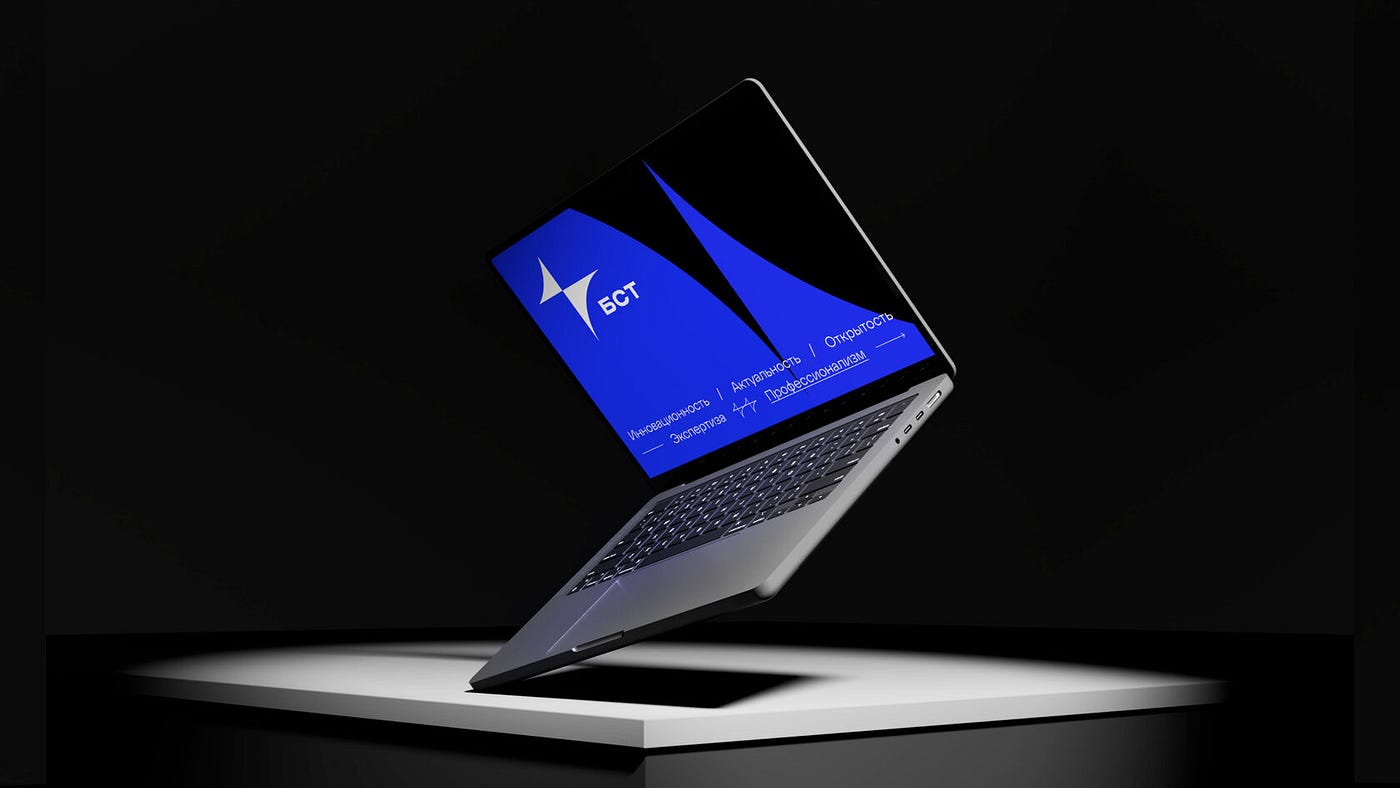
The updated identity had to make BST look closer to the company it had become: larger, more technological, and more consistent across everyday communications.
Why rebranding an IT company is not just about “modernizing the logo”
An IT company is not the easiest object for branding. It rarely has one audience around which the entire image can be built. Corporate clients care about reliability, expertise, and a clear portfolio. Government clients often read a brand through status and professionalism: a visual style that is too bright or too playful can easily seem unserious. Partners and integrators need to see a systematic player, not a company with a random set of services. And then there are candidates. For them, the employer image has long been a separate part of the brand, and visual identity also works in that direction.
All these people look at the same company, but they expect different things from it. That is why the identity has to hold up in several contexts at once. It needs to work in tender documentation, on a stand at an IT conference, in a job post, and in an image video for a corporate event. If the style only looks good in one format, that is not enough for a large IT company.
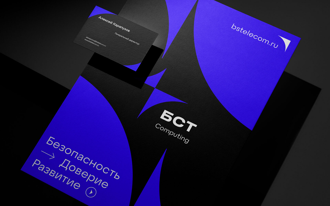
For BST, the identity was not designed for one perfect mockup. It had to hold together documents, presentations, branded materials, and employer communications
This is especially visible in HR. In the IT sector, the employer brand is no longer a secondary story. It has become one of the tools of competition. Companies constantly compete for developers, architects, system engineers, and other technical specialists, and the shortage of talent only makes that competition stronger. For a candidate, visual identity is one of the first signals. It helps them read how modern the company feels, how carefully it treats its own image, and whether it pays attention to details. An outdated or faceless identity can create the impression that the company does not really keep track of itself in general.
Branding in IT is not just about having a neat visual style. The brand needs to look technological, but not cold. Expert, but not closed off. Reliable, but not frozen in place. At the same time, it needs to be memorable and different from dozens of similar companies. Separately, these tasks may sound simple. Combining them all is a different matter, and this is exactly where problems usually appear.
The main challenge: timing and approvals
The project had only six weeks. The deadline was strict: the final concept had to be approved before an important corporate event. No one was going to move the event. Any delay could have thrown the entire project off schedule.
A compressed timeline is not only a source of stress. It can also be a useful constraint. It forces everyone to focus on what matters and avoid endless edits for the sake of edits. But this only works when the task is clear and the decision-making process is manageable.
That is where the real difficulty begins. BST had many people involved in decisions. Each of them saw the brand from their own angle, with their own expectations and priorities. In a situation like this, a project can easily turn into an endless chain of comments. One person wants it to be “more modern,” another wants it to be “more dynamic,” and a third starts remembering that “the old logo was better.” Without a tool for managing all this, the project can simply get stuck in approvals, especially under a hard deadline.
The solution is not to draw more options. The solution is to define evaluation criteria in advance. When everyone understands from the beginning what they should be looking at — whether the brand matches the business task, how it works across formats, how clearly the values are read — the discussion stops being about “I like it” or “I don’t like it.” It becomes more specific: does it work or not? The conversation moves faster because everyone has a common language.
This is the kind of approach that makes it possible to move from analysis to a finished brand book in six weeks. Not superficially, but systematically.
[embed]A short timeline made it especially important to define the visual logic early and keep every format connected to it
Why continuity mattered
Rebranding a mature company is not the same as building a brand from scratch. BST already had an image: market recognition, familiar associations, clients, partners, and several directions inside the group. If everything had been changed too sharply, the company could easily have lost what it had been building for years. People were used to recognizing the brand through certain cues, and a sudden visual turn could have created confusion.

The old and new BST logos show the main idea of the project: continuity without a full visual reset
So the task was not to invent BST from zero. The task was to take the next step: preserve what already worked in the company’s image and bring it to a more contemporary level. Not a revolution, but a natural development.
Of course, continuity is not always necessary. Sometimes an old brand actively holds the business back: it looks outdated, creates the wrong associations, or carries a negative trail. In that case, a complete break may be justified. But BST’s situation was different. The company already had a reputation, partnerships, and accumulated trust. Resetting everything just for the sake of a “fresh start” would have been strange. It was much more important to update the brand so that it became stronger without becoming unrecognizable.
There was also a practical reason to avoid a radical break with the previous image. BST was not a new company trying to invent itself from scratch. The brand already existed in the market, had recognition among clients and partners, and had accumulated trust over time. So the rebranding needed to build on that foundation instead of replacing it with a completely unfamiliar visual image.
How the idea for the new logo appeared
The new BST mark turned out to be very compact and focused: two triangles meet in the center and form a star. There is no unnecessary complexity in it, and in this case that is a strength. For an IT company, a symbol like this needs to be read quickly, work across different formats, and still not look like random geometry.
The form carries the idea of moving from the old image to the new one. One triangle can be read as a foundation built on experience and an already established reputation. The other can be read as movement forward, toward new tasks and technologies. They do not split the mark into two parts. They come together into one form. That is the logic of BST’s rebranding: not to erase the brand, but to develop it carefully.

The new mark was designed to stay clear and recognizable at different scales, from a small branded item to signage in an office space
The star that appears at the point of intersection suggests expansion and the desire to move further. For a company working in information system development and technological infrastructure, this image feels natural. It communicates ambition and growth without becoming overly dramatic.
The form itself is important too. The geometry gives the mark a technological feel, but it does not seem cold. There is a sense of movement and dynamics. It is structured, which matters for B2B clients and government customers, yet distinctive enough not to disappear among dozens of similar “technology” logos.
From a practical point of view, the mark is easy to scale. It reads well on a large screen and as a small icon, on an envelope and on branded merchandise. For a company with many different touchpoints, that is critical. A logo that loses its meaning when reduced or prints badly on a non-standard surface becomes an image problem. The BST mark was designed with these situations in mind from the start, rather than being adjusted to fit different formats afterward.
How the umbrella branding system works
For a group of companies, one logo is usually not enough. BST has several directions, each with its own audience, tasks, and points of contact. If each division starts designing materials however it wants, the overall picture quickly falls apart. Today a presentation looks one way, tomorrow a commercial proposal looks another, and the next day a separate direction is almost visually disconnected from the group. For the client, this creates confusion. They may work with one division and not understand that another one also belongs to BST.
But simply putting the same logo everywhere is not the answer either. In that case, the subsidiary directions lose their own identity. And that matters, because each one works with its own audience and solves its own tasks. They should not look like nameless departments inside a larger structure.
That is why BST needed not a single “general picture,” but an umbrella branding system. In this kind of system, each division has its own logo, but all of them are built according to a common logic. The principles of form, typography, and overall visual character are preserved. At the same time, the directions keep their individual accents — visible enough to tell them apart, but not so separate that they fall out of the BST brand.
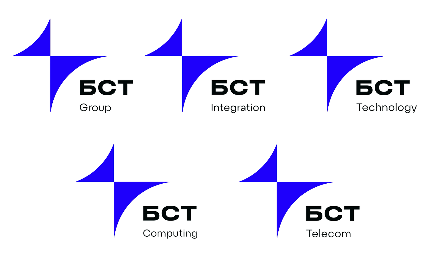
The umbrella system gave each BST division its own name while keeping the same visual logic across the group
In everyday work, this is more useful than it may seem at the beginning. Clients and partners can more easily understand which direction they are dealing with and how it is connected to the group. Internal teams benefit too: a division gets its own identity, rather than feeling like a “subsidiary” without a name or character. For the group itself, it also creates a foundation for growth. If a new direction appears, it does not need to be designed from scratch. It can immediately fit into an already clear system.
There is also a very practical side that companies often remember only later. A fixed brand architecture makes life much easier after the rebranding is complete. New products, divisions, presentations, and materials can be built according to rules, rather than each time starting over with the question, “How should we look now?” This reduces dependence on one specific designer or agency and helps the brand avoid falling apart six months after launch.
Why the identity was divided into business and image-building modes
An IT company communicates with audiences in very different places, and the same tone does not work equally well everywhere. What feels appropriate in social media or at a corporate event may look strange in a tender presentation. The reverse is also true: a very dry business style does not translate well into HR communications, where people expect the brand to show not only status, but also a more human side.
BST has a business communication layer: documents, presentations for government clients, contracts, and B2B communications with large companies. Here the visual style needs to be composed and calm. It should communicate professionalism, reliability, and scale. Excess decoration, overly bold colors, or “playful” elements would get in the way in this context. The company could start looking out of place for its own level.
But there is another layer as well: corporate events, HR campaigns, social media, and image materials. Here it is important not only to prove expertise, but also to show the brand’s character. If a company speaks only in an official tone everywhere, it quickly becomes closed and faceless. For recruitment and image-building communications, that is a weak position.
So BST’s adaptive identity is built around two modes. In the business mode, there are stricter graphic elements, a more restrained palette, more order, and more status. In the image-building mode, the same basic elements are used differently: with more air, openness, emotional emphasis, and attention to the company’s values and advantages.

BST’s identity uses the same core elements in different ways: more restrained for business materials, more expressive for image and event communications
The important thing is that these are not two different brands. It is one system with different intonations. BST remains recognizable both in an official presentation and in an HR post, but in each case it looks appropriate. For a mature identity, this is exactly the key point: not to freeze in one format, but to change register without losing recognition.
In practice, this means that one logo, one type system, and shared graphic elements can work both in a commercial proposal for a government customer and in a social media post. In the first case, the brand looks serious. In the second, it feels more open. But it is still the same company, not a set of random visual decisions.
How the identity was tested on real materials
A rebranding project does not end when the logo, colors, and typefaces are approved. On paper, a system can look good. The real test starts later, when it is applied to actual materials. Not just to a neat mockup in a presentation, but to formats and objects where it immediately becomes clear whether the identity can live outside the screen.
For BST, branded materials were developed: umbrellas, notebooks, bags, accessories, and business documents. These were not just “nice pictures” for a case study. Different formats help test the system’s strength. A small mark on a notebook demands one thing from a logo. A large banner demands another. An umbrella with a pattern shows how the graphics behave on a non-standard surface. Business documentation immediately reveals whether the typography and layout are suitable for a professional environment.

Applying the identity to everyday objects helped check whether the logo, graphics, and typography still worked outside presentation mockups
If a visual identity passes these tests and still looks coherent, the system has been built properly. If the mark loses readability somewhere, if the pattern starts fighting with the shape of the object, or if documents look unconvincing, it is better to see this before the project is closed. After launch, fixing such things becomes harder and more expensive.
The brand book is also important. It is not a final report and not just a beautiful PDF that goes into a folder called “brand” and is never opened again. A brand book is needed for everyday work with the identity after the agency has finished the project. It will be used by an in-house designer, an external contractor, or a marketer preparing materials for an event a year later. Everyone needs one point of reference: how to use the system’s elements without breaking them along the way.
A good brand book explains more than logo usage rules. It shows how to write texts, what kind of photography fits the brand, how layouts should be built across different formats, where a more image-led approach is acceptable, and where a stricter business register is needed. The clearer this is described, the less room there is for random interpretations in real work.
[embed]The identity was also tested in vertical layouts, where the logo, typography, and graphic shapes had to stay balanced
Without a brand book, even a strong identity gradually starts to drift. Someone slightly changes the color because “it looks better this way.” Someone stretches the logo because otherwise it does not fit. Someone builds a presentation almost according to the rules, but uses the wrong typeface. Each of these small things may not seem critical on its own. But after a few months, they turn back into visual noise. The brand book exists to prevent the rebranding from falling apart after launch.
What made it possible to finish in six weeks
The speed of this project did not come from simplifying the work or staying on the surface. It came from the process. When the process is built properly, the team does not spend weeks on chaotic discussions and endless redesigns. In that sense, speed is not a replacement for quality. It is the result of organization.
[embed]Working with a complete system made the process faster: each new format followed the same visual logic instead of being designed from scratch
The first factor was a clear task and agreed evaluation criteria. When everyone involved understands from the start what needs to be done and how the result will be assessed, there are fewer unnecessary circles. In creative projects, a lot of time is lost not because of the work itself, but because of a vague brief. Everyone imagines the final result differently, and the discussion quickly moves away from the actual task.
The second factor was working with the system, not with separate elements. The logo, identity, umbrella structure, business and image-building modes, and materials were all considered together. It was not a process where the mark was designed first, the divisions were considered later, and then everyone suddenly remembered presentations and merchandise. When the logic is set from the beginning, one element does not start conflicting with another.
The third factor was continuity. From the start, it narrowed the search and removed unnecessary options. The team did not need to invent BST from scratch or look for a radically new idea just for the sake of novelty. There was a clear direction: develop the existing image. This helped the project move faster while keeping the connection with what the company already had.
What businesses can take from this case
The BST case is interesting not only as the story of one project, but also as an example of several principles that work more broadly.
A rebranding project can be completed within a short deadline, but only under two conditions: a clear task and a manageable decision-making process. In this situation, speed is the result of organization, not a way to sacrifice quality. If the process is chaotic, even several months will not save the project from endless edits and approvals.
For an IT company, it is especially important not to lose trust and expertise in the visual image. Any decision that makes the brand look less serious or less professional can work against the company in a B2B environment, even if it seems “modern” or “trendy.”

The BST case shows that rebranding is not only about a new logo, but about building a system that can work in real business contexts
When a business has several directions, an umbrella branding system helps preserve the unified image of the group without erasing the individuality of its divisions. Trying to use one logo “for everyone,” or allowing every direction to develop separately, usually leads to chaos. A system reduces that risk.
And finally, a brand is not just a logo or a set of attractive mockups. It is a system that has to work across different formats, in different communication registers, on different materials, and continue working correctly after the agency has finished the project. Testing the identity on real applications and preparing a brand book are not decorative extras. They are part of what makes a rebranding project complete.
Conclusion
The BST case shows clearly that a six-week rebranding project is not simply a story about “doing things quickly.” The timeline itself does not prove much. What matters more is how the process is structured, what criteria decisions are based on, what is preserved from the previous brand image, and what kind of visual system the project ultimately builds.
In this case, the system had to help an IT company look modern, technological, and coherent — in business documentation, at a corporate event, and across all the formats in between.
If a company has grown and its visual identity no longer matches its scale, structure, or level of expertise, it is better not to start with the question, “What should the new logo look like?” First, it is worth understanding something else: what directions exist inside the business, how they are connected, where and with whom the company communicates, and what touchpoints it will need next. Only after that does a real foundation for a systematic update appear, even if the project has to be completed within a short deadline.

After the rebranding, BST received not just a refreshed look, but a visual system that could keep the group consistent across future communications
You can view the full case here: https://gromovbranding.ru/brending-dlya-it-kompanii
메타데이터
- post_id
- 7ede63674a5d
- slug
- how-gromov-branding-rebranded-an-it-company-in-six-weeks-the-bst-case-7ede63674a5d
- url
- https://medium.com/@press_40832/how-gromov-branding-rebranded-an-it-company-in-six-weeks-the-bst-case-7ede63674a5d
- canonical_url
- https://medium.com/@press_40832/how-gromov-branding-rebranded-an-it-company-in-six-weeks-the-bst-case-7ede63674a5d
- author_url
- https://medium.com/@press_40832
- status
- ok
- fetched_at
- 2026-06-21 12:17:11