Why the NBC Peacock Worked, and Why Most Rebrands Fail.
A firsthand account of how NBC restored trust through research-led branding — and why abandoning iconic symbols still carries consequences.

Rockefeller Center in New York is the home for NBC’s brand.
Why the NBC Peacock Worked, and Why Most Rebrands Fail.
Trust was the product. Design was the system. And execution, not novelty, determined the outcome.
A Message From Now
Recently, a friend sent me a message that made me stop and think about how great brands were made — and how they continue to be made, even in a digital, algorithmic, AI-driven world.
“Did you see it?” he wrote. “MSNBC is becoming MS NOW, and they’re dropping the Peacock. That’s a terrible decision.”
Then he added the part that felt personal.
“Weren’t you part of the team that rebranded NBC and brought the Peacock back in the late ’70s?”
The message was from John — someone whose opinion I respect deeply. He had been a White House speechwriter for a U.S. president and later spent a lifetime leading global corporate communications at IBM. His entire career was built on language, symbols, and institutional trust.
So when he said, “They’re dropping the Peacock,” I didn’t hear nostalgia. I heard professional concern.
Wow, I thought. That was a long time ago—nearly half a century.
I told him the truth: since I’ve been living abroad, I don’t watch much American television, mainly to avoid the constant churn of political noise. I hadn’t seen the new MSNBC identity yet. But I also told him something I still believe, after a lifetime in branding.
When a company drops an iconic symbol, it is almost never because someone woke up one morning and decided to insult history. The era of the lone heroic CEO sweeping in to “fix everything” is largely over. Modern organizations are too complex for that. Decisions, especially brand decisions, are usually driven by ownership structures, legal realities, spinoffs, and governance constraints.
Still, that message didn’t raise a design question.
It raised a trust question.
And that’s where this story really begins.
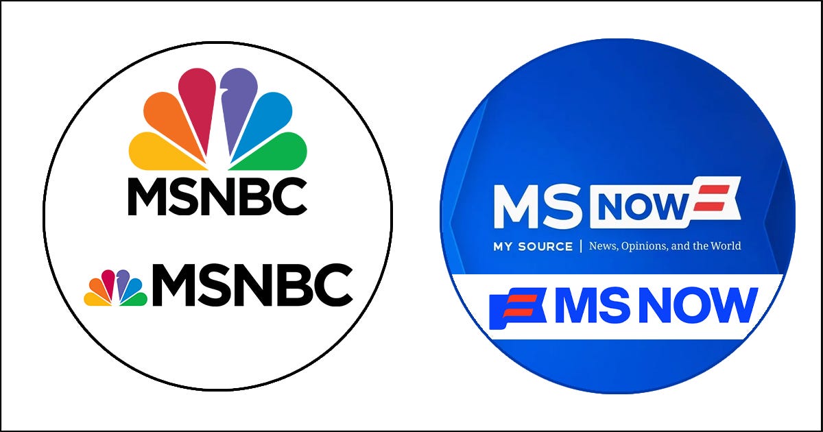
MSNBC → MS NOW: A shift from inherited broadcast equity to abstracted identity. The removal of the Peacock severs accumulated institutional meaning in a trust-based news category, replacing recognition with generic futurism. The result signals legal and structural change — but dilutes authority rather than rebuilding it.
Prologue: When Brands Lose Trust
Trust, credibility, and the limits of rebranding
In severe cases, such as Arthur Andersen, one of the original “Big Five” accounting firms was effectively destroyed by the Enron scandal in 2001–2002.
Andersen was Enron’s auditor. The firm was found to have destroyed audit documents after investigations began. In 2002, Arthur Andersen was convicted of obstruction of justice (later overturned in 2005, but far too late). Clients fled. Trust evaporated. The firm collapsed globally.
Arthur Andersen did not, and could not, rebrand itself. Most partners and practices were absorbed into Deloitte, EY, PwC, and KPMG. The Andersen name became toxic.
Why this matters is simple:
When trust is the product, you can’t rebrand your way out of betrayal.
Logos can be changed. Names can be replaced. But credibility, once lost, doesn’t reboot.
I’ve always said: it may take 30 years to build a reputation and 30 seconds to lose it.
Examples of Squandered Reputation, and What Some Companies Did Next
There are many well-documented cases of companies forced to rebrand because their credibility, legality, or reputation collapsed.
1. Andersen Consulting → Accenture (2001)
Reason: Legal separation and brand contamination Outcome: ✅ Highly successful
Andersen Consulting was originally part of Arthur Andersen. Following a contentious legal split, the firm was required to abandon the Andersen name. It adopted the name “Accenture” (short for “Accent on the Future”). Critically, this transition occurred before the Enron scandal fully destroyed Arthur Andersen’s reputation. Accenture emerged as a global consulting leader.
Lesson: Rebranding can succeed when the core business remains strong, and trust has not yet collapsed.
2. Philip Morris → Altria (2003)
Reason: Reputational damage associated with tobacco Outcome: ✅ Successful as strategic distancing
Philip Morris had become synonymous with cigarettes, litigation, and public health controversy. To protect its broader portfolio — particularly food and consumer brands — the parent company was renamed Altria. Tobacco brands remained intact, but the corporate umbrella changed.
Lesson: In some cases, rebranding is not denial; it is containment.
3. Valeant Pharmaceuticals → Bausch Health (2018)
Reason: Ethics violations, pricing scandals, investor collapse Outcome: ⚠️ Mixed
Valeant became notorious for aggressive drug price increases, triggering political backlash, lawsuits, and a severe stock decline. The company rebranded using the name of its more respected subsidiary, Bausch & Lomb.
Lesson: A name change may stabilize perception, but it does not erase institutional memory.
4. Blackwater → Xe → Academi (2009–2011)
Reason: Severe reputational damage Outcome: ⚠️ Partial
Blackwater, a private military contractor, became globally toxic following civilian killings in Iraq. The company rebranded twice under new ownership and continued operations under different names.
Lesson: Rebranding can buy time, but it cannot confer absolution.
5. Facebook → Meta (2021)
Reason: Trust erosion, regulatory pressure, strategic pivot Outcome: ❓ Still unfolding
Facebook, as a platform, has become associated with misinformation, privacy violations, and political manipulation. The parent company rebranded as Meta, while Facebook remained the product name.
Lesson: Rebranding can signal ambition, but credibility is restored only through behavior.
6. Weight Watchers → WW (2018)
Reason: Cultural fatigue and shifting norms Outcome: ⚠️ Limited
Weight Watchers sought to move beyond diet culture by rebranding as “WW” and emphasizing wellness. The repositioning lacked clarity and left consumers confused.
Lesson: When the meaning is unclear, an abbreviation does not solve the problem.
7. Monsanto → Bayer (2018)
Reason: Acquisition of an extremely toxic brand Outcome: ⚠️ Risky
Monsanto’s name was deeply associated with glyphosate litigation and environmental distrust. Bayer eliminated the Monsanto name immediately following the acquisition but inherited its legal and reputational liabilities.
Lesson: Acquiring a toxic brand does not neutralize toxicity; it transfers it.
8. Enron (No Rebrand — Collapse)
Reason: Fraud Outcome: ❌ Impossible
Enron did not rebrand. It ceased to exist.
Lesson: Some brands are beyond repair.
9. Uber (Internal Rebrand Following Culture Crisis, 2018)
Reason: Toxic culture and leadership scandal Outcome: ⚠️ Partial
Uber faced widespread allegations of sexual harassment and regulatory violations. Leadership was replaced, internal values were rearticulated, and brand tone was softened.
Lesson: Cultural reform matters more than visual change.
10. BP (“Beyond Petroleum”), Failed Rebrand (2000s)
Reason: Image laundering Outcome: ❌ Backfired
BP attempted to reposition itself as environmentally responsible through branding. The Deepwater Horizon disaster exposed the gap between message and reality.
Lesson: Rebranding without behavioral change accelerates reputational collapse.
11. Twitter → X (2023)
Reason: Ownership change and ideological reset Outcome: ❌ Backfired
Twitter’s core product was trust: a shared public square built on clarity, convention, and participation. The abrupt Rebrand to X discarded accumulated meaning without replacing it. Product decisions, governance shifts, advertiser retreat, and user behavior — not the logo — determined the outcome.
Lesson: This case stands in direct opposition to NBC’s Peacock thesis: meaning was discarded rather than recovered.
This set of cases is not presented for drama, but for distinction. Once the pattern is visible, it becomes impossible to ignore.
Now, to answer what many have asked: my opinion, as a branding professional, is.
I don’t offer opinions lightly, especially without access to internal research, strategic constraints, legal requirements, or organizational realities that shape decisions behind the scenes. I was not in the room. I did not see the briefs, the data, or the timelines.
That said, as a branding professional, I am trained to read signals. And based solely on what is publicly visible—the name, the logo, the execution quality, and the category it operates in—my surface-level assessment is as follows.
12. MSNBC → MS NOW
Reason: Corporate restructuring and legal separation from NBC trademarks following Comcast’s cable-network spinoff. Outcome: ⚠️ Unclear / High risk
MSNBC operates in a trust-based category. While the name change was driven by legal and structural necessity, identity alone cannot compensate for the loss of accumulated institutional meaning. The new mark prioritizes abstraction over authority and breaks continuity with audience memory without clearly establishing a replacement source of trust.
Lesson: In trust-based institutions, legal necessity may explain a rebrand — but it does not guarantee credibility. When meaning is removed faster than it is rebuilt, audience confidence erodes before performance metrics can stabilize.
The pattern is consistent:
Rebranding works only when it reflects real structural change — not when it tries to hide failure.
NBC’s story is the opposite of most of these cases.
The Pattern (This Is the Key Insight)
Rebranding works only when:
- The core business is still trusted
- Leadership changes accompany the brand change
- The move is honest, not cosmetic
- The audience is not being gaslit
Rebranding fails when it is used to hide, deflect, or erase accountability.
And now we can return to my friend’s message — with clearer eyes.
Branding Is Value Creation
My approach to branding was never mystical. I didn’t come into television to make “museum art.”
I came in with a research habit, a business habit, and a belief that much of what passes for branding is either ungrounded aesthetics or corporate theater.
Branding, for me, was closer to architecture and industrial design: research plus strategy, engineering plus craft, packaged with discipline and creativity. It wasn’t decoration.
Value is not abstract. Value is employees keeping their jobs. Families having stability. Shareholders have confidence, and talent wanting to affiliate. Advertisers believe the audience is real. Systems that reduce chaos instead of multiplying it.
Over decades, the systems I worked on contributed — conservatively — to tens of billions of dollars in brand and business value across more than a thousand brand expressions.
That’s why branding mattered at NBC.
The Peacock wasn’t just nice. It was valuable — because it restored meaning.
Back to MS NOW — and Why This Connects to NBC
MSNBC’s rebrand as MS NOW is tied to Comcast’s cable-network spinoff and its legal separation from NBC trademarks.
But when people say, “They dropped the Peacock,” they don’t mean a graphic.
They mean memory.
When people say you dropped the Peacock, they don’t mean a logo. They mean a relationship.
NBC’s story wasn’t about hiding failure. It was about returning to the meaning the audience already owned.
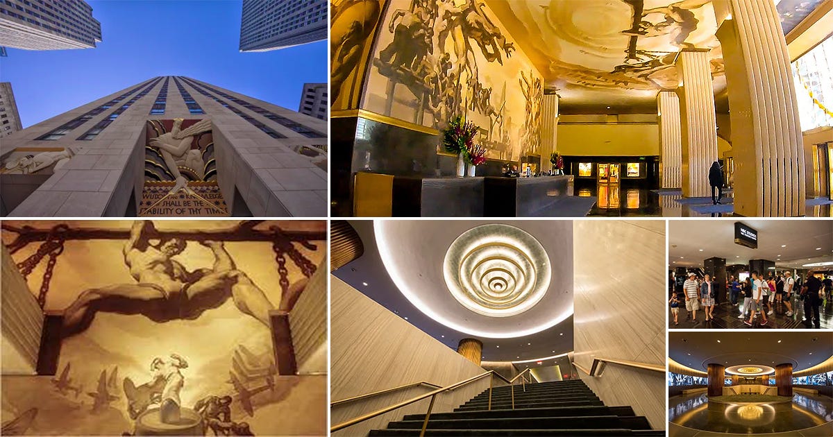
Art Deco Lobby at 30 Rockefeller Plaza reflects an era when institutions invested in permanence, craft, and cultural authority.
30 Rock, Late 1970s
When I first walked into 30 Rockefeller Plaza, NBC was stuck in third place, tense, bruised, and recovering from a branding fiasco.
The Art Deco lobby felt like a temple. But it also had a ghost.
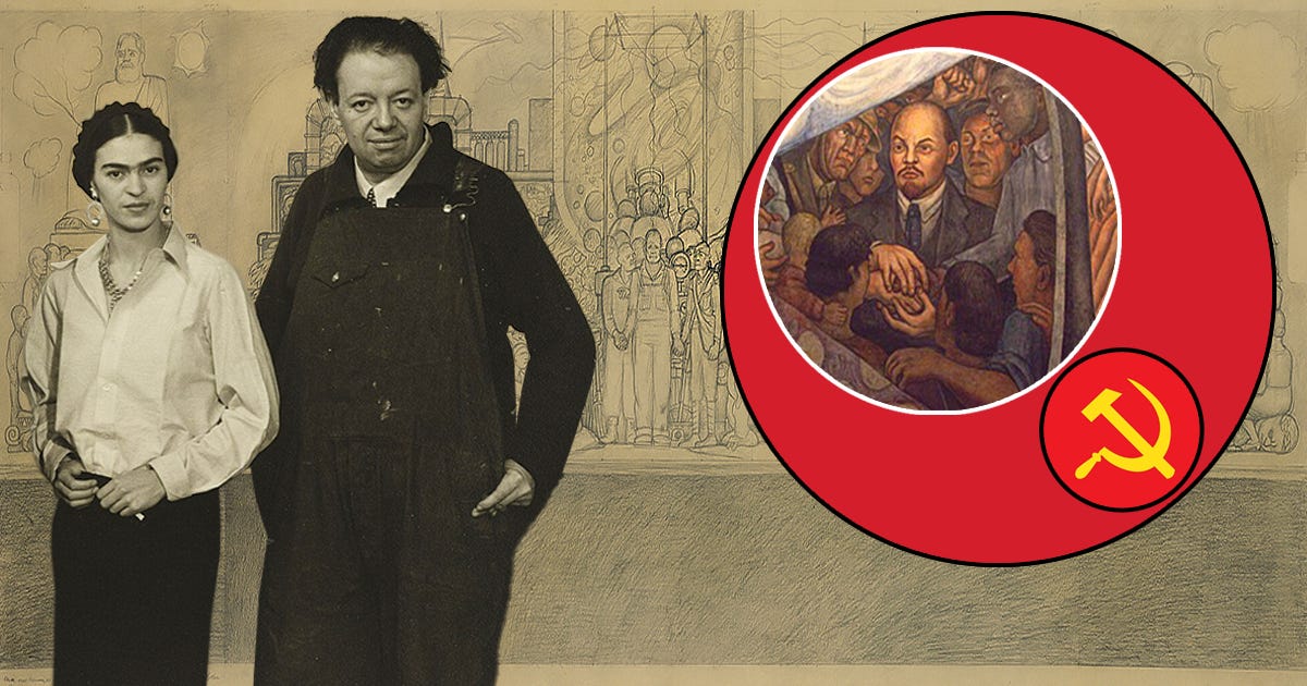
Rivera-Era Hidden Murals: The building’s murals embody unresolved tensions between art, power, ideology, and commerce — mirroring television’s own contradictions.
The Ghost in the Lobby
In 1933, the Rockefellers commissioned Diego Rivera to paint Man at the Crossroads. The mural included Lenin. Rivera refused to remove him. The mural was destroyed.
Rockefeller Center was built on contradiction — capitalism, revolt, beauty, and censorship.
A perfect stage for American television.
Every morning, tourists looked up. I looked forward.
I was there to bring back a bird.
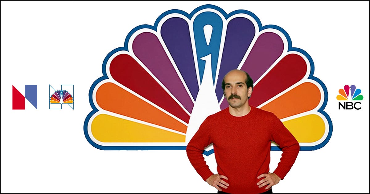
The NBC Peacock, Modern Form: The simplified Peacock translated legacy symbolism into a durable, scalable broadcast brand identity. Design, Art Direction, Creative Directions: Vazken Kalayjian. Executive Leadership: Mike Mohamad, Charles Blake, Elaine Zeitsoff. Department: NBC Network Advertising, On-Air Promotion and Marketing. Lettering: Tom Carnase.
The Talented Immigrant Arrives
I arrived at NBC as a Pratt Institute graduate — but not as a beginner. I had worked in publishing, packaging, animation, architecture, signage, and corporate identity.
When a headhunter said “NBC,” I asked, honestly, “What is NBC?”
I didn’t own a television.
Two days later, I was sitting at my desk at 30 Rock.
I had no idea what was coming.
The Million-Dollar Mistake
NBC had just spent $1 million on a patriotic red-white-blue “N” designed by Lippincott & Margulies.
It had no soul.
Worse, a Nebraska public television network already had a similar logo — reportedly purchased for $100. A lawsuit followed. The logo became an internal joke.
But the research told a different story.
Audiences missed the Peacock.
Not the corporate logo — the bird that opened its feathers to say: this program is in color.
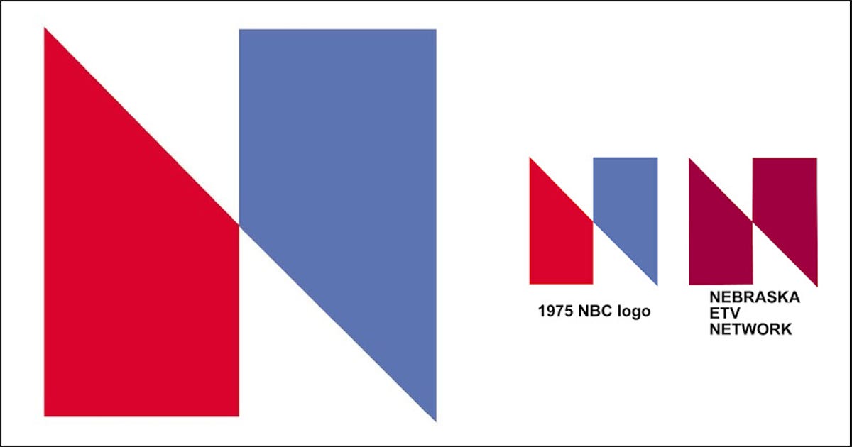
In February 1976, Nebraska ETV (now Nebraska Public Media), the PBS member network for Nebraska, filed a trademark infringement lawsuit against NBC alleging that the new “N” logo was virtually identical to a logo Nebraska ETV had adopted in June 1975. NBC and Nebraska ETV reached an out-of-court settlement under which NBC provided Nebraska ETV with more than $800,000 worth of new broadcasting equipment, including a color mobile unit, and an additional $55,000 to cover the cost of designing and implementing a new logo. In return, NBC was permitted to continue using its “N” logo.
My Big Mouth Moment
In a meeting I wasn’t even supposed to attend, I blurted out something I probably should have kept to myself.
“Why don’t we bring back the Peacock?”
The room froze. Executives stared. My boss looked like I had thrown a brick through a window.
But I had read the research, page after page of it. And viewers weren’t asking for another clever corporate symbol.
They were asking for what they already loved. “Where is the peacock?”
Iconic brands are not invented by committees. They are adopted by people.
Grant Tinker Arrives — and Everything Changes
Fred Silverman joined NBC in 1978. He had been one of the most successful programming executives in television history, serving as President of ABC Entertainment from 1975 to 1978, following a successful run as CBS programming VP. Despite all his genius as a programmer, he couldn’t single-handedly turn the NBC Network around as president and CEO. He was too erratic and crazy with the programming. Something deeper was missing.
Then Grant Tinker arrived, and the atmosphere changed. He was calm, elegant, and deeply respectful of writing and creativity. Under his leadership, NBC began launching shows that didn’t just pull ratings — they changed culture.
NBC regained its voice.
Its confidence.
Its soul.
But just as the creative side was rising, one executive decision threatened to reopen the identity chaos.
Programming as Brand Recovery Grant Tinker brought calm, confidence, and respect for writing and creativity. Under his leadership, NBC launched programs that rebuilt trust through content:
Major Program Launches — NBC (Late 1970s–1980s)
A period of disciplined programming strategy produced a portfolio of culturally durable franchises, reinforcing brand credibility through content performance rather than visual identity alone.
- Saturday Night Live: A high-risk format innovation that redefined live television and established NBC as a platform for generational talent and cultural commentary.
- Taxi: Character-driven storytelling elevated the sitcom genre, demonstrating NBC’s commitment to creative depth over formula.
- The Tonight Show: A legacy franchise anchoring NBC’s late-night authority and continuity across decades of audience change.
- Cheers (1982–1993): Initially underperforming, later dominant — an example of executive patience aligning creative vision with long-term audience trust.
- Quincy, M.E. (1976–1983): Early procedural television integrating social issues, expanding the scope of network drama beyond entertainment.
- Hill Street Blues (1981–1987): Narrative complexity and moral ambiguity reshaped television drama, raising expectations for the medium.
- St. Elsewhere (1982–1988): A hospital drama that challenged conventional storytelling and expanded creative latitude for network television.
- L.A. Law (1986–1994): Stylized realism merged with topical relevance, reinforcing NBC’s leadership in prestige drama.
- Miami Vice (1984–1989): Aesthetic innovation integrated with music and fashion, influencing television’s visual language worldwide.
- Shōgun (1980): Event television that demonstrated NBC’s capacity for ambitious, global storytelling at scale.
- The A-Team (1983–1987): Action-driven entertainment balancing escapism with a broad demographic reach during peak network competition.
- The Smurfs (NBC Saturday Morning): Children’s programming as brand stewardship — extending trust and familiarity to the next generation of viewers.
- The Flintstones (NBC Broadcast Era): Classic animation used strategically to stabilize family viewing blocks and reinforce mass appeal.
- The Source (NBC Radio): An early experiment in youth-oriented audio branding, reflecting NBC’s multi-platform ambitions ahead of its time.
- Today Show — Identity System: Morning television as a designed ritual — graphics, tone, and pacing working together to create habitual trust.
- NBC Saturday Morning — Brand System: A unified identity applied across properties, demonstrating how a coherent brand framework supports diverse content.
- NBC SportsWorld: Editorial rigor and visual consistency positioned NBC Sports as a credible global broadcaster.
NBC didn’t fix its brand with graphics.
It fixed it with quality programming and behavior.
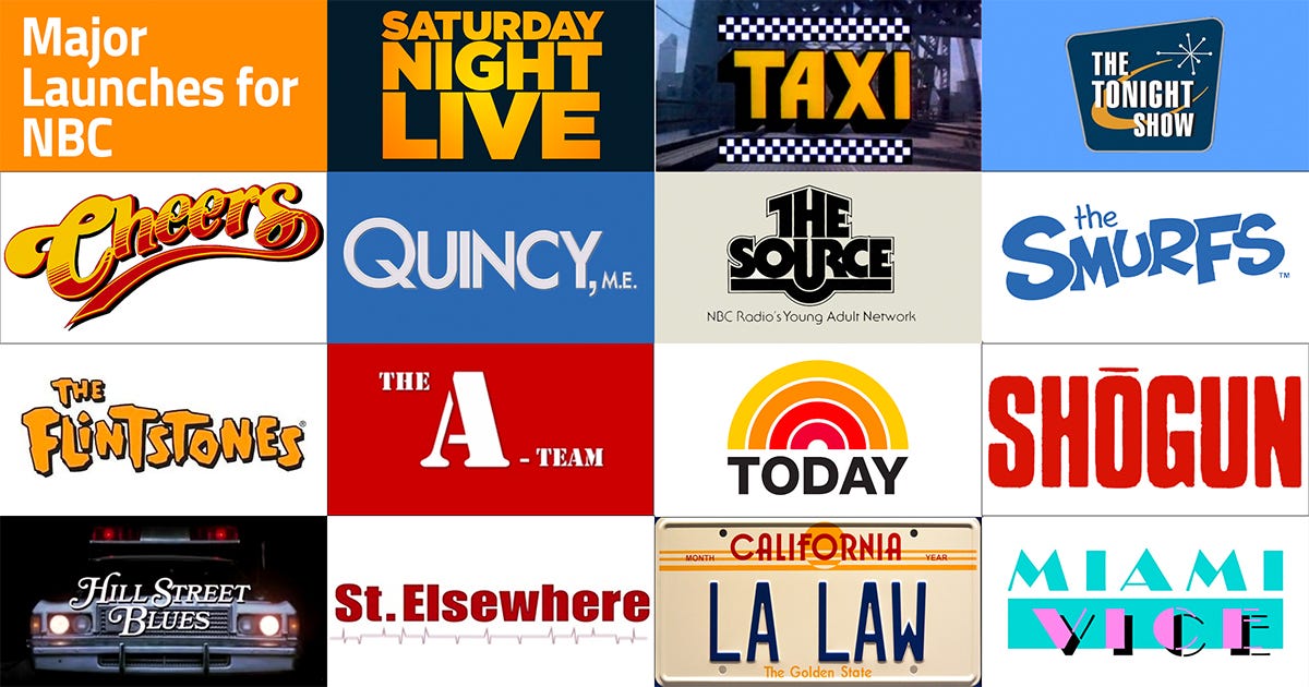
Major Program Launches, NBC (Late 1970s–1980s) Design, Art Direction, Creative Directions: Vazken Kalayjian. Executive Leadership: Mike Mohamad, Charles Blake, Elaine Zeitsoff. Department: NBC Network Advertising, On-Air Promotion and Marketing.
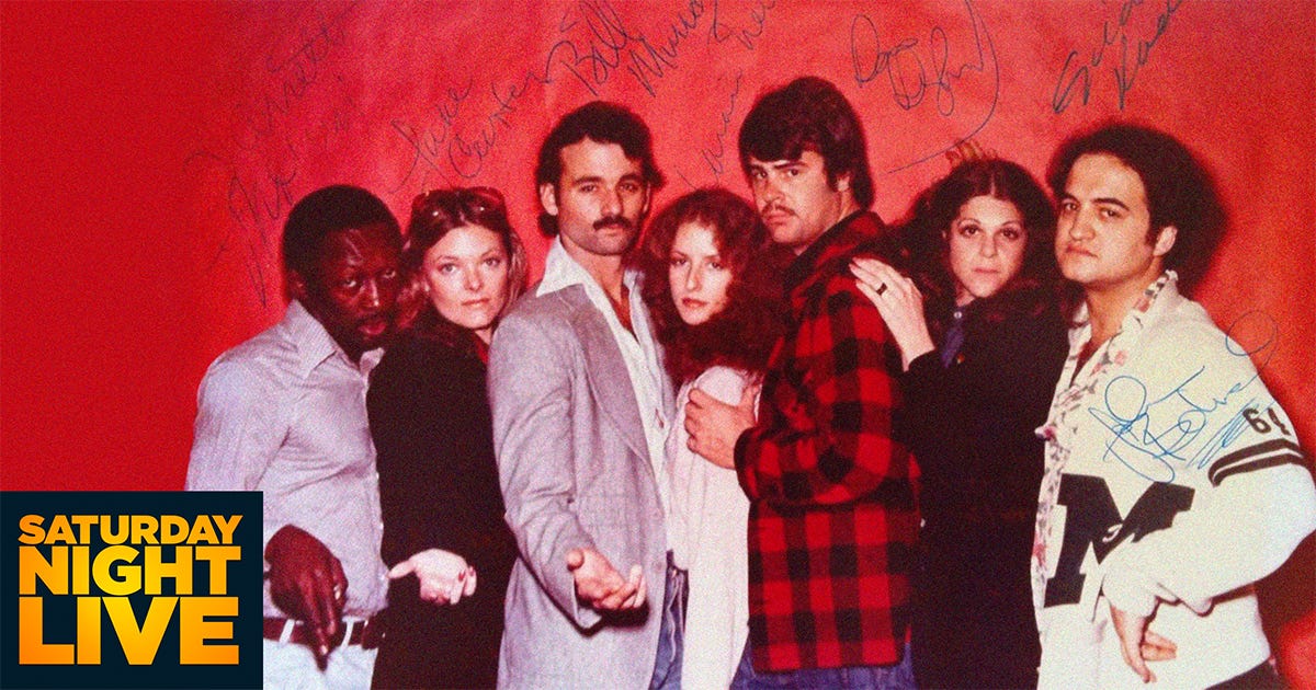
Saturday Night Live — Early Cast. Design, Art Direction, Creative Directions: Vazken Kalayjian. Executive Leadership: Mike Mohamad, Charles Blake, Elaine Zeitsoff. Department: NBC Network Advertising, On-Air Promotion and Marketing.
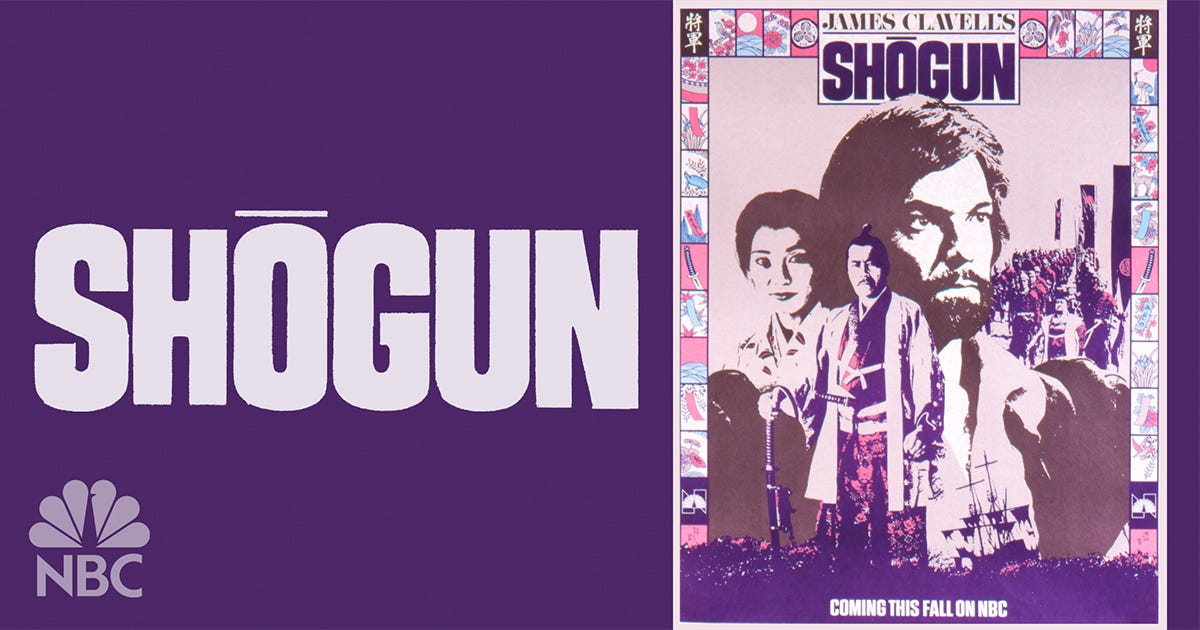
Design, Art Direction, Creative Directions: Vazken Kalayjian, Tetsuya Matsuura. Executive Leadership: Mike Mohamad, Charles Blake, Elaine Zeitsoff. Department: NBC Network Advertising, On-Air Promotion and Marketing.
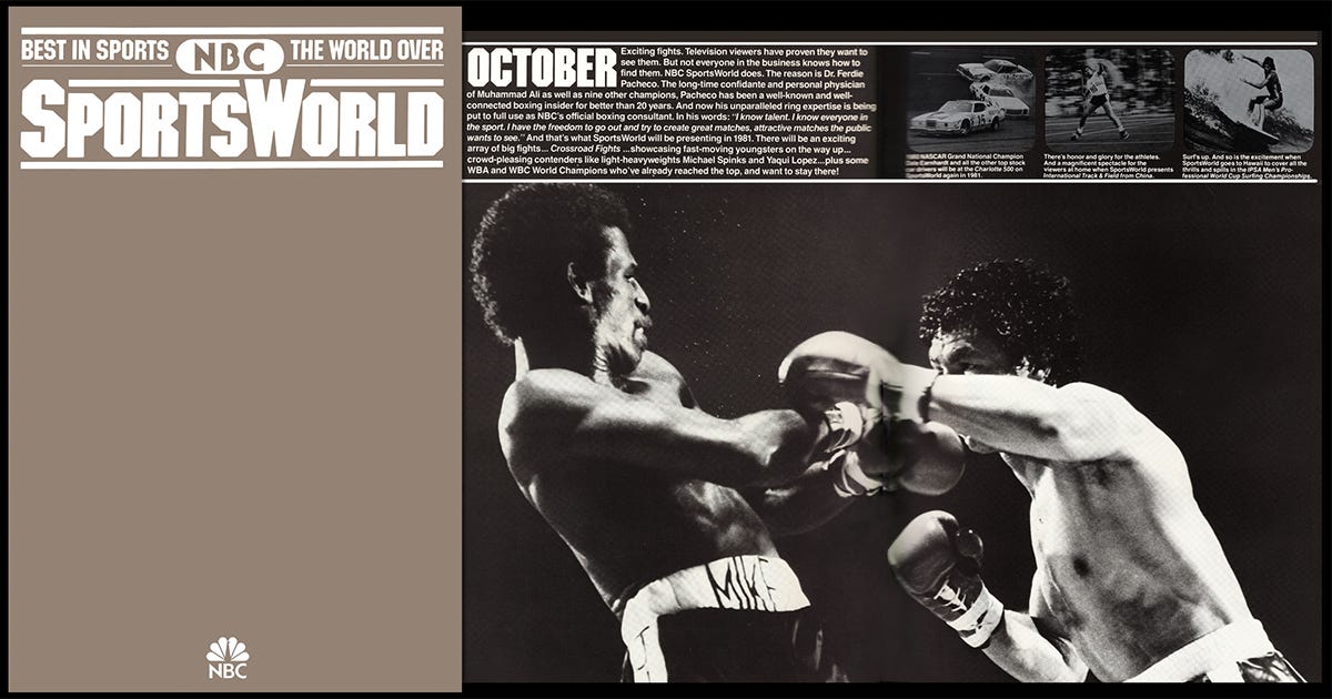
NBC SportsWorld. Design, Art Direction: Vazken Kalayjian, Tetsuya Matsuura. Executive Leadership: Mike Mohamad, Charles Blake, Elaine Zeitsoff. Department: NBC Network Advertising, On-Air Promotion and Marketing
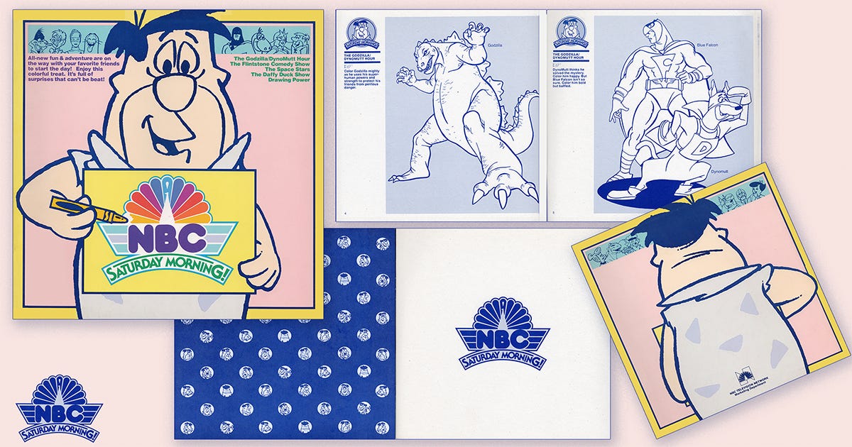
The Flintstones. Design, Art Direction: Vazken Kalayjian, Tetsuya Matsuura. Executive Leadership: Mike Mohamad, Charles Blake, Elaine Zeitsoff. Department: NBC Network Advertising, On-Air Promotion and Marketing. Lettering: Tom Carnase. Gerard Huerta.
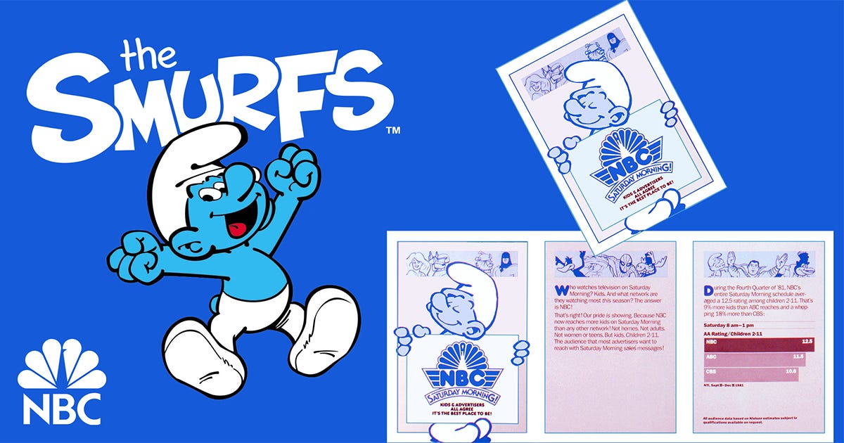
The Smurfs. Design, Art Direction, Creative Directions: Vazken Kalayjian. Executive Leadership: Mike Mohamad, Charles Blake, Elaine Zeitsoff. Department: NBC Network Advertising, On-Air Promotion and Marketing. Lettering: Tom Carnase.
Setting the Record Straight
Chermayeff & Geismar did not design the NBC Peacock.
Their involvement was limited to reducing the birds’ feathers from eleven to six.
The Peacock that became NBC’s identity was developed in-house by the NBC Network Advertising, On-Air Promotion and Marketing Department, including Mike Mohamad, Frank Pintauro, Buck Biggers, Charles Blake, Elaine Zeitsoff, and me, with lettering support from Tom Carnase.
Design history deserves accuracy.
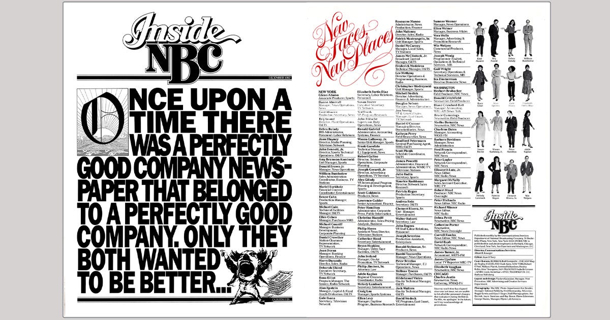
Inside NBC (Employee News): Before “employer branding” became a management discipline, NBC understood that culture is strategy made visible. Inside NBC, the employee news treated staff not as an internal audience but as stakeholders, using editorial rigor, design excellence, and transparency to align people around purpose, standards, and ambition. It stands as an early model of internal communications as a leadership tool, not an HR afterthought. Design, Art Direction, Creative Directions: Vazken Kalayjian. Executive Leadership: Mike Mohamad, Charles Blake, Elaine Zeitsoff. Department: NBC Network Advertising, On-Air Promotion and Marketing. Lettering: Tom Carnase and Gerard Huerta.
The Rebirth of the Peacock
We simplified the Peacock from eleven feathers to six, one color per division, to preserve clarity on broadcast screens and reinforce internal structure.
The Peacock wasn’t redesigned.
It was simplified.
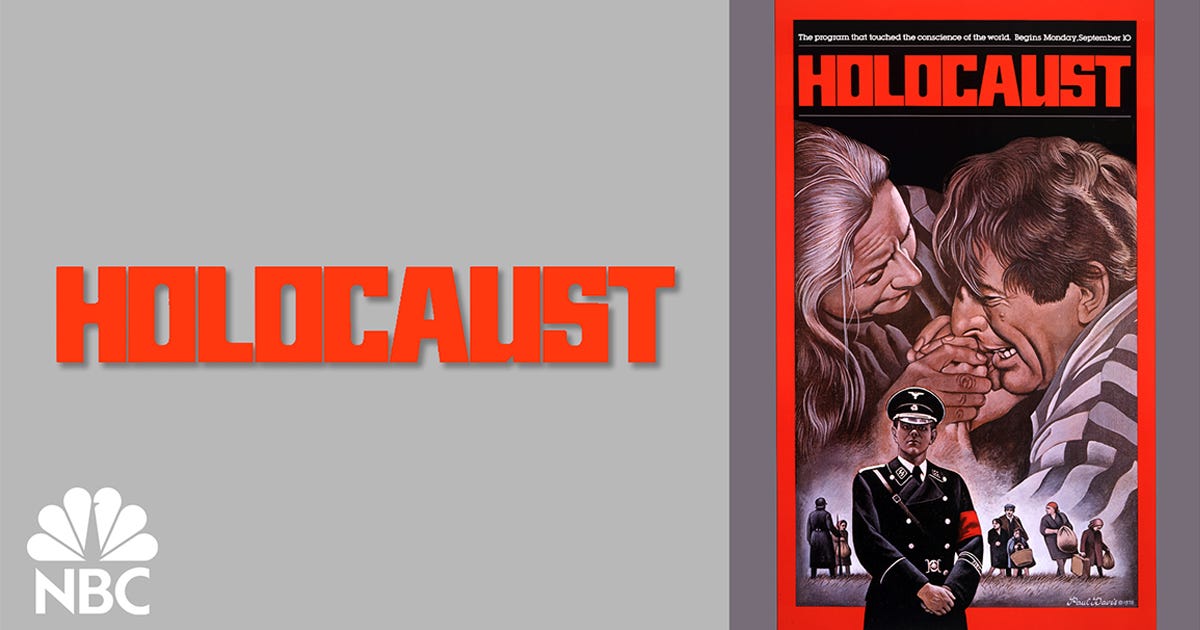
Holocaust: NBC’s broadcast of Holocaust demonstrated that moral authority can become brand equity. Trust deepens when a network risks discomfort in the service of truth. Design, Art Direction, Creative Directions: Vazken Kalayjian. Executive Leadership: Mike Mohamad, Charles Blake, Elaine Zeitsoff. Department: NBC Network Advertising, On-Air Promotion and Marketing. Illustration: Paul Davis.
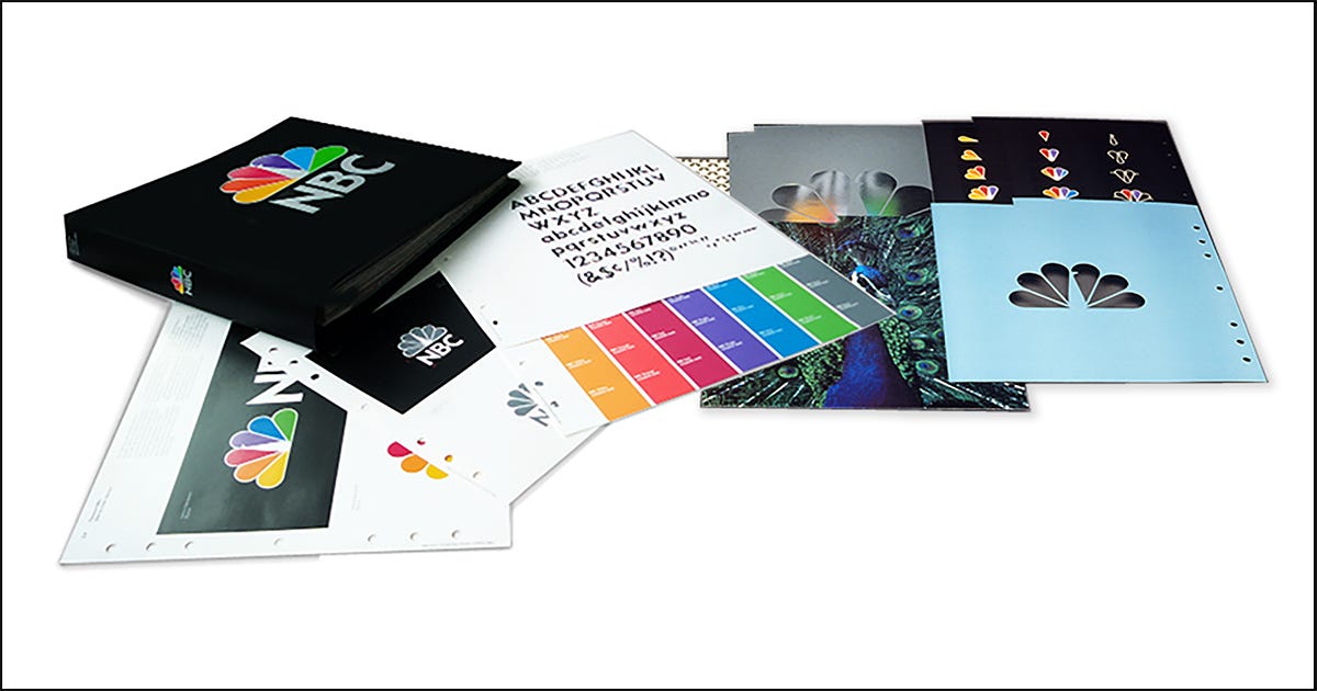
NBC Identity Standards Manual. Design, Art Direction, Creative Directions: Vazken Kalayjian. Executive Leadership: Mike Mohamad, Charles Blake, Elaine Zeitsoff. Department: NBC Network Advertising, On-Air Promotion and Marketing. Lettering: Tom Carnase.
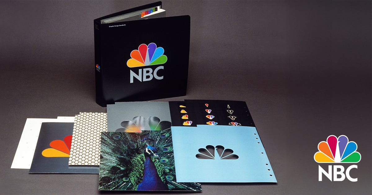
NBC Brand Standards Manual: Systematized identity governance ensured consistency across divisions while allowing creative variation. Design, Art Direction, Creative Directions: Vazken Kalayjian. Executive Leadership: Mike Mohamad, Charles Blake, Elaine Zeitsoff. Department: NBC Network Advertising, On-Air Promotion and Marketing. Lettering: Tom Carnase.

MSNBC initially benefited from NBC’s symbolic trust.
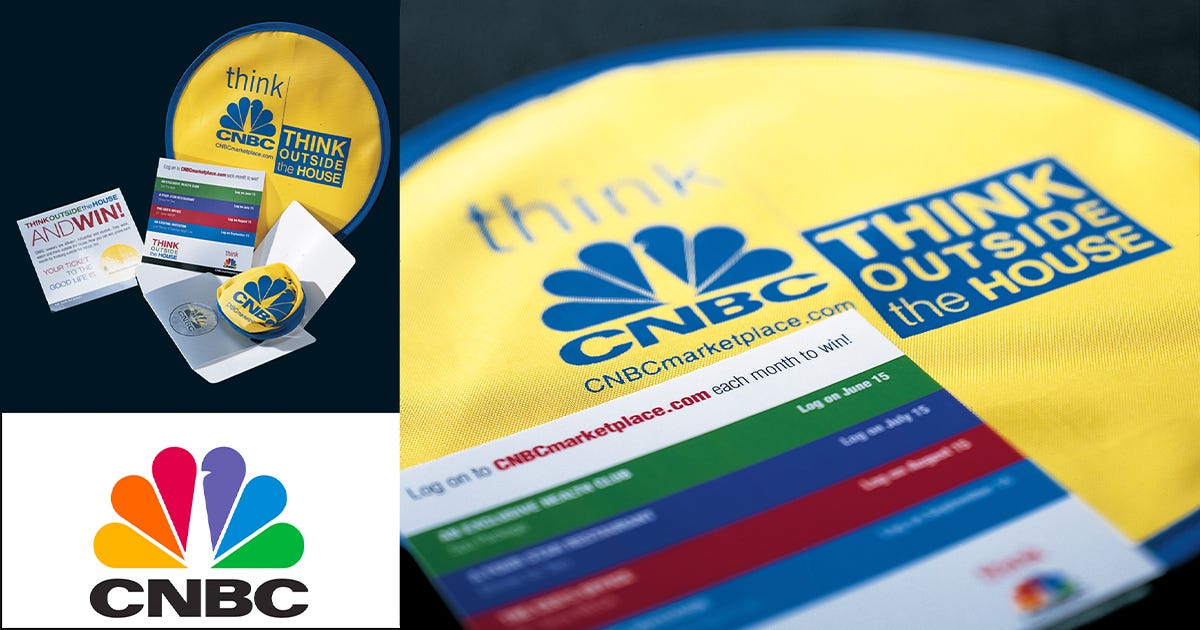
Successful launch of CNBC. Design, Art Direction, Creative Directions: Vazken Kalayjian. Executive Leadership: Mike Mohamad, Charles Blake, Elaine Zeitsoff. Department: NBC Network Advertising, On-Air Promotion and Marketing.
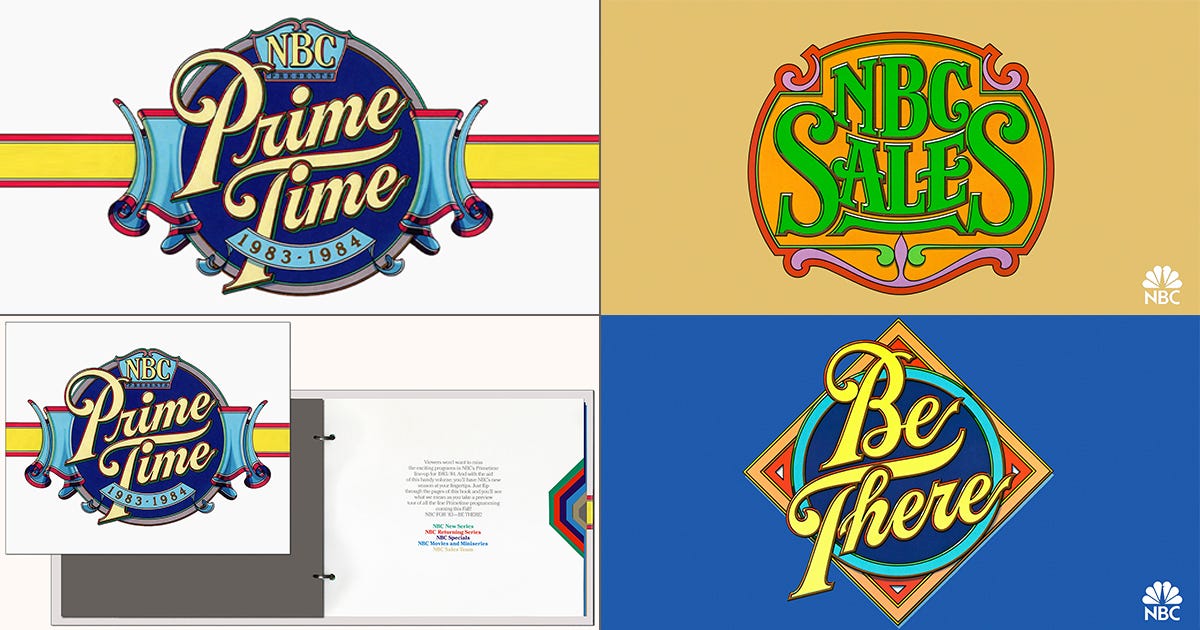
NBC Prime Time Launch. Design, Art Direction, Creative Directions: Vazken Kalayjian. Executive Leadership: Mike Mohamad, Charles Blake, Elaine Zeitsoff. Department: NBC Network Advertising, On-Air Promotion and Marketing. Lettering: Gerard Huerta.
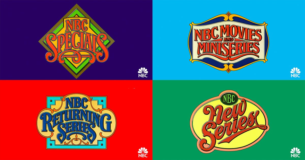
NBC Prime Time Launch. Specials / Movies / Miniseries / Returning Series. Design, Art Direction, Creative Directions: Vazken Kalayjian. Executive Leadership: Mike Mohamad, Charles Blake, Elaine Zeitsoff. Department: NBC Network Advertising, On-Air Promotion and Marketing. Lettering: Gerard Huerta.
From Third Place to Number One
NBC rose from third place to the most profitable network in America.
The million-dollar “N” vanished. The Peacock stayed.
Because audiences didn’t love a logo. They loved what it represented.
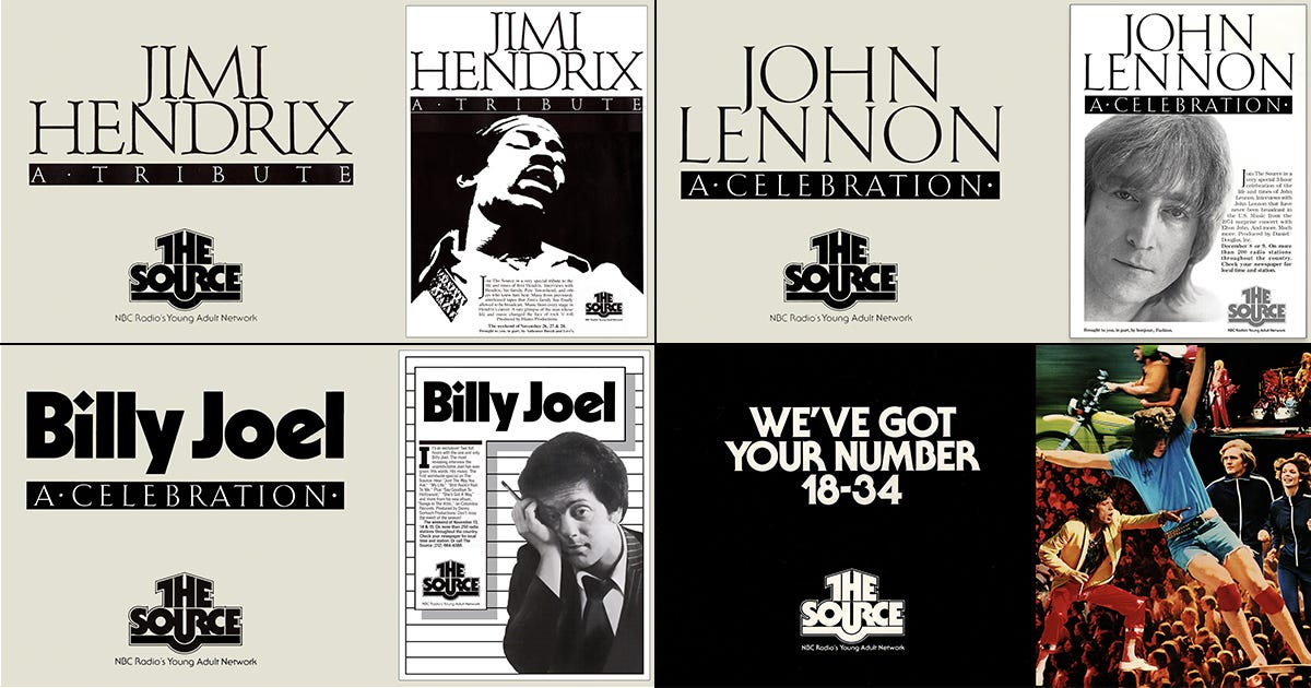
The Source (NBC Radio): An early experiment in youth-oriented audio branding, reflecting NBC’s multi-platform ambitions ahead of its time. Design, Art Direction, Creative Directions: Vazken Kalayjian. Executive Leadership: Mike Mohamad, Charles Blake, Elaine Zeitsoff. Department: NBC Network Advertising, On-Air Promotion and Marketing. Lettering: Tom Carnase.
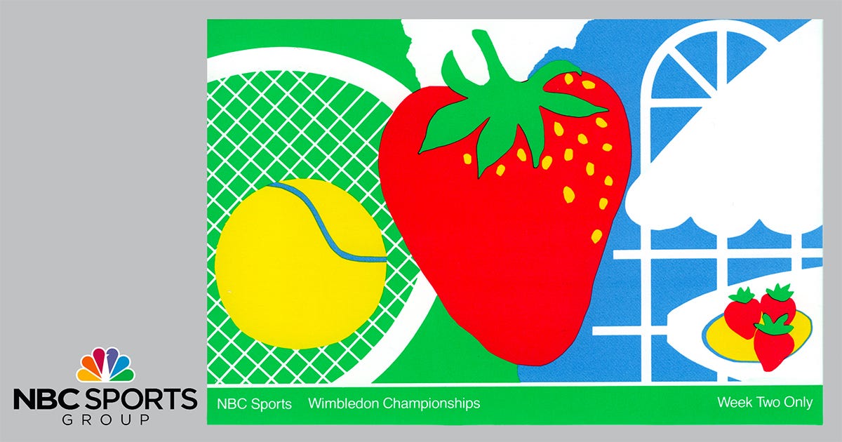
NBC’s Wimbledon coverage demonstrates how a strong master brand can flex across contexts without dilution. By translating tennis into a bold, symbolic visual language — court, ball, fruit, and tradition — NBC Sports reinforced its core promise: premium storytelling rooted in clarity, consistency, and respect for the audience. Brand systems work best when they elevate the event without overpowering it. Design, Art Direction, Creative Directions: Vazken Kalayjian. Executive Leadership: Mike Mohamad, Charles Blake, Elaine Zeitsoff. Department: NBC Network Advertising, On-Air Promotion and Marketing.

Dr. Ruth Westheimer: Distinctive personality branding extended trust through clarity, authority, and authentic voice. Design, Art Direction, Creative Directions: Vazken Kalayjian. Executive Leadership: Mike Mohamad, Charles Blake, Elaine Zeitsoff. Department: NBC Network Advertising, On-Air Promotion and Marketing. Lettering: Tom Carnase.
What This Story Means Today
In an era of AI-generated media, deepfakes, and algorithmic trust erosion, the Peacock offers a lesson:
Trust is not created by technology. It is accumulated through consistency, memory, and restraint.
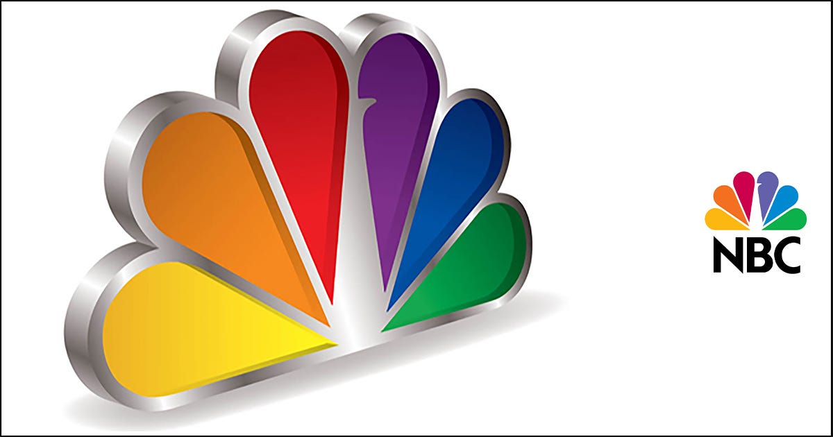
Three-Dimensional NBC Peacock Mark: Dimensional execution reinforced clarity, hierarchy, and confidence across physical and digital environments. Design, Art Direction, Creative Directions: Vazken Kalayjian. Executive Leadership: Mike Mohamad, Charles Blake, Elaine Zeitsoff. Department: NBC Network Advertising, On-Air Promotion and Marketing.
Epilogue: Still Flying
Some symbols outlive the companies that own them.
Because they live in the audience.
Still bright. Still proud. Still iconic. Still flying.
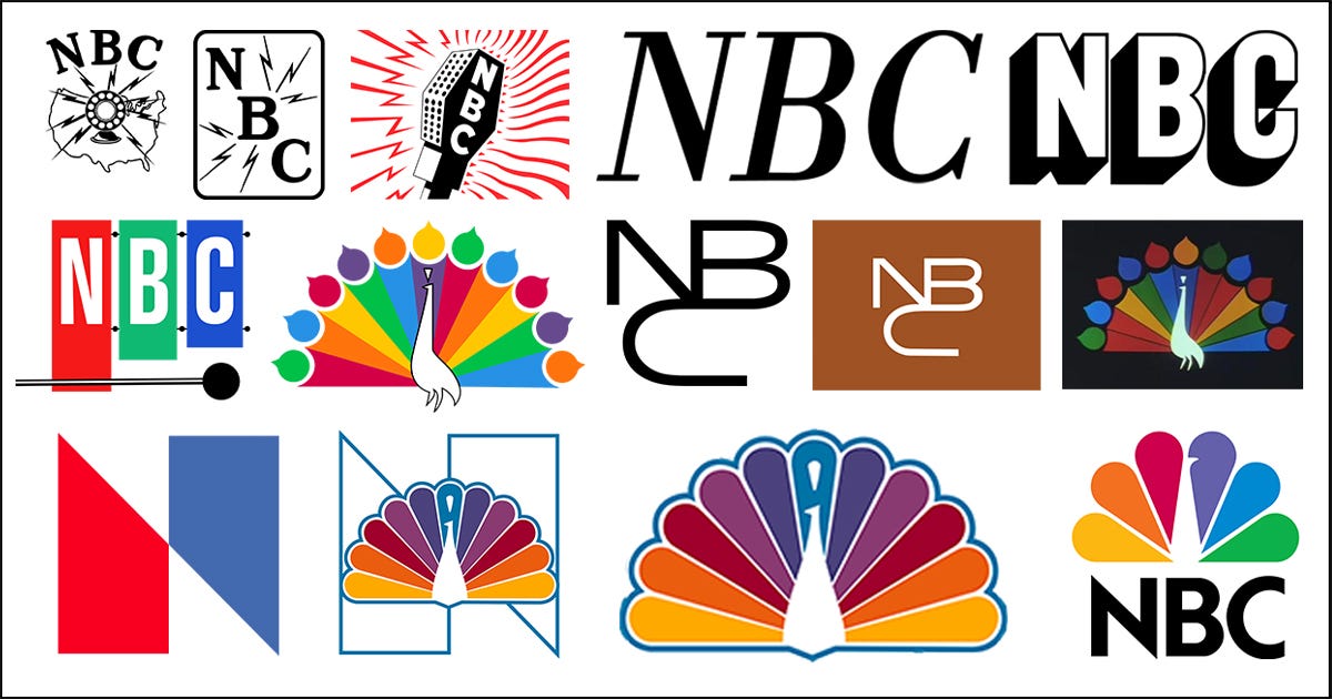
The Evolution of the NBC Logo: 1926–1931: Early radio-era marks emphasizing signal strength and broadcast reach rather than brand personality. 1931–1943: Microphone and lightning-bolt symbols reflecting Art Deco aesthetics and NBC’s technological authority in radio. 1943–1954: Typographic NBC wordmarks signaling institutional consolidation during wartime and early television. 1954–1956: The abstract “X” television logo — conceptually modern, but emotionally disconnected from audiences. 1956–1975: The original 11-feather Peacock was introduced to signal NBC’s leadership in color television and RCA technology. 1975–1979: The patriotic red-white-and-blue “N,” aligned with the bicentennial era but failing to displace audience attachment to the Peacock. 1979–1986: The modern 6-feather Peacock — simplified, scalable, and emotionally resonant — restoring coherence and meaning to the brand. 1986–1993: Refined Peacock and wordmark integration, standardizing the identity across divisions. 1993–2011: Dimensional and metallic Peacock treatments reflecting the digital broadcast and on-air graphics era. 2011–2013: Transitional flattening as NBC adapted to emerging digital and mobile platforms. 2013–2020: A fully flat, minimal Peacock optimized for multi-platform and global consistency. 2020–Present: The current Peacock — durable, flexible, and trust-laden — is designed for streaming, apps, and AI-mediated environments.
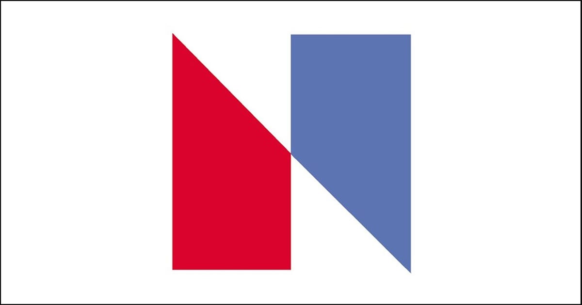
The 1975 NBC “N” Logo, designed by Lippincott & Margulies, featured a patriotic red-and-blue “N” that sought modern abstraction during America’s bicentennial. Strategically, it failed: audiences never transferred emotional meaning from the Peacock, and the mark became entangled in a legal dispute with Nebraska Educational Television over visual similarity. The lawsuit was settled, the logo quietly abandoned, and the episode stands as a cautionary case — symbolic novelty without audience meaning or legal foresight weakens, rather than advances, brand equity.
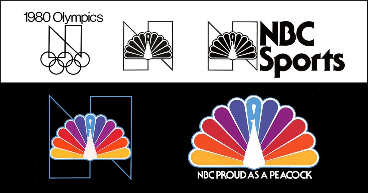
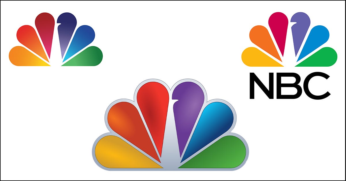
Evolution of the NBC Peacock: From color-era signal to primary brand asset, the Peacock’s evolution reflects continuity rather than reinvention.
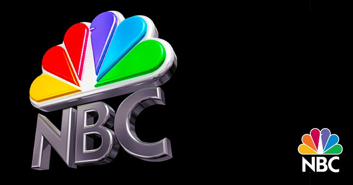
Three-Dimensional NBC Peacock Mark: Dimensional execution reinforced clarity, hierarchy, and confidence across physical and digital environments. Design, Art Direction, Creative Directions: Vazken Kalayjian. Executive Leadership: Mike Mohamad, Charles Blake, Elaine Zeitsoff. Department: NBC Network Advertising, On-Air Promotion and Marketing.
NBC Logo History — Ultra-Precise
NBC’s logo history is often told loosely, and that’s how people end up mixing up two completely different “snake/N” chapters. Here is the clean, precise version, with what changed and why. (Wikipedia)
NBC’s earliest marks, dating back to 1926, were radio-era insignia: microphones, lightning bolts, seals, and typographic badges designed for print, stations, and signal authority. (Wikipedia)
In 1956, NBC introduced the original Peacock as an on-air device to signal that programs were being broadcast in color. This is the root of the audience “memory imprint” I’m describing: it wasn’t just a mark; it was a ritual that meant modernity had arrived in your living room. (Wikipedia)
Now comes the first confusion point:
Beginning in 1959, NBC used an animated typographic monogram that assembled itself into an “NBC” configuration. This is historically known as the “NBC Snake.” It ran in an era when NBC was building a cohesive on-air broadcast identity, alongside other idents. (Wikipedia)
In a major modernization push, NBC retained Lippincott & Margulies to create a standardized identity system across divisions. The centerpiece was an abstract geometric “N” made of two trapezoids — one red and one blue — officially debuting on-air on January 1, 1976, at the start of the U.S. Bicentennial year. The logo was also notable as one of the first electronically animated idents used by a U.S. television network. (Wikipedia)
In February 1976, the Nebraska ETV Network (now Nebraska Public Media) filed a trademark-infringement lawsuit against NBC over the “N.” This is the collision I’m describing — the humiliation of money, scale, and corporate showmanship colliding with a small organization that already bore a similar mark. (Wikipedia)
NBC then introduced a more dimensional, more “flag-like” version of the “N,” commonly referred to as the “Proud N.” This is the chapter I call the failed patriotic “N”—the one that, inside the building, became shorthand for a corporate-branding overreach and the aftertaste of embarrassment. (Wikipedia)
NBC’s Peacock didn’t just “return.” It rose in status, from beloved on-air memory to the core emblem the brand could actually stand behind. Wikipedia’s timeline captures a crucial nuance: the Peacock became part of NBC’s primary logo in 1979, a simplified modern Peacock was unveiled in 1986, and the Peacock became NBC’s sole, universally used logo by the fall of 1988. (Wikipedia)
From there, the evolution becomes about the realities of media technology: refinement for broadcast standards, then for digital screens, then for contemporary interface systems — modernization without losing the symbol itself. (Wikipedia)
Finally, to anchor the opening scene in current reality: MSNBC’s Rebrand to “MS NOW” and the retirement of the Peacock are being framed publicly as part of Comcast’s cable-network spinoff into a new entity called Versant. This separation requires moving away from NBC’s trademarks and identity system. (AP News)
Mapping the Rebrand Cases Against My NBC Thesis
A comparison table (credibility collapse vs. meaning recovery)
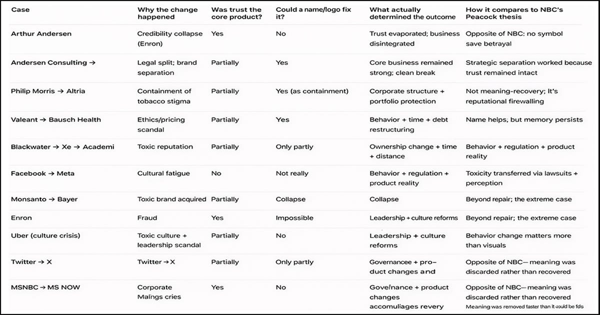
In other words, not every name change can salvage a damaged brand. This chart shows that when trust erodes or the core product is compromised, merely changing the logo or name rarely resolves the underlying issue. NBC’s Peacock thesis — where a symbol accrues meaning through consistent behavior — stands in contrast to these cases where reputation was too broken for a rebrand to fix.
Rebranding works best when it is not used to hide, deflect, or launder, but to return to meaning already owned by the audience. NBC didn’t manufacture love. It recognized where love already lived — and built the system around that truth.
NBC rebuilt power by returning to meaning the audience already trusted; MS NOW weakens power by discarding meaning without replacing it. –Vazken Kalayjian
NBC’s recovery through the Peacock was an act of strategic humility: the organization listened to its audience, recognized where meaning already lived, and rebuilt its identity around that truth.
MS NOW represents the inverse impulse. Faced with structural change, it abandoned accumulated meaning without offering a credible replacement, mistaking abstraction for neutrality and minimalism for authority. One strategy restored trust by honoring memory; the other diluted trust by assuming memory could be reset. In trust-based institutions, that difference is decisive.
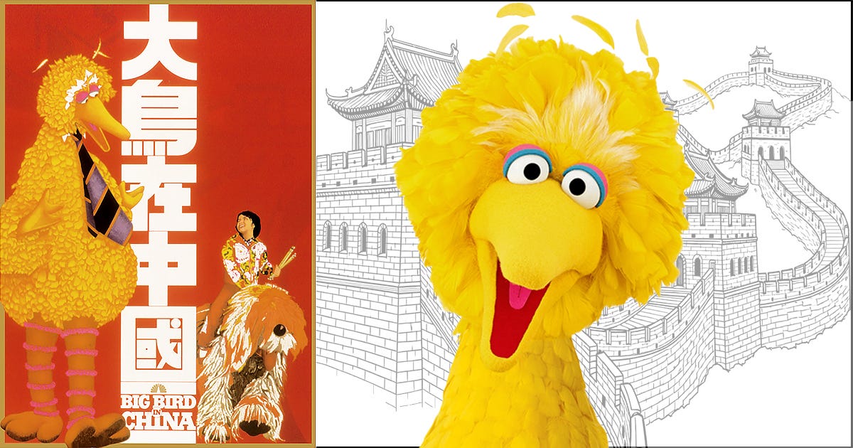
Sesame Street’s Big Bird in China: NBC’s broader ecosystem participated in cultural diplomacy, extending trust across borders through familiar symbols. Design, Art Direction, Creative Directions: Vazken Kalayjian. Executive Leadership: Mike Mohamad, Charles Blake, Elaine Zeitsoff. Department: NBC Network Advertising, On-Air Promotion and Marketing.
🔔 If you found this story valuable, please clap — 👏 up to 50 times. Your engagement helps thoughtful work reach the right readers. Feel free to comment, and subscribe to me on Medium — Vazken Kalayjian — for more explorations at the intersection of history, branding, design, trust, and meaning.
Glossary: Brand Identity: The integrated system of symbols, language, design, and behavior through which an organization is recognized and remembered. Brand Value: The economic and cultural value created when trust, recognition, and preference translate into performance — revenue, talent attraction, advertiser confidence, and long-term equity. On-Air Identity (Broadcast): Visual and auditory elements used between programs — logos, idents, transitions — that shape audience perception subconsciously over time. Rebranding: A structural change in name, identity, or positioning that reflects a fundamental shift in ownership, behavior, leadership, or strategy — not cosmetic change alone. Trust as Product: Industries where credibility itself is the primary value proposition (e.g., news, accounting, finance, medicine).
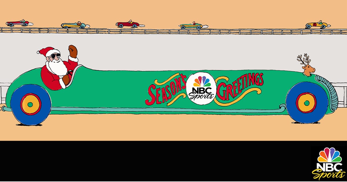
NBC Sports Holiday Card: The Peacock adapted across divisions without losing coherence — an indicator of a functioning identity system. Design, Art Direction, Creative Directions: Vazken Kalayjian. Executive Leadership: Mike Mohamad, Charles Blake, Elaine Zeitsoff. Department: NBC Network Advertising, On-Air Promotion and Marketing. Illustration: Seymour Chwast.
Sources & Reference:
- NBC Logo History & Peacock Timeline — Wikipedia (NBC identity chronology, Peacock introductions, “Snake,” “N,” and trademark history)
- Arthur Andersen / Enron Collapse — U.S. Department of Justice records; Supreme Court ruling (2005); business ethics case studies
- MSNBC → MS NOW / Comcast Spinoff (Versant) — AP News reporting on Comcast cable-network restructuring
- Diego Rivera / Rockefeller Center Mural — Wikipedia; Museum of Modern Art archives
- Grant Tinker Era / NBC Rise — Broadcast industry histories; Nielsen ratings archives (late 1970s–1980s)
NBC Work Attribution: All NBC branding, on-air, advertising, and promotional work referenced in this article was developed by the NBC Advertising, On-Air, Marketing, and Promotion Department. Design, Art Direction, Creative Direction: Vazken Kalayjian. Executive Leadership: Mike Mohamad, Charles Blake, Elaine Zeitsoff. Department: NBC Network Advertising, On-Air Promotion and Marketing. Lettering: Tom Carnase and Gerard Huerta. Illustration: Paul Davis, Seymour Chwast.
Photo Credit: Visuals developed by the author using AI image generation, digital editing, and conceptual art direction, informed by historical reference imagery and created for educational and transformative use.
Trademark Notice: NBC, the NBC Peacock, MSNBC, MS NOW, and all referenced program titles are trademarks of their respective owners and are used here for editorial and historical commentary under fair-use principles. All original text and visual interpretations © Vazken Kalayjian. All Rights Reserved.
메타데이터
- post_id
- 9f6709596e3e
- slug
- why-the-nbc-peacock-worked-and-why-most-rebrands-fail-9f6709596e3e
- url
- https://medium.com/@kalayjian/why-the-nbc-peacock-worked-and-why-most-rebrands-fail-9f6709596e3e
- canonical_url
- https://medium.com/@kalayjian/why-the-nbc-peacock-worked-and-why-most-rebrands-fail-9f6709596e3e
- author_url
- https://medium.com/@kalayjian
- status
- ok
- fetched_at
- 2026-06-26 06:47:43