The Crocodile Strikes Back
A brand is only as strong as the story behind it. Lacoste is dipping back into its archives for new stories to tell.
The Crocodile Strikes Back
A brand is only as strong as the story behind it. Lacoste is dipping back into its archives for new stories to tell.
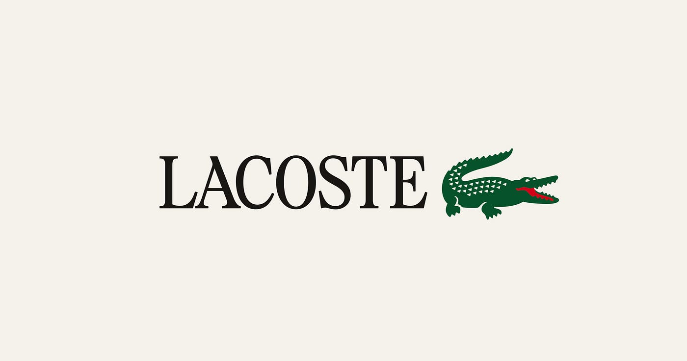
Lacoste has recently gone back to its roots with a refreshed global visual identity to reconnect the brand with its own heritage.
The move reflects a trend among heritage labels striving to stand out by changing lanes. The brand is attempting to detach itself from the mass-market “athleisure” sector and align with the “quiet luxury” movement that prioritizes narrative and cultural relevance.
The rebranding, developed with London based Commission Studio, centers on a return to the company’s 1930s origins. Drawing on the wealth of its archives and the earlier creations of René Lacoste and his “creative sidekick” Robert George, the brand returns to the codes that have shaped its identity, reviving details, colors, and typography rooted in the brand’s origins.
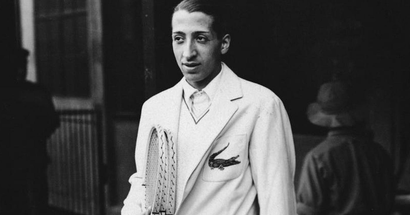
At 18, René Lacoste was studying at the Polytechnic School in Bordeaux. Like his father, his real passion was sport and tennis took up most of his time. That passion led him to leave his studies behind and pursue a life in sport. Match after match, he climbed to the top of the world rankings, claiming seven Grand Slam titles along the way.
The nickname that would define him came from an unusual bet. In a 1923 tournament, his team captain promised him a crocodile leather suitcase the player admired in a store window if he won his next match. Although he lost, the American press was struck by his tenacity and christened him “the crocodile”. René took on the nickname, asking his friend and stylist Robert George to embroider a crocodile onto his court jackets.
A few years later, the polo entered the scene. The crocodile over the heart made Lacoste the first brand to display a visible logo on an article of clothing.
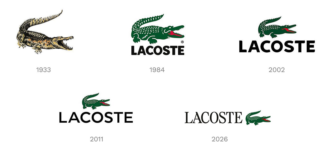
The current iconic crocodile hasn’t changed much from the 2011 version but it did gain prominance within the branding. The sticking red tongue detail appears in certain versions, a small contribution to the spirit of freedom and playfulness that defines Lacoste.
The crocodile moves from a stacked position above the wordmark to a horizontal placement, almost like a punctuation mark ending a sentence, gaining both prominence and better flexibility across applications. It also seems to have gained increased usage as a standalone mark.
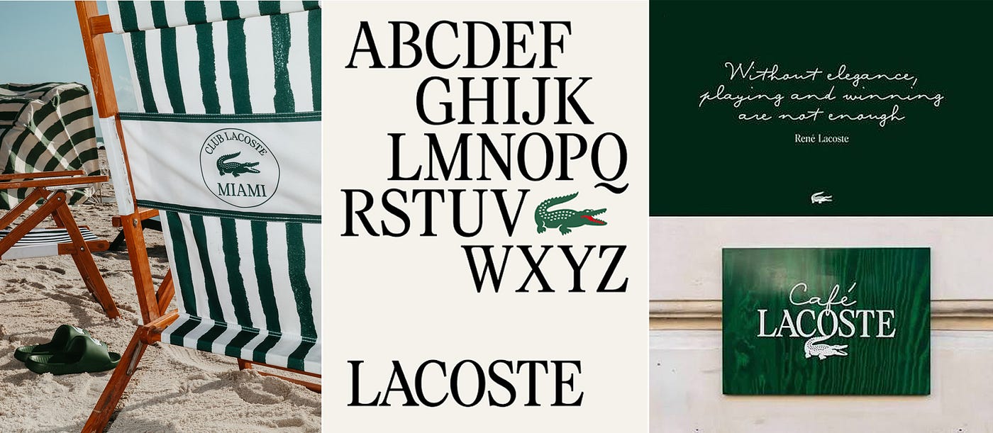
Typography, on the other hand, seems to be the main driving force within the re-branding.
The Lacoste wordmark shifts from a neutral sans-serif to a bespoke serif developed in collaboration with Möbel Type. The font takes inspiration from early 20th century French serifs, updated by condensed forms, sharp tapers and subtle, stencil-like gaps.
A companion script, based on René Lacoste’s handwriting, further enriches this visual language. Introduced in selected brand applications, notably within the Café Lacoste logotype, it brings a more personal dimension, directly connected to the origins.
This shift within branded applications signals that the visual shift is not merely cosmetic but designed to support a lifestyle expansion beyond its core sportswear business.
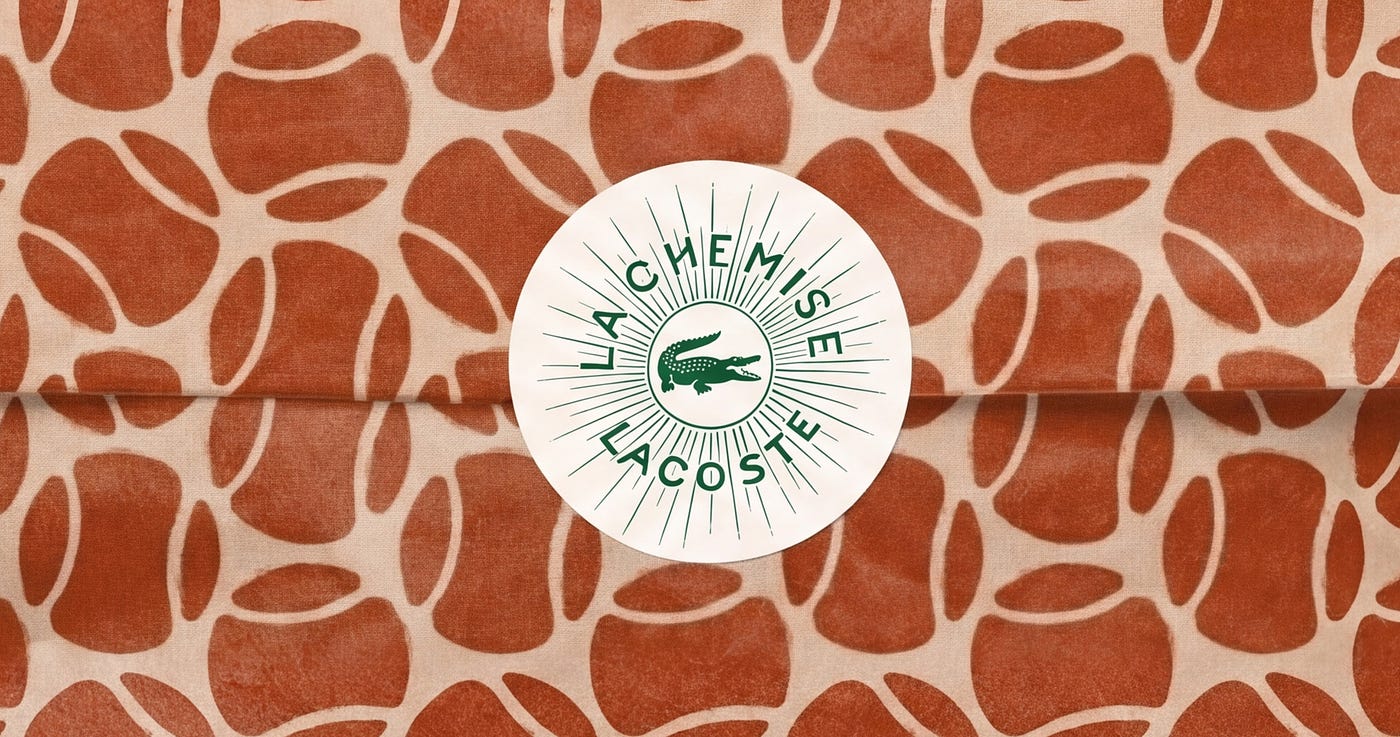
The colour palette places greater emphasis on the brand’s historic hues. The palette features the iconic green, refined to its original hue in three shades, alongside clay, echoing tennis courts, and farine, a tribute to the off-white of René Lacoste’s first blazer.
This visual language is further enriched by motifs inspired by the graphic archives, in line with the work of Robert George, and drawing from the brand’s territories and codes: tennis, golf and the crocodile of course.
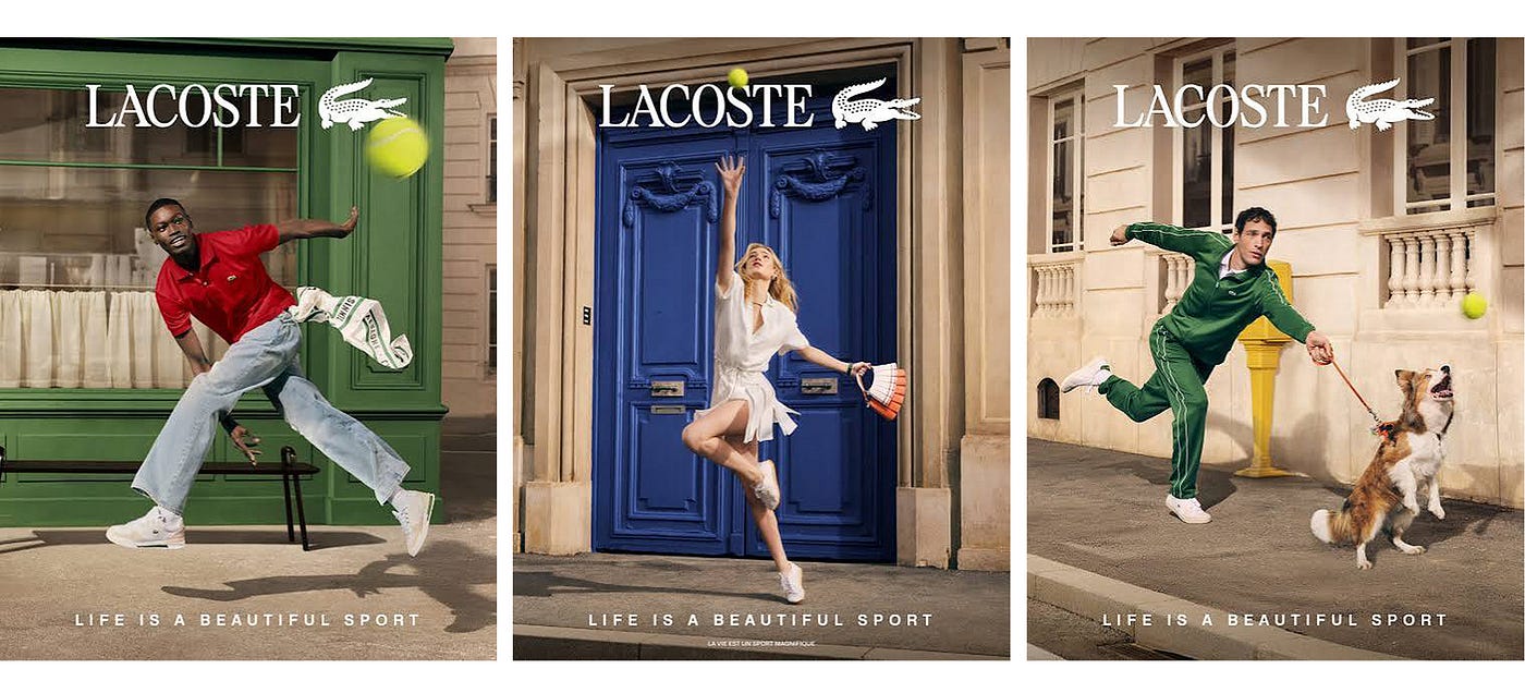
The campaign deserves a mention too. The tagline “Life is a Beautiful Sport” clearly states that Lacoste is still into sports but going into a more lifestyle direction.
The imagery does exactly what the identity asks of it. It feels rooted yet still fresh and dynamic. It preserves the brand’s close ties with tennis. There’s a sense that the brand knows where it came from and isn’t anxious about where it’s going.
The new identity will roll out gradually and given the scale of the brand, that’s no small operation. The bigger question is whether the repositioning holds up beyond the visual layer. Heritage is a compelling story, but consumers are getting better at telling the difference between a brand that has earned its history and one that’s simply leaning on it. There are good signs that Lacoste seems to be aware of that. Whether the product and sustainability side keeps pace with the new visual ambition remains to be seen.
Hi, I’m Elif, a brand designer and art director based in the Netherlands. You can follow me on Medium or connect with me on LinkedIn.
메타데이터
- post_id
- a6e9822ab0ae
- slug
- the-crocodile-strikes-back-a6e9822ab0ae
- url
- https://medium.com/@elifkavalci/the-crocodile-strikes-back-a6e9822ab0ae
- canonical_url
- https://medium.com/@elifkavalci/the-crocodile-strikes-back-a6e9822ab0ae
- author_url
- https://medium.com/@elifkavalci
- status
- ok
- fetched_at
- 2026-06-21 12:17:11