FWP Creative Suite Capstone Case Study
A full rebrand and digital overhaul for a Florida community theatre.
FWP Creative Suite Capstone Case Study
A full rebrand and digital overhaul for a Florida community theatre.
Date
Spring 2026
Roles
Nicole: Co-Lead WordPress Developer
Nicole works closely with Grace to redesign the organizations website. Together, they focus on creating a modern, mobile-responsive, and user-friendly experience. She develops and customizes WordPress themes and plugins to reflect the new branding, integrates and evaluates on-site ticketing options for streamlined patron access, and optimized site performance for reliability.
Grace: Co-Lead WordPress Developer
Grace works closely with Nicole on both the website redesign and the evaluation and re-implementation of FWP’s ticketing system. She collaborates on developing and refining site structure and content organization, and works alongside Nicole to evaluate, select, and integrate the most cost-efficient and functional third-party ticketing system.
Sharayah: Lead Project Manager
Sharayah is responsible for overseeing project completion, including goal alignment, timeline reinforcement, and internal communication initiatives. She also supports UX research and QA of digital assets. She works closely with her team members to create and review creative assets and maintain visual consistency across the theater’s digital materials.
Nicholas: Lead Media Specialist — Print and Digital Creatives
Nicholas is handling the strategy and design of public-facing digital and print media, including social media, advertising, show posters, business cards, and merch. Using the new branding suite, he will create a system of guidelines and templates that will allow the client to consistently create on-brand, diverse content to reach their audience of patrons and volunteers more effectively.
All Team Responsibilities: Research, project brief and pitches, and presentations
Project Overview
The Francis Wilson Playhouse in Clearwater, Florida has struggled for several years to modernize its branding, visual identity, and website. The FWP Creative Suite was developed to bring the theatre’s visual presence into the modern age, with a focus on accessibility, usability, and celebrating its nearly century-long legacy.
The Problem
Drawing on Co-Lead WordPress Developer Nicole’s long-standing involvement with FWP, this project addresses a disconnect between the theatre’s artistic strength and its outdated, inconsistent external communications. A lack of unified visual identity, usability limitations, and inconsistent social media presence have hindered audience growth, accessibility, and overall brand credibility.
The FWP Creative Suite responds to these challenges with a cohesive design system, featuring a new brand identity, modernized visuals, and a user-friendly website to strengthen FWP’s public image and better connect with both longtime patrons and new audiences.
The Solution
Visual Style
Our first step was to create a new visual style system to serve as the foundation for the entire Creative Suite. These efforts were led by Sharayah, who presented the client with a color palette featuring rich tones, a few lighter options for contrast, and a striking CTA color. Using Coolors, multiple combinations were explored before finalizing the official palette: Curtain Call Red, Velvet Plum, Encore Champagne, Clearwater Blue, and Marquee Ivory.
Press enter or click to view image in full size
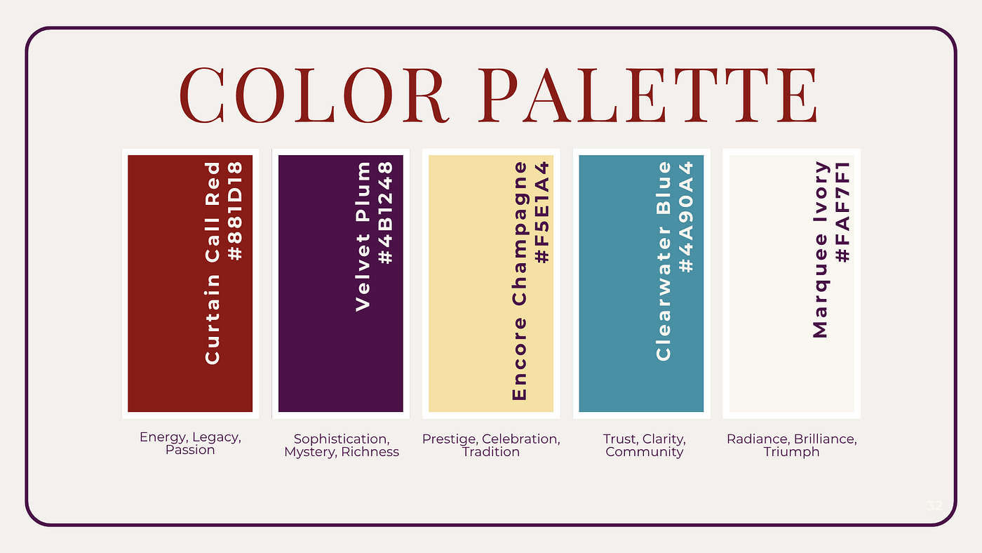
The new Francis Wilson Playhouse Color Palette.
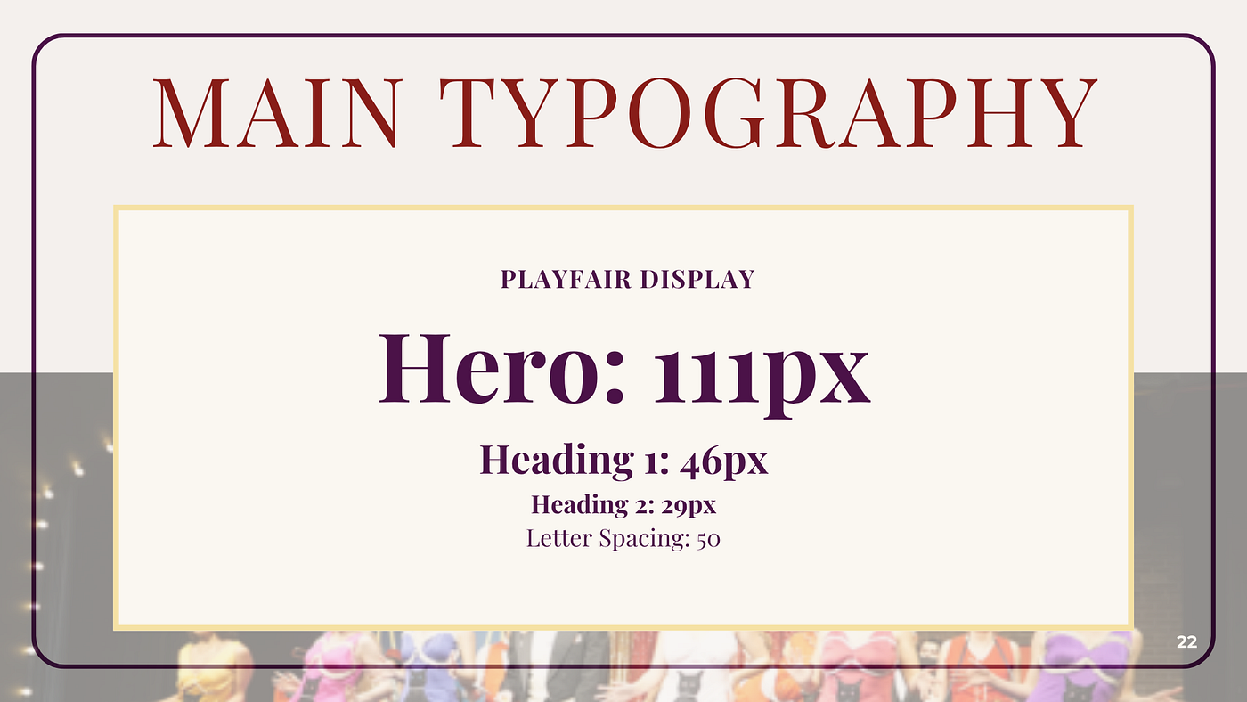
After the client approved the color palette, Sharayah moved on to typography. The final selection included Playfair Display for H1–H2, the logo, and hero banners, and Montserrat for H3–H5 and body copy, striking a balance between elegance and readability.
Press enter or click to view image in full size
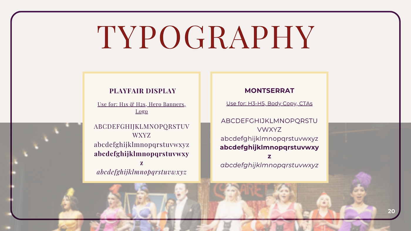
The two main Francis Wilson Playhouse typefaces.
Press enter or click to view image in full size
Press enter or click to view image in full size
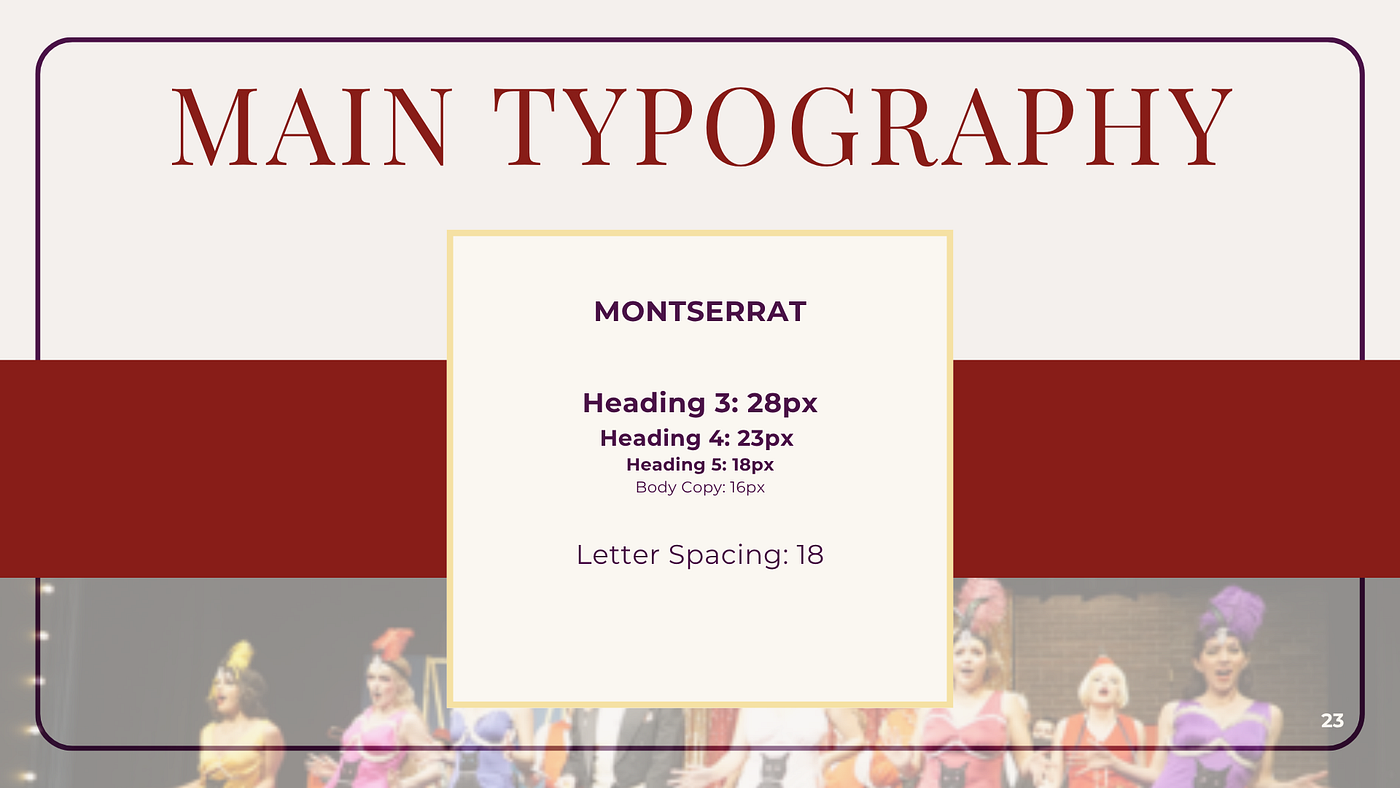
Use cases for both fonts
Logo
The theatre’s original logo was a simple black and white text logo, which lacked the creative energy they wanted their branding to portray.
Press enter or click to view image in full size
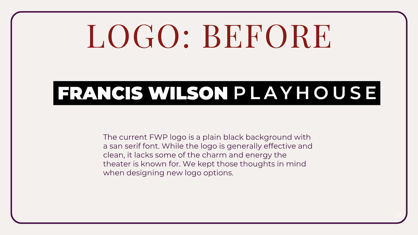
Original Francis Wilson Playhouse logo
Our Co-Lead WordPress Developer, Grace, used the approved colors and typefaces to create the first draft of the theatre’s new logo.

First draft of the FWP logo.
After client feedback requesting a cleaner, less busy look, Grace developed several alternate logo options using different display fonts.
Press enter or click to view image in full size
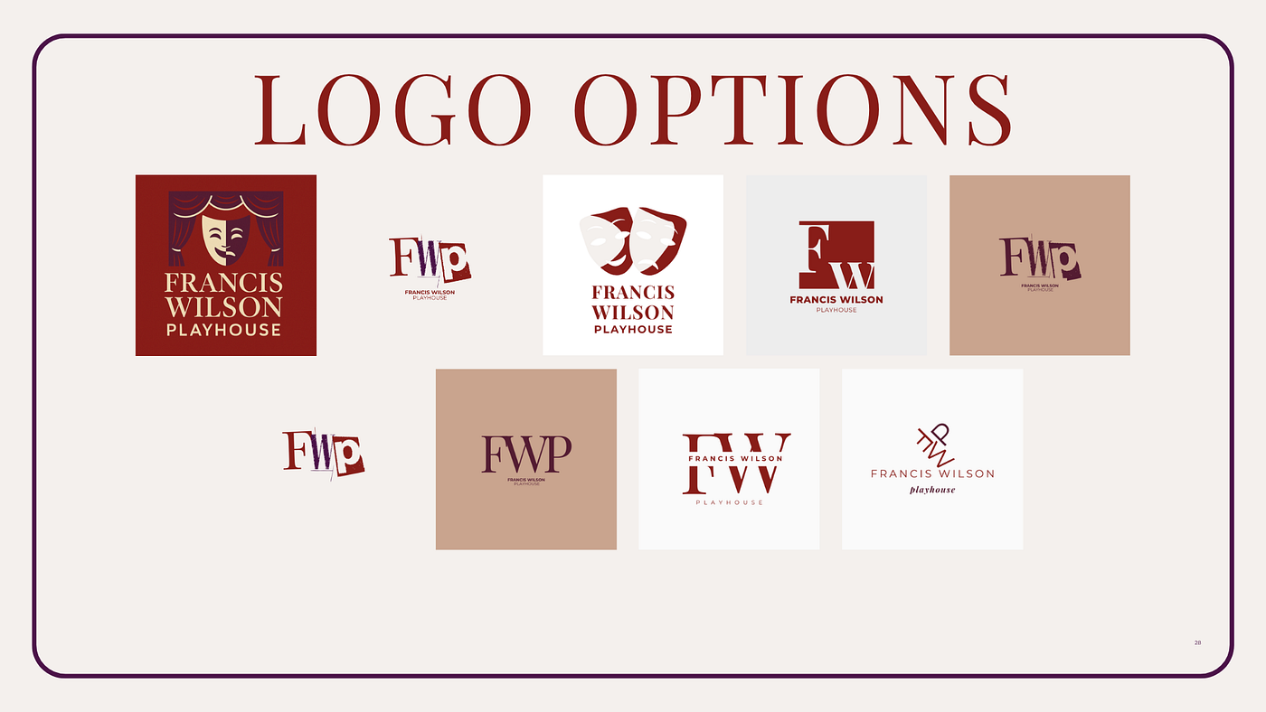
Logo options presented to the theatre.
Narrowing down the new logo was largely a collaborative process between Grace and FWP. Several stakeholders at the Playhouse expressed that they preferred the purely text-based logos with lighter background colors. They also preferred the logo text that blended both the Curtain Call Red and Velvet Plum colors.
After a bit of back and forth, the theatre ultimately chose the design featuring a creative-leaning display font called Drunken Hour.
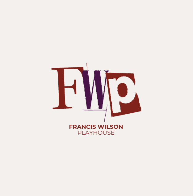
Final approved logo design.
Grace also developed color variations for Nicholas to use in creatives.
Press enter or click to view image in full size
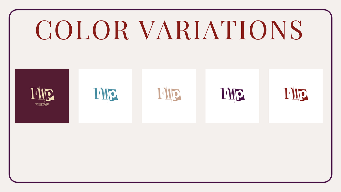
Color variations of the FWP logo.
With an approved logo, palette, and type system, we built out a comprehensive design system, including visual and editorial guidelines, example content, and brand “dos and don’ts.”
Press enter or click to view image in full size

New visual guidelines for the theatre.
Press enter or click to view image in full size
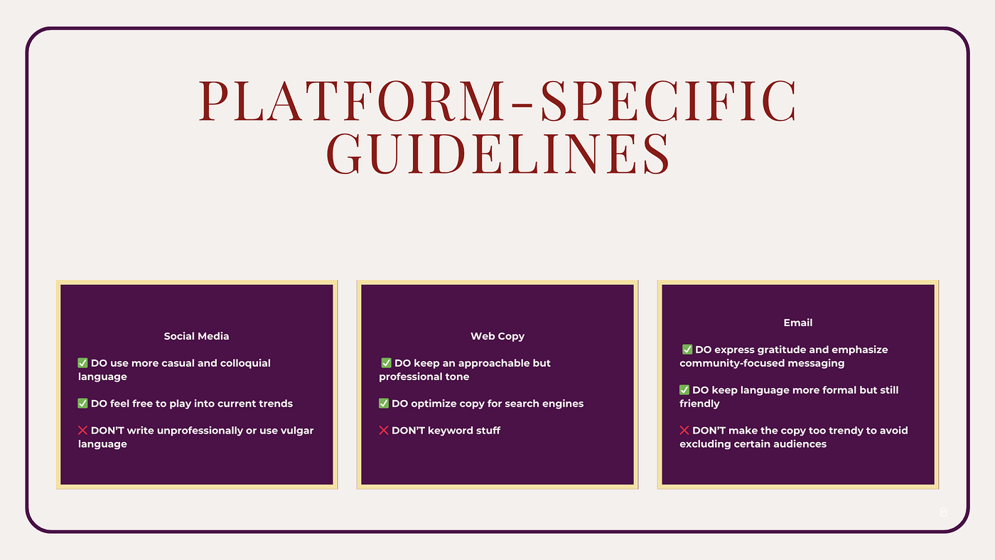
Platform-specific editorial content guidelines for the theatre.
Website
With the main style guidelines in place, Grace and Nicole began designing the new website. They selected the City Town WordPress theme for its clean interface and flexibility.
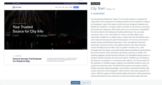
A preview of the City Town WordPress Theme.
Their first goal was to build a homepage centered around key user actions, including a scrollable gallery with CTA buttons, an Instagram feed, and a MailChimp signup form. This was their initial homepage prototype:
Press enter or click to view image in full size
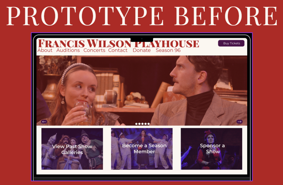
Our initial vision for the website’s homepage. Made in Figma.
After building more of the website’s structure, they revised their initial prototype to better reflect the current build:
Press enter or click to view image in full size
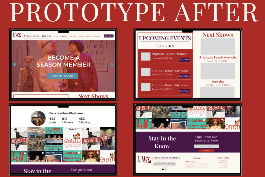
A revised prototype for the homepage after selecting the WordPress theme. Made in Figma.
During development, they encountered technical issues when implementing the Instagram feed and newsletter form. Error messages appeared frequently, and at one point, the homepage temporarily displayed as deleted in WordPress admin. After troubleshooting, they discovered the plugins were incompatible with the gallery plugin. Nicole disabled the conflicting plugins and installed a new gallery solution, which resolved the issue.
Press enter or click to view image in full size
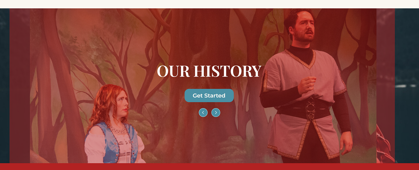
The new gallery plugin on the homepage.
Beyond functionality, the visual and structural updates in Spring 2026 helped better highlight the theatre’s productions. The homepage carousel was improved to feel more engaging and polished, drawing attention to important content without feeling cluttered.
Press enter or click to view image in full size
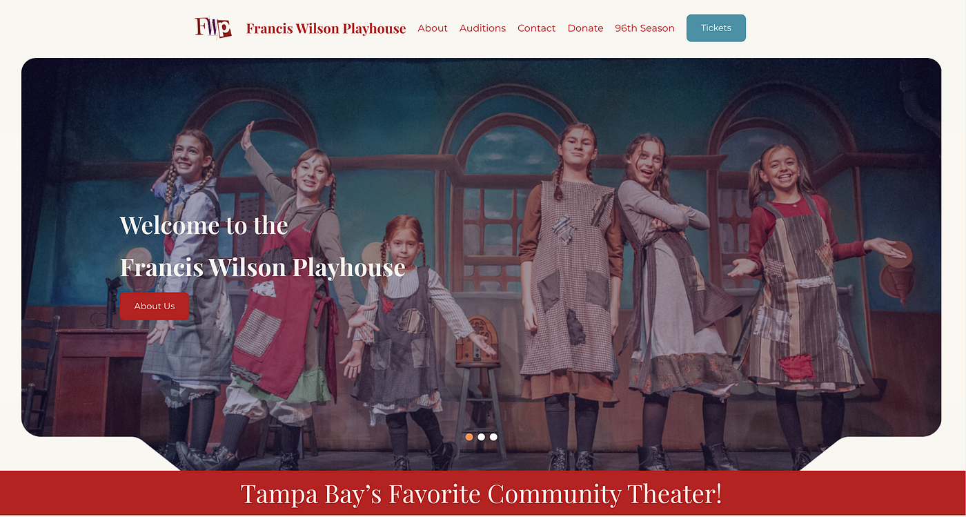
New and improved homepage carousel.
Adding current shows directly to the homepage also makes it easier for users to immediately see what is playing and take action.
Press enter or click to view image in full size
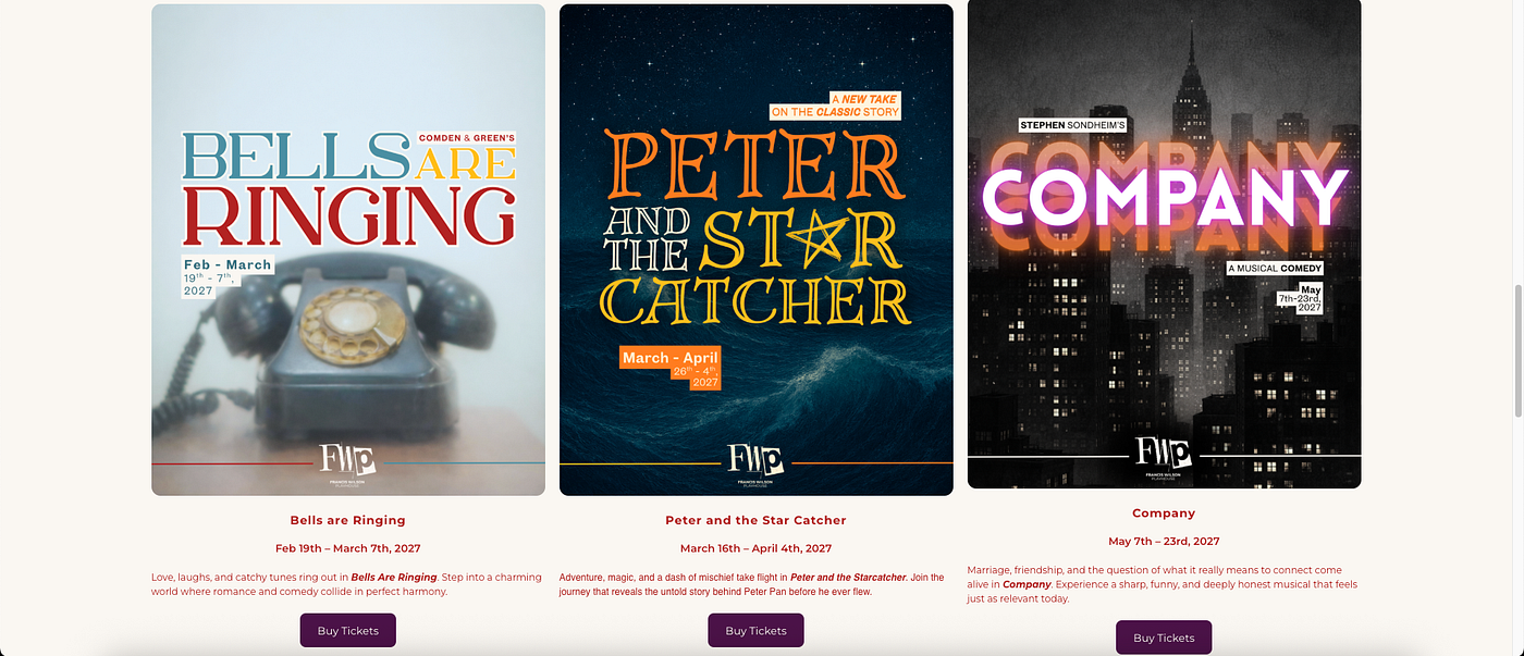
Current show listings on homepage.
In addition, creating individual pages for each show in the season allows each production to have its own space for details and promotion. This not only improves the overall organization of the site, but also makes it feel more professional and aligned with what users expect from a theatre website today.
Press enter or click to view image in full size
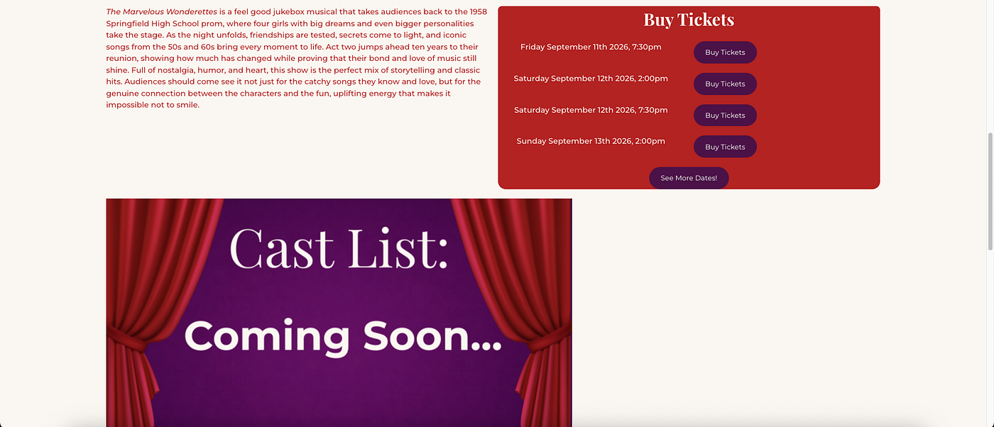
Individual show page.
Creatives
Our Lead Media Specialist, Nicholas, handled the creation of print and digital creative assets. In an early client presentation, he drafted an example Instagram story post, show poster, and volunteer ad to establish a creative direction:
Press enter or click to view image in full size
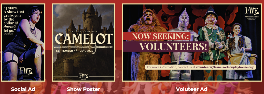
Initial creative designs presented to the theatre.
After receiving approval, he expanded the asset library to include business cards and a sample show poster for the upcoming season’s production of Little Women:
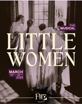
Sample poster for Little Women.
Press enter or click to view image in full size
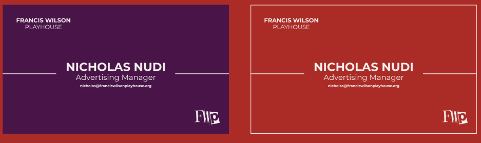
Front of FWP business cards.
Back of FWP business cards.
Through this initial work, Nicholas aimed to templatize creative assets, ensuring future designers have a consistent foundation after the Creative Suite is handed off.
Building on the initial creative direction, the Season 97 assets were developed as a direct extension of the playhouse’s updated design system. Using the Little Women poster as a foundational template, Nicholas established a repeatable framework for future seasonal posters. Each design begins with an AI-generated image, guided by a show-specific prompt and a curated background color palette, and is paired with a unique, complementary typeface for the show title. While maintaining a consistent layout and visual hierarchy across all materials, this system allows each production to retain its own distinct identity, resulting in a cohesive yet flexible suite of creative assets.
Press enter or click to view image in full size
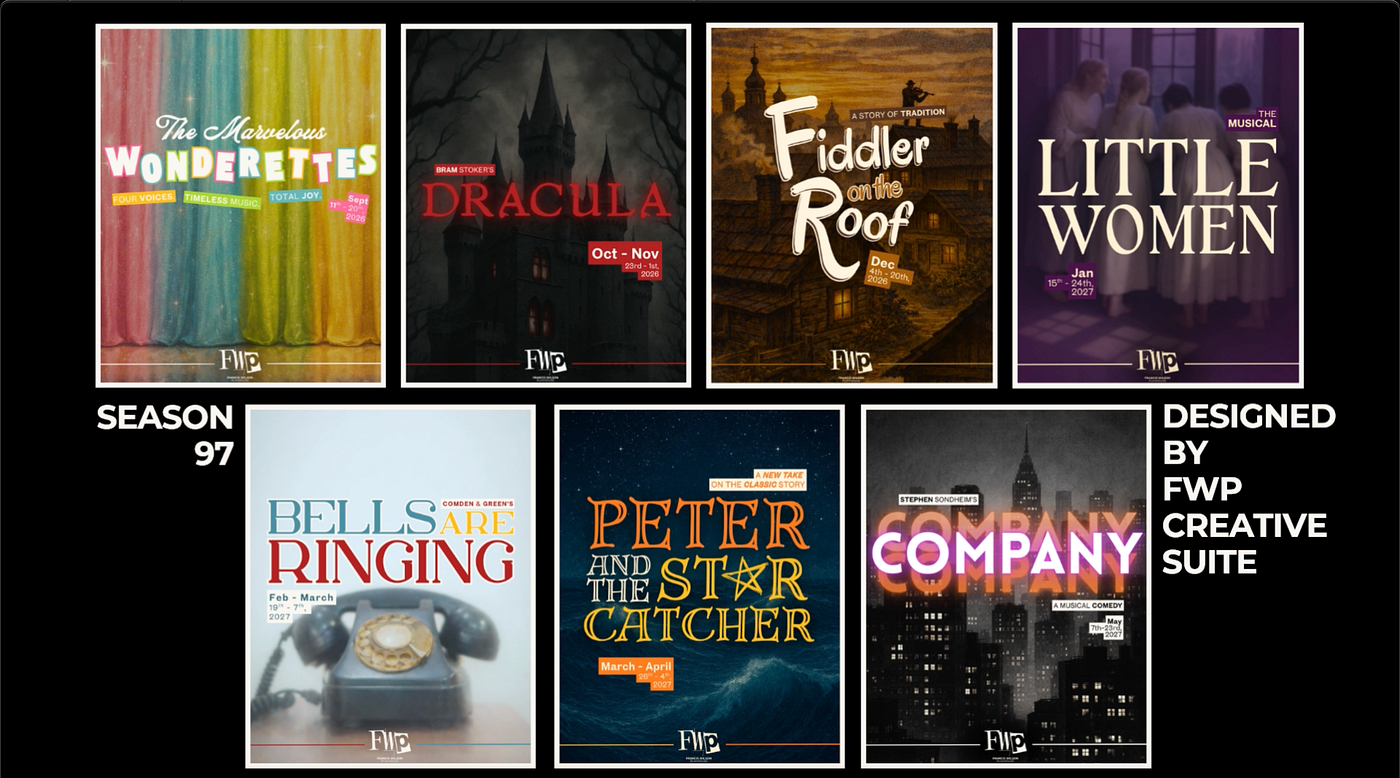
Full suite of Season 97 show posters.
Strategy
We set out to define our overall strategy and priorities while developing the FWP Creative Suite. Here were some of our key insights:
- FWP has two primary target audiences: retiree-aged community members and former theatre kids living in or visiting the Clearwater area.
- The Creative Suite centers on three goals: A New Brand Identity, Modernized Visuals, and a New Website with Frictionless UX.
- Transparent and easily accessible information emerged as a top concern for both audience groups.
After completing our UX Strategy Toolkit, we drafted our User Experience Research Plan. Our research goals were divided into two main categories: usability and visual style.
Usability Goals:
- Determine whether users can successfully complete core site tasks without confusion
- Identify any unintuitive information architecture on the site
- Measure how easily users can locate frequently-needed information
Visual Style and Brand Identity Goals:
- Understand how the site’s visual style aligns with the users’ expectations for a community theatre
- Discover if the intentional branding, visual content, and user experience establish trust and perceived credibility in the organization
Test participants included Clearwater locals, visitors, and individuals in surrounding states interested in community theatre. We recruited through Nicole’s connections in the local theatre community, as well as Grace’s connections working in a retirement community.
Testing
We conducted usability testing with five participants across two rounds. Round One included two participants from our older target audience and served as a beta test. After applying initial findings, Round Two included three participants from our younger target audience to validate improvements.
Round 1 testing revealed two primary usability issues:
Press enter or click to view image in full size
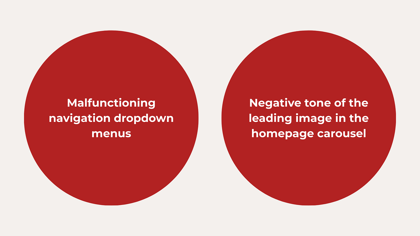
Initial usability issues in Beta Testing.
Press enter or click to view image in full size

Broken drop-down menus in the top nav bar.
Press enter or click to view image in full size
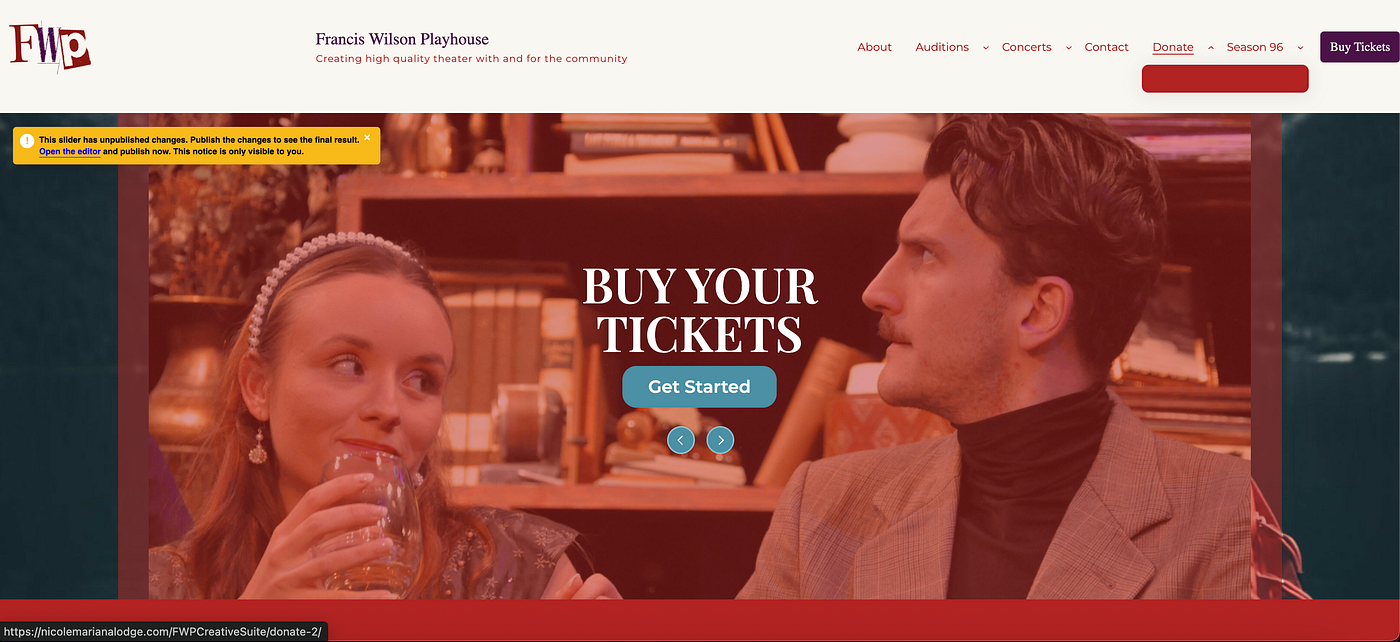
Carousel image noted as having a negative tone by a beta participant.
Round Two testing demonstrated that these changes improved usability and overall site experience.
Press enter or click to view image in full size

Updated functioning nav bar.
Press enter or click to view image in full size
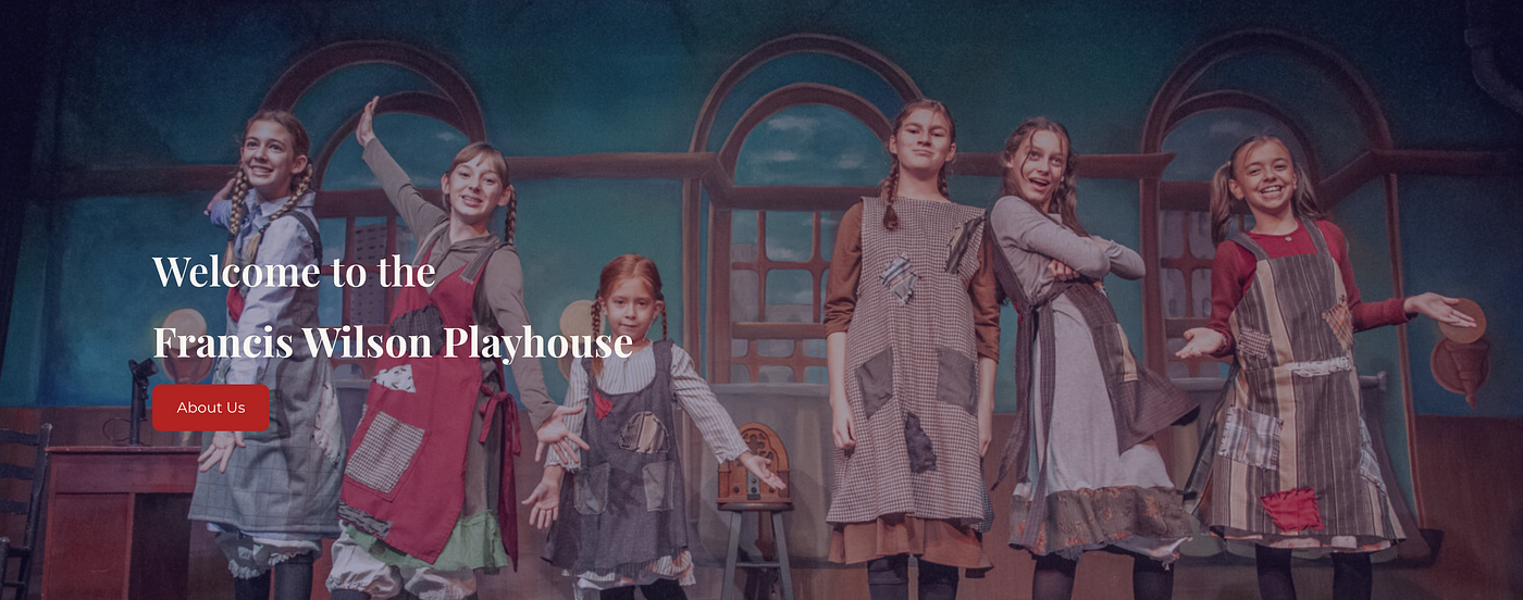
New leading carousel image with a positive tone.
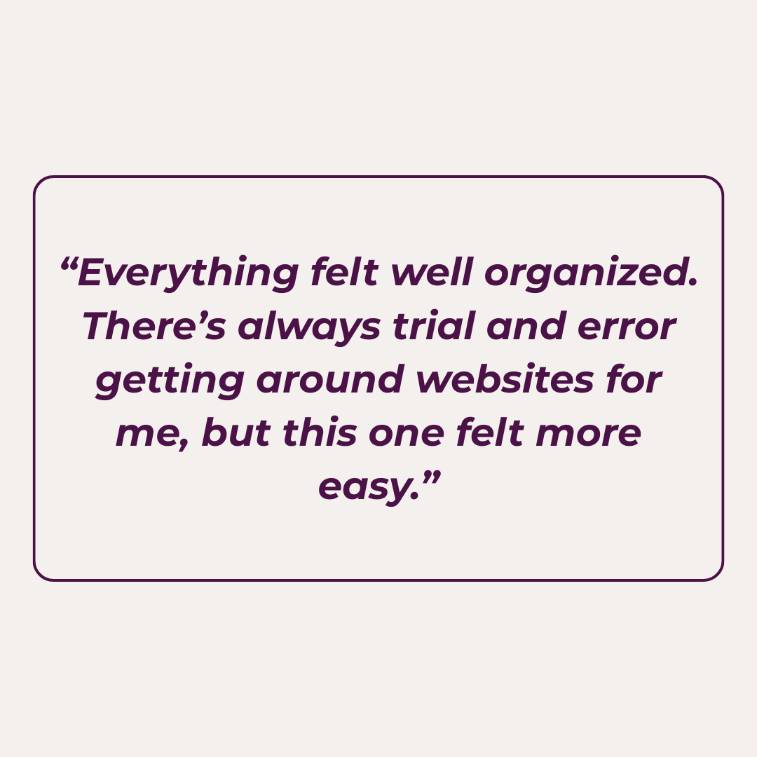
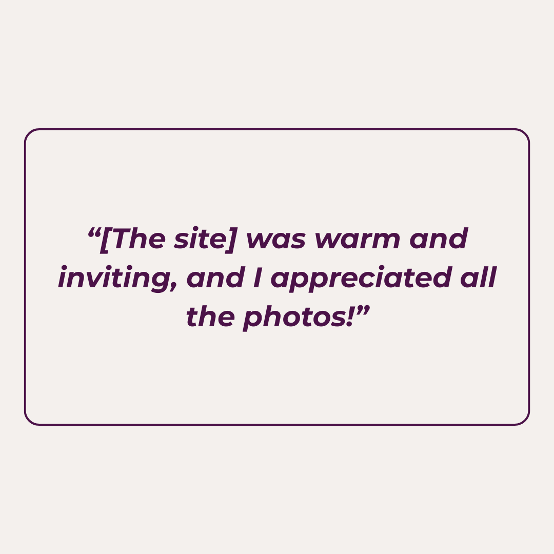
Participants consistently praised the navigation system and visuals as strong points of the site in free-form feedback and in product reaction card results:
Press enter or click to view image in full size
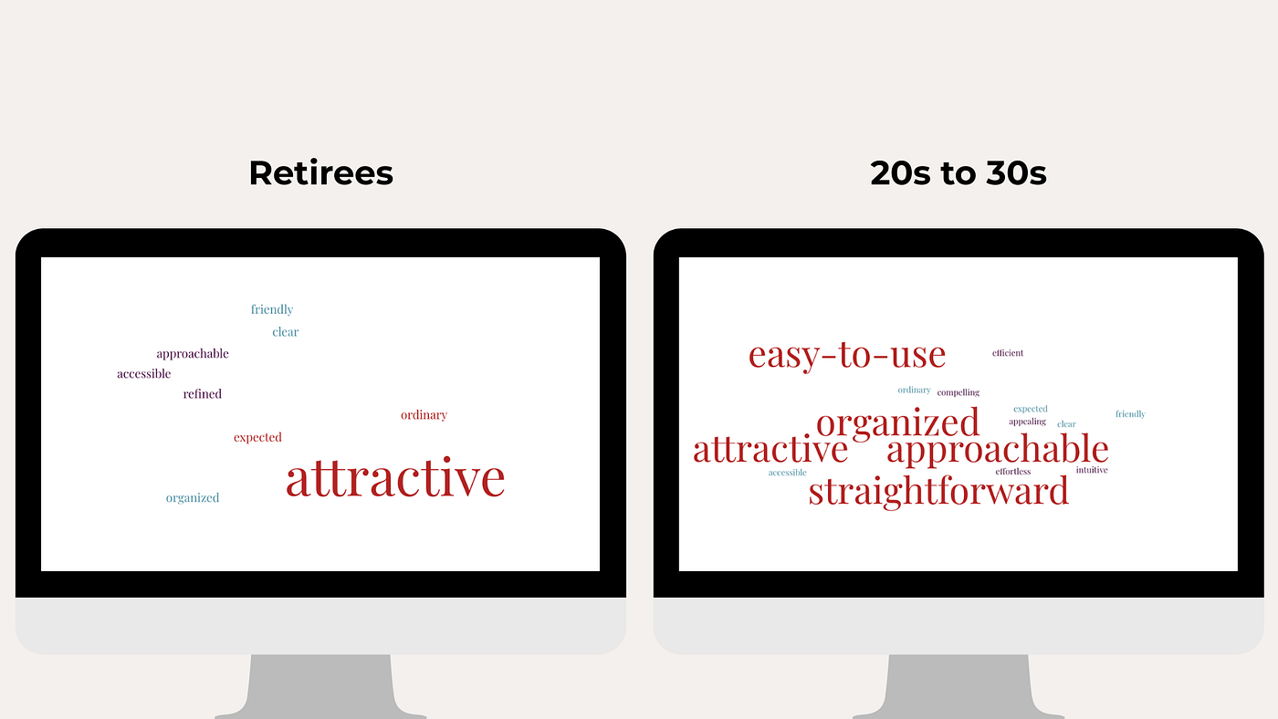
Most commonly used terms in product reaction card results.
Press enter or click to view image in full size
Press enter or click to view image in full size
Press enter or click to view image in full size
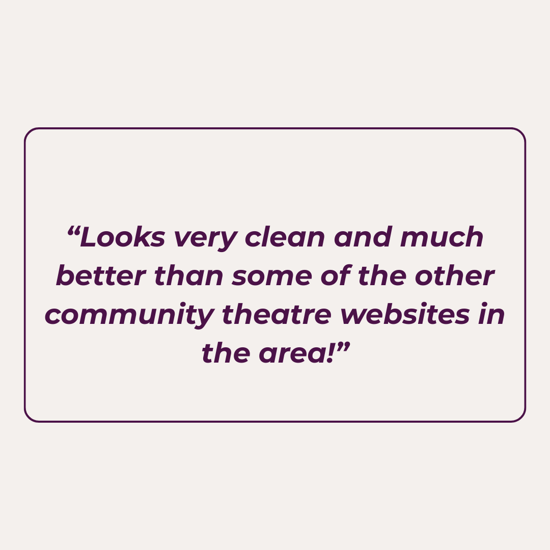
Quotes from testing participants across both testing groups.
Observed user behavior showed that participants generally found information quickly and navigated the site with little difficulty.
Only a few small pain points and patterns emerged:
- Some users indicated that they would like to see the theatre’s address and map information more prominently displayed.
- Our older target audience mentioned wanting to see clearly visible information about handicap accessibility and parking availability.
Findings
The research revealed key differences in behavior, needs, and trust levels between the theatre’s two primary audiences.
Target Audience 1 demonstrated noticeably lower trust in purchasing tickets through websites. But these participants also indicated that strong visual design and clear information significantly influenced whether they felt comfortable trusting a site. This suggested that design quality plays a particularly important role in establishing credibility for this audience. Clear communication about location, parking, handicap accessibility, and pricing was essential to building trust. Also, emphasizing the human element behind the organization, such as the staff available to assist patrons, could help reinforce credibility for users who were hesitant about online ticket purchasing.
In contrast, Target Audience 2 tended to be more comfortable with online interactions and more responsive to visual design. Maintaining a clean and intuitive layout while showcasing the theatre’s creative energy through engaging visuals was important for keeping this audience interested and engaged.
Applied Findings
The updates made to the Francis Wilson Playhouse Creative Suite website focused on making the user experience more intuitive and accessible. We addressed this by updating the visual hierarchy of the contact page, prioritizing address, parking, and accessibility information at the top. One of the most important changes was including an embedded map, which allows users to quickly understand where the theatre is located without having to leave the site. We also added direct click-to-call and click-to-email buttons, limiting the number of steps a patron has to take in order to contact the theatre.
Press enter or click to view image in full size

New visual hierarchy of the contact page.
Press enter or click to view image in full size
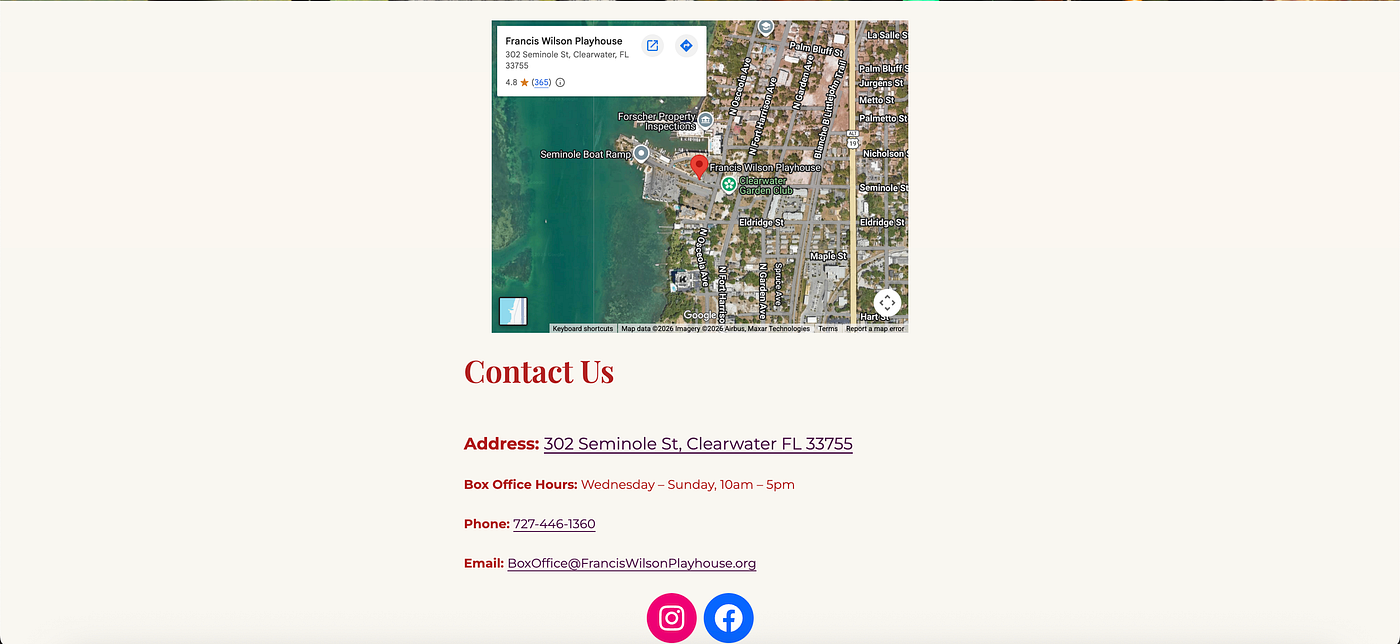
The previous contact page, where information was buried under the embedded map.
Results
The feedback we received on the rebrand, creative assets, and redesigned website for the Francis Wilson Playhouse was instrumental in refining our work. Testing results demonstrated clear improvements in usability and overall audience experience.
As part of the final phase of this project, we focused on creating a sustainable handoff for the theatre’s internal team. This includes a comprehensive design system with clear guidelines for typography, color usage, and layout, as well as templatized creative assets.
Poster designs were standardized using AI-assisted background image prompts, allowing future materials to be created efficiently, even if the theatre does not always have access to a dedicated graphic designer. These systems were built to reduce friction and maintain long-term visual consistency.
At the same time, we emphasized that the Creative Suite is a living system. While it provides a strong and consistent foundation, the theatre is encouraged to adapt and evolve these guidelines over time to meet its changing needs.
These updates directly support the theatre’s broader goals:
- Attracting new, younger audience members, often former theatre participants interested in community arts
- Continuing to serve and build trust with longtime patrons, who often express less comfort with digital platforms
By improving clarity, accessibility, and visual appeal, the Creative Suite helps bridge that gap. Ultimately, this modernization effort both strengthens the theatre’s brand and supports its long-term sustainability and ability to grow its audience.
메타데이터
- post_id
- cca2ed70a355
- slug
- fwp-creative-suite-capstone-case-study-cca2ed70a355
- url
- https://medium.com/@NicoleMarianaLodge/fwp-creative-suite-capstone-case-study-cca2ed70a355
- canonical_url
- https://medium.com/@NicoleMarianaLodge/fwp-creative-suite-capstone-case-study-cca2ed70a355
- author_url
- https://medium.com/@NicoleMarianaLodge
- status
- ok
- fetched_at
- 2026-07-24 23:33:55