The History of Typography: How the Past Shapes the Systems We Design Today
While expanding my typography knowledge, what stood out to me was how little of it is actually new. When I started studying typography more…
The History of Typography: How the Past Shapes the Systems We Design Today
While expanding my typography knowledge, what stood out to me was how little of it is actually new. When I started studying typography more deeply as part of Lyft’s rebrand work, I expected to dive straight into learning modern best practices like accessibility guidelines, responsive type scales, and variable fonts. Instead, I found myself looking backward.
I discovered that the challenges we face with typography today as product designers, like creating hierarchy, conveying meaning, or utilizing letterforms to express our values, are the same problems civilizations have been solving for thousands of years. Long before design systems, printers were standardizing type sizes to create hierarchy. Long before print, Mesopotamians were using symbols to convey meaning on soft clay tablets. The tools have changed, but many of the foundational principles have stayed the same.
Understanding this history changed how I think about typography, not as a set of visual rules, but as a centuries-long effort to scale communication clearly and consistently.
In the first article in this series, I shared the learning roadmap that helped me build a stronger foundation in typography. In this article, I’ll dive into how learning the history of typography helped ground the decisions I made.
What History Taught Me About Recognition
Typography systems work best when they build on patterns users already understand intuitively. Many of the typography systems we still rely on today can be traced back to Johannes Gutenberg’s movable type printing press in the 1400s. What made Gutenberg’s invention revolutionary was not just the ability to print books faster, but the systemization of type itself.
That shift fundamentally changed how information was organized and consumed. Consistent type sizes and hierarchy patterns made content easier to scan and navigate, creating recognizable structures that readers learned over time. After centuries of repeated exposure, our brains have become remarkably efficient at recognizing these typographic cues almost instantly.
During Lyft’s rebrand work, I spent a significant amount of time building typography scales, defining hierarchy patterns, and mapping styles across products and platforms. Even though my tools looked dramatically different from Gutenberg’s, the underlying challenge felt very similar: how do you create a system that helps people process information quickly, consistently, and intuitively across many contexts?
As I evaluated where and how different styles should appear, I found myself thinking less about personal preference and more about recognition and comprehension. Breaking too far from established typographic conventions risks increasing cognitive load by asking users to consciously process information their brains would otherwise recognize automatically. That perspective became especially relevant when deciding where to use Lyft’s proprietary typeface, Rebel Sans Display, versus Rebel Sans Text.
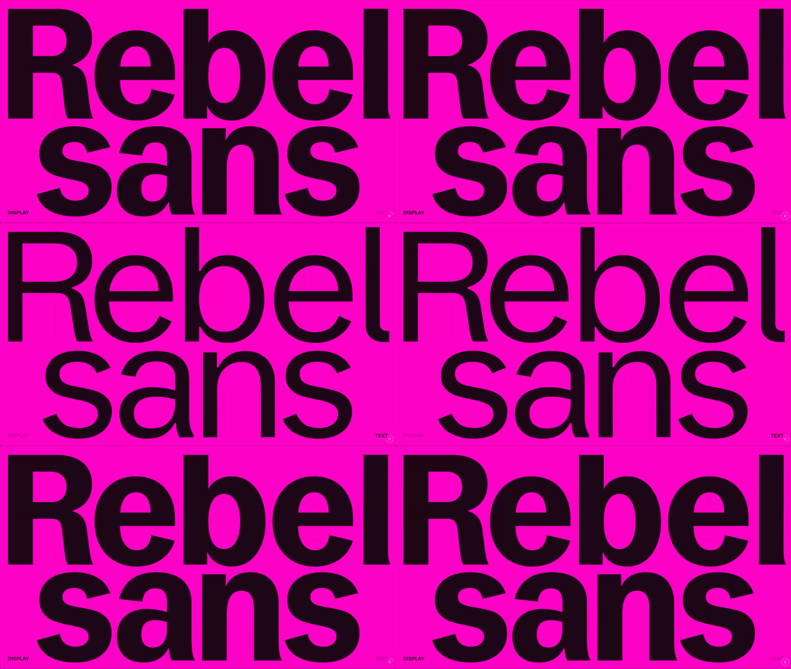
Rebel Sans Display versus Rebel Sans Text. Image source: Koto. https://koto.com/projects/lyft
Display brought stronger personality and brand expression, but it also introduced more stylized forms and exaggerated characteristics that demanded greater visual attention. In marketing surfaces or moments where brand expression was the priority, those qualities worked beautifully. But within dense product experiences where users needed to scan quickly and process information efficiently, Rebel Sans Text consistently created more stable hierarchy and readability.
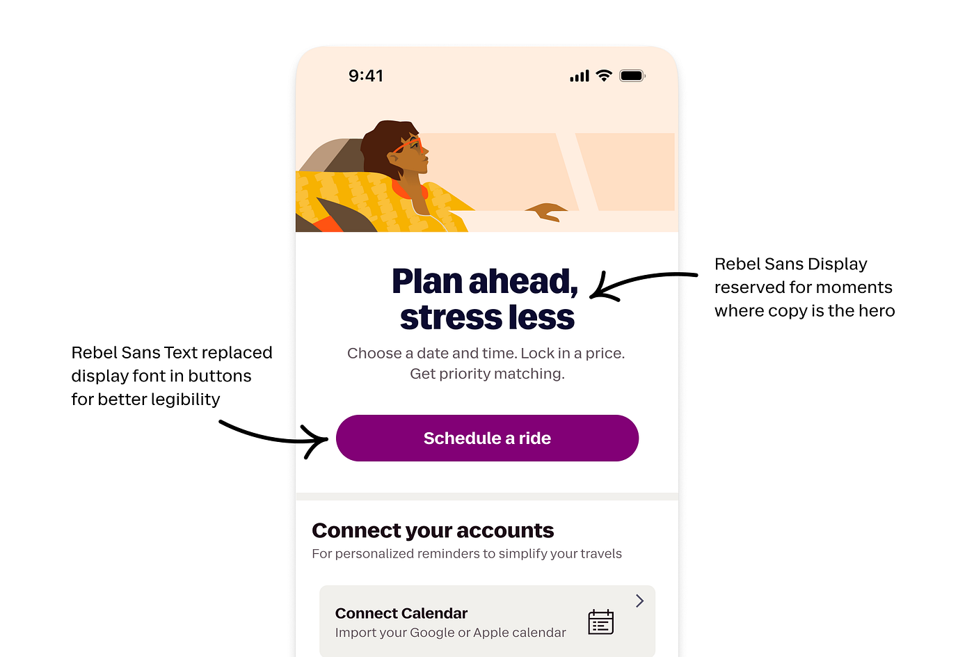
Rebel Sans Display and Rebel Sans Text, are designed to balance expression with function. Display styles bring energy and distinction to key brand moments, while Text styles are optimized for accessibility and legibility across devices and contexts.
This was not simply a debate between “expressive” versus “practical” typography. It was a recognition problem. Typography systems work best when they build on patterns users already understand intuitively. Readers build mental models through repeated exposure over time. Familiar hierarchy structures reduce cognitive effort and help interfaces feel easier to navigate.
I realized these decisions were not just aesthetic preferences. I was building on centuries of typographic patterns designed to help people read, scan, and understand information more effortlessly. Learning typography history changed how I thought about typography systems more broadly. I stopped seeing hierarchy as simply a visual styling exercise and started seeing it as a recognition system built around human pattern recognition.
Learning to See Letterforms Differently
I mostly thought about letterforms in terms of aesthetics and readability. But tracing typography back to some of the earliest writing systems completely changed how I looked at type design. One of the first things I noticed was how deeply letterforms are shaped by the tools and materials used to create them.
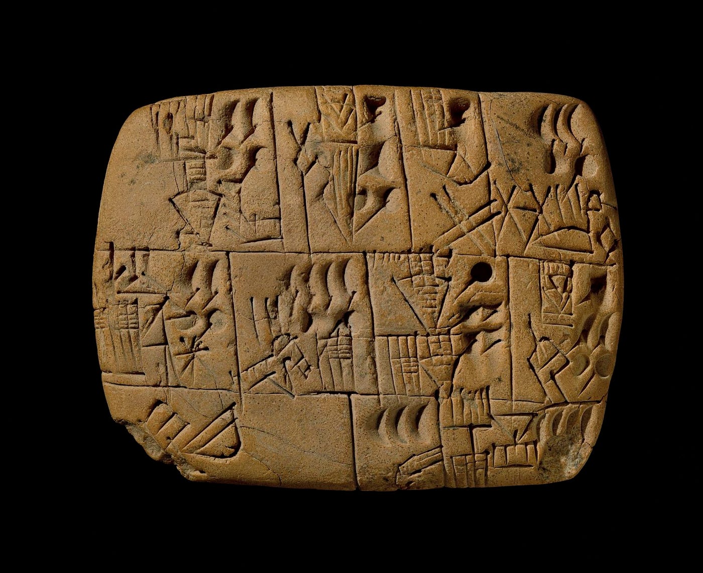
In ancient Mesopotamia, cuneiform was created by pressing a wedge-shaped stylus into soft clay tablets, resulting in sharp, angular forms. Image source: Smarthistory. https://smarthistory.org/cuneiform/
Typography has always been a conversation between humans and technology. Letterforms are not arbitrary. They evolve in response to physical constraints, readability needs, cultural context, and the tools available at the time. Everything from chisels to pens to metal type to digital rendering technologies has shaped the way typography looks and functions.
This research directly applies to how I work with modern typography technology too, especially variable fonts. Instead of seeing variable fonts as simply a more flexible file format, I started thinking about them as another chapter in typography’s long history of adapting to new tools and constraints.
During Lyft’s rebrand work, this sparked a renewed curiosity around how different variable font axes could be used more intentionally within product experiences. One area I became especially interested in was the grade axis. Unlike weight, which changes the overall width and spacing of letterforms, grade adjusts stroke thickness more subtly while preserving layout.
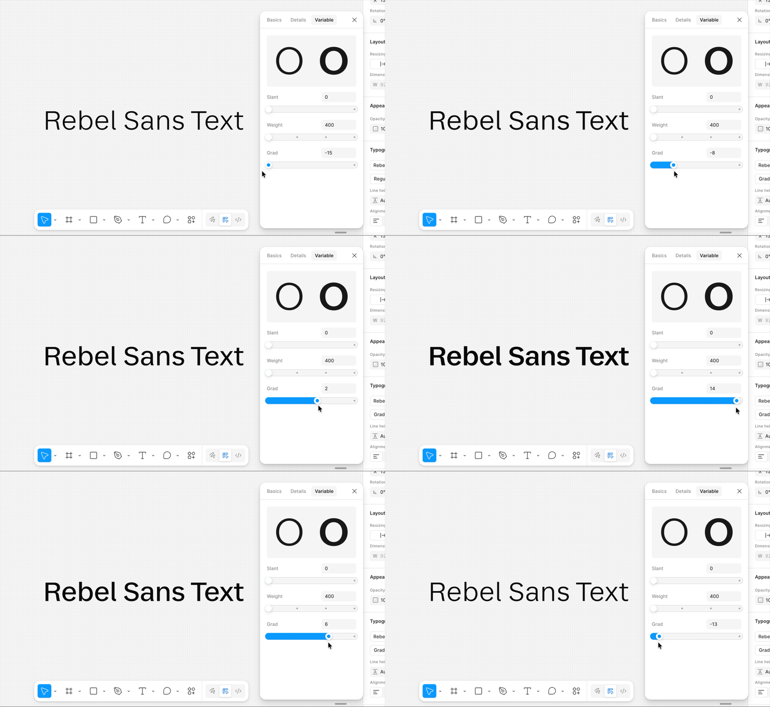
The grade variable allowed us to increase emphasis in our type styles while minimizing layout shift in product.
That distinction opened up interesting possibilities for balancing brand expression and usability. In situations where increasing weight introduced layout shift or disrupted hierarchy, grade created opportunities to increase emphasis and improve readability while maintaining a more stable interface.
The grade variable allowed us to increase emphasis in our type styles while minimizing layout shift in product.

Early explorations of the new Rebel Sans Text typeface demonstrated the benefit of utilizing the grade axis to prevent major layout shifts in product.
The Emotional Language of Letterforms
As I reviewed refinements to the Rebel Sans typeface with the agency and foundry teams involved in Lyft’s rebrand work, I started paying much closer attention to the construction of individual letterforms and the functional role each design decision played.
How much personality could a shape carry before it impacted legibility in product surfaces? How would specific curves, spacing, or proportions hold up across different contexts and screen sizes?
One of the most interesting shifts for me was realizing that typography communicates emotionally long before users consciously process the words themselves. Sharp angles, geometric forms, stroke contrast, spacing, and proportions all subtly influence how a typeface feels.
That made me start looking at Rebel Sans differently.
As I studied the sharp, angular forms found in early writing systems like cuneiform, I started seeing parallels in some of the stronger geometric characteristics within Rebel Sans. The wedge-shaped stylus used in cuneiform naturally created sharp triangular impressions, rigid angles, and structured forms. Over time, these kinds of shapes became associated with qualities like precision, permanence, and authority.
I started noticing similar visual qualities within parts of Rebel Sans. Certain sharp terminals, angular cuts, and geometric structures created a feeling of confidence and maturity that aligned closely with Lyft’s evolving brand expression. At the same time, balancing those sharper forms with subtle flares helped preserve a sense of warmth and humanity that was absent from the rigid structure of cuneiform. These associations are often subconscious. Readers may not actively think about the shape of a terminal or the angle of a stroke, but those details still influence how a typeface is perceived emotionally.
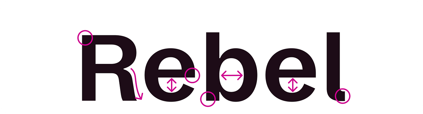
Rebel Sans Text demonstrates how balancing strong angles and geometric forms with slight curves and flares contributes to the typeface feeling mature and confident yet still human and relatable.
Rebel Sans Text demonstrates how balancing strong angles and geometric forms with slight curves and flares contributes to the typeface feeling mature and confident yet still human and relatable.
Historical context gave me a much stronger framework for evaluating typography decisions during the rebrand process. Instead of asking only whether a letterform looked visually interesting, I started asking what emotional qualities it communicated and how those qualities would affect readability, recognition, and trust across product experiences. Understanding the historical relationship between tools, shapes, and perception helped me think more intentionally about how the personality of a typeface could support brand expression without compromising usability.
Further Reading: Typography History Resources
Want to geek out on the history of typography like I did? Check out these resources:
- I promise this story about fonts is interesting
- The Evolution of Typography: A Journey Through History
- The Evolution of Typography: A Journey Through Time, Culture, and Craftsmanship
Next in this series
Did you know our brains often recognize words by their overall shape before processing individual letters? Features like ascenders, descenders, and varied letter heights help create distinctive word silhouettes, allowing readers to scan text more efficiently at a glance. Next up in this series: the anatomy of letterforms, where I’ll explore how the structure of type impacts readability, accessibility, and brand expression.
Special thanks to Runi Goswami, and Justin Gabbard for their time, thoughtful feedback, and editorial support on this article.
메타데이터
- post_id
- fd7e790f3368
- slug
- the-history-of-typography-how-the-past-shapes-the-systems-we-design-today-fd7e790f3368
- url
- https://medium.com/lyft-design/the-history-of-typography-how-the-past-shapes-the-systems-we-design-today-fd7e790f3368
- canonical_url
- https://medium.com/lyft-design/the-history-of-typography-how-the-past-shapes-the-systems-we-design-today-fd7e790f3368
- author_url
- https://medium.com/@namikavarma
- status
- ok
- fetched_at
- 2026-06-21 12:17:11